 Install FontSwap
Free Alternatives to Rockwell with Bold Style
Rockwell is known for its bold aesthetic. If you're looking for a free serif font with a similar bold feel, these 6 alternatives offer comparable characteristics. We've identified 6 that are especially well-suited for this context. All are available under open-source licenses for unrestricted commercial use.
Top Picks
Comparison Table
| Font | Relevance ⓘ
How well this alternative fits the specific context (use-case or trait) of this page. Score 0–100 based on matching keywords, industries, and font characteristics. Alternatives scoring 25+ are highlighted.
| Similarity ⓘ
How visually similar this free font is to the premium original. Score 0–100 based on x-height, width, stroke contrast, use-case overlap, and language coverage.
Learn more → | Weights | Variable | License | Source |
|---|---|---|---|---|---|---|
| Arvo | 50 | 75% | 2 | No | OFL-1.1 | Google Fonts ↗ |
| Bitter | 49 | 72% | Variable | Yes | OFL-1.1 | Google Fonts ↗ |
| Zilla Slab | 48 | 66% | 5 | No | OFL-1.1 | Google Fonts ↗ |
| Roboto Slab | 37 | 85% | Variable | Yes | Apache-2.0 | Google Fonts ↗ |
| Rokkitt | 34 | 70% | Variable | Yes | OFL-1.1 | Google Fonts ↗ |
| Slabo 27px | 32 | 62% | 1 | No | OFL-1.1 | Google Fonts ↗ |
All Alternatives (6)
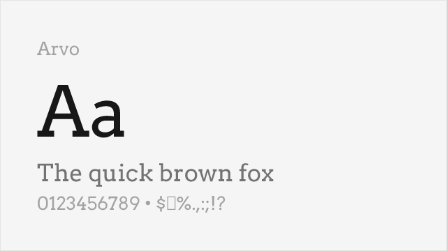
Friendly geometric slab with good readability and distinctive character
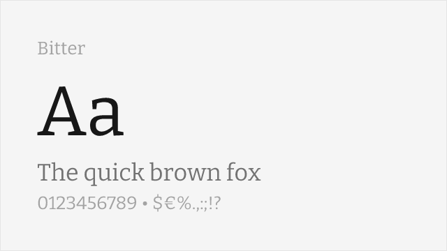
Screen-optimized slab serif with similar sturdy construction
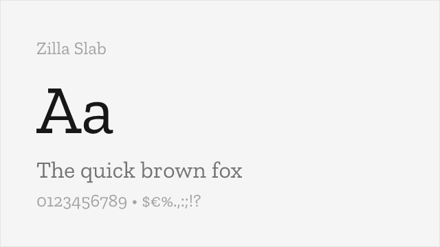
Mozilla's humanist slab — warmer and less rigid than Rockwell, with true italics
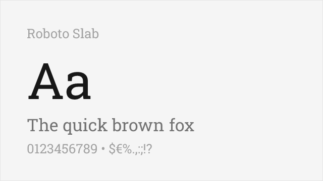
Modern geometric slab with excellent web support and variable font option
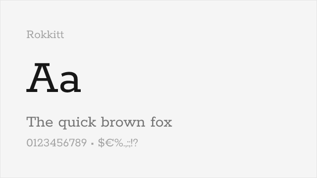
Geometric slab with a full variable weight axis, close to Rockwell's monoline spirit
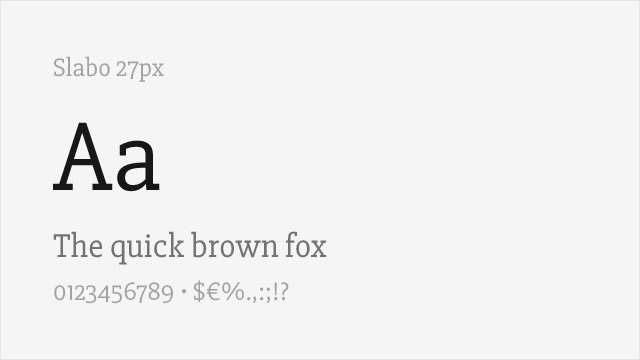
Single-weight geometric slab tuned for text at 27px — no bold, so plan accordingly