Free Alternatives to Museo Slab

About Museo Slab
- Foundry
- Exljbris Font Foundry
- Classification
- serif
- Style
- slab-serif
Brands Using Museo Slab
Late-2000s/early-2010s tech landing pages and pitch decks where the free 500 weight spread widely
Wordmarks and identity systems from studios drawn to its friendly geometric slab
Large-scale display work where the bracketed slabs hold a confident presence
A friendly geometric slab for approachable editorial and brand typography
 See Museo Slab live on these sites with FontSwap →
Museo Slab is the slab-serif member of the Museo superfamily, drawn by Jos Buivenga and published through his exljbris Font Foundry. It takes the geometric bones that made Museo and Museo Sans recognizable — circular bowls, low stroke contrast, a warm and even rhythm — and adds slab feet, producing a face that manages to feel engineered and friendly at the same time. For a stretch of the late 2000s and early 2010s it was nearly unavoidable on startup landing pages, pitch decks, and small-studio branding. The reason is as much about business as it is about design.
Why Museo Slab Matters
Buivenga did something unusual with the Museo family: he gave part of it away. The 500 weight — the central, book-weight cut that most projects actually set text in — was released free for personal and commercial use, while the rest of the family stayed commercial.
That single decision is most of the story of why Museo Slab became so widely used.
Designers on tight or nonexistent budgets could drop the free 500 into a real project, ship it, and get comfortable with the typeface. When a job later needed more range — a hairline for captions, a heavier weight for display — buying the full family was an easy call because the type was already familiar and already loved. It was freemium applied to type before that word was common in the font world, and it worked. Museo Slab spread through the startup ecosystem on the strength of a free weight and stayed because the design earned it.
The design earned it because it solved a specific problem of the era. The late-2000s tech boom wanted typography that read as modern and trustworthy without feeling cold, corporate, or generic. A pure geometric slab like Rockwell can feel industrial; a neutral grotesque can feel faceless. Museo Slab split the difference. It looked contemporary enough to belong on a software company's homepage and warm enough to make that company feel approachable rather than clinical.
That balance — geometry softened by personality — is the whole reason the typeface matters, and it is exactly what you are trying to preserve when you reach for a free substitute.
Design Characteristics
Museo Slab is best understood as a geometric skeleton wearing slab serifs, with a handful of decisions that keep it from ever feeling mechanical:
- Geometric construction: Bowls and curves are built on near-circular forms, giving letters a rounded, open quality and a consistent, rational rhythm across a line.
- Low stroke contrast: The difference between thick and thin strokes is minimal, so text sets with an even, sturdy color rather than the modulated sparkle of a high-contrast serif.
- Bracketed slabs: The serifs are gently bracketed — softened where they meet the stem — rather than the blunt, unbracketed geometric slabs of Rockwell. This is a large part of why Museo Slab reads as friendly instead of hard-edged.
- Rounded terminals and humanist touches: Small softenings throughout the letterforms keep the geometry from feeling cold, the same trick that defines the wider Museo family.
- Generous spacing: Letters sit comfortably apart rather than locked tight, which reinforces the open, approachable texture and helps the face breathe at display sizes.
- A staged weight system: The family spans weights from 100 up to 900 (with a display 1000 added later), so a designer moves in clear, distinct steps — Light for elegant headlines, the free 500 for body and general use, heavier cuts for emphasis and display — rather than through a continuous range.
Put together, these traits explain why the closest free alternatives cluster into two groups: friendly geometric slabs that copy the warm, circular skeleton (Rokkitt, Aleo), and screen-tuned slabs that keep the sturdy low-contrast texture while fixing Museo Slab's small-size behavior (Bitter, Zilla Slab).
Where Museo Slab Excels
Museo Slab is fundamentally a display and branding typeface, and it is at its best wherever a little warmth improves the message:
- Brand identities and logotypes: The mix of geometric confidence and friendliness makes it a natural fit for wordmarks and brand systems that want to feel modern without feeling severe.
- Tech and startup marketing: Homepages, feature sections, and pitch decks, where the face reads as current and trustworthy — the context that made it famous in the first place.
- Editorial headlines: Titles, decks, and pull quotes gain a distinctive-but-readable character that stands apart from a plain geometric sans.
- Packaging and posters: At large sizes the bracketed slabs and even color hold up cleanly and give products a confident shelf presence.
- Paired systems: Because it comes from a superfamily, Museo Slab combines naturally with Museo Sans for headline-plus-body typography that shares a single design DNA.
The common thread is scale. Museo Slab rewards being seen — set it large enough for its rounded geometry and softened slabs to register, and it does exactly what tech brands hired it to do.
Where Museo Slab Struggles
The same qualities that make Museo Slab a strong display face create its limits.
- Small sizes and dense text: Low-contrast slabs and generous spacing that look crisp on a poster can start to fill in and feel heavy in long paragraphs of small on-screen text. Museo Slab was never really meant to carry a wall of body copy.
- A staged, not continuous, range: The distinct weights are elegant, but you don't get the fine-grained control of a variable font. When a layout needs a weight between the steps, or wants to interpolate across breakpoints, the static family can't provide it.
- Full-family licensing cost: The free 500 is generous, but a complete typographic system — multiple weights, italics, matching Museo Sans — means paying for the commercial family, which is exactly the budget line a free alternative removes.
- Personality is not neutral: Museo Slab has a recognizable voice. That is a strength for branding and a liability when a project needs the type to disappear, or when its early-2010s ubiquity reads as dated for a particular audience.
None of these are flaws so much as a description of the job the typeface is good at. Recognizing them is what makes choosing a substitute straightforward: match Museo Slab where it is strong, and pick a screen-tuned option where it is weak.
How to Choose a Free Substitute
The right free alternative depends less on which one looks most like Museo Slab in a single specimen and more on where your type has to live and how many weights you need.
Closest overall feel → Josefin Slab. At 82% similarity it is the natural starting point: an elegant geometric slab with distinctive, slightly condensed character and a Josefin Sans companion that mirrors Museo's superfamily approach. Reach for it when you want Museo Slab's refined, design-forward personality.
Most weights from one file → Rokkitt. Rokkitt keeps the rounded, friendly geometry but ships a full 100–900 variable axis. If you were relying on Museo Slab's staged weights and wished for more, Rokkitt gives you a continuous range for free — ideal for responsive systems that need to fine-tune weight across breakpoints.
Body text and long reading → Bitter. Museo Slab's weakest spot is small on-screen text, and Bitter was drawn specifically to fix that. It shares the sturdy, low-contrast slab texture but opens the spacing and counters for legibility, making it the safe pick for blogs, articles, and any layout that is more paragraph than headline.
Maximum warmth → Aleo. Aleo leans into the friendly, humanized half of Museo Slab's character with rounded terminals and semi-organic curves, plus its own 100–900 variable range. Choose it when approachability matters more than strict geometric precision.
Digital-first neutrality → Roboto Slab. Less distinctive than Museo Slab but superbly optimized for the screen, with a nine-weight variable family and Google Fonts delivery. It is the pragmatic choice when performance and familiarity outrank unique character.
Headline branding with editorial edge → Zilla Slab. Mozilla's humanist slab trades pure geometry for bracketed, Clarendon-influenced serifs. It keeps the confident, trustworthy tone at display sizes and is a strong pick for logotypes and titles that want a touch more editorial character.
A practical rule: if you are matching Museo Slab's personality, start with Josefin Slab or Aleo; if you are matching its job — headlines versus body, static versus variable — let the medium decide, and Bitter or Rokkitt will usually serve you better than a face chosen purely for resemblance.
Premium Font Neighbors
If you are drawn to Museo Slab, several other premium typefaces sit nearby and are worth knowing, whether to license as a complement or simply to understand what you actually want from the slab.
- Museo Sans is Museo Slab's direct sibling — the same geometric skeleton without the slabs. Setting Museo Slab headlines over Museo Sans body text is the family's intended pairing and the most cohesive system you can build around it.
- Archer is Hoefler&Co's warm, humanist slab, arguably the reference point for the "friendly geometric slab" idea. It is more editorial and more carefully finished, and it defined the tone for a generation of approachable brands.
- Rockwell is the classic geometric slab with blunt, unbracketed serifs. Comparing it to Museo Slab is the fastest way to feel how much Museo Slab's bracketing and rounded touches soften the geometric formula.
- Clarendon represents the older, bracketed slab tradition Museo Slab's warmth quietly borrows from — sturdier and more nineteenth-century in flavor, and the ancestor of humanist slabs like Zilla Slab.
- Sentinel is Hoefler&Co's take on the Clarendon model, a versatile bracketed slab with a full range of weights and italics built for both text and display.
- Serifa is Adrian Frutiger's geometric slab, essentially the slab-serif counterpart to Univers — a cleaner, more rationalist neighbor that shows what Museo Slab looks like with the friendliness dialed down.
Exploring these clarifies the choice. If you want the exact superfamily system, that is Museo Sans; if you want the warmth, Archer and Clarendon are the premium expression of it; and if you simply want the geometric-slab feeling at no cost, the free alternatives above deliver it.
FAQ
What is the best free alternative to Museo Slab?
Josefin Slab is the closest free alternative to Museo Slab, at roughly 82% similarity. It shares Museo Slab's elegant geometric construction, slightly condensed proportions, and distinctive-but-clean character, and it comes with a Josefin Sans companion that mirrors Museo's superfamily approach. It is available free under the SIL Open Font License, including a variable font version for precise weight control.
Is Museo Slab free to use?
Partly. Jos Buivenga's exljbris Font Foundry released the 500 weight of Museo Slab free for personal and commercial use, which is what drove the typeface's popularity. The rest of the family — the lighter and heavier weights that make up a complete typographic system — is commercial and must be licensed. If you need more than the free 500, a free alternative like Rokkitt or Aleo can supply a full range of weights at no cost.
Who designed Museo Slab, and what family is it part of?
Museo Slab was designed by Jos Buivenga and released through his exljbris Font Foundry. It is the slab-serif member of the Museo superfamily, which also includes the Museo and Museo Sans designs. The family shares a geometric skeleton with low stroke contrast and humanist warmth; Museo Slab adds bracketed slab serifs to that skeleton.
Which free alternative is best for body text?
Bitter is the strongest choice for running text. Museo Slab's low-contrast slabs and generous spacing are built for display, and they can feel heavy in small on-screen paragraphs. Bitter keeps a similar sturdy slab texture but was specifically engineered for screen reading, with more open spacing and counters, so it stays legible in blogs, articles, and long-form layouts where Museo Slab struggles.
Do any free alternatives offer a variable font like Museo Slab does not?
Yes. Museo Slab ships as a set of distinct static weights, but several free alternatives provide continuous variable axes. Rokkitt, Bitter, and Aleo each offer a 100–900 weight axis, and Roboto Slab does as well. If you were limited by Museo Slab's staged weights, any of these lets you fine-tune weight freely and interpolate across responsive breakpoints. Zilla Slab is the exception among the alternatives here — it is a static five-weight family.
How do I match Museo Slab's weights with a free alternative?
Museo Slab spans weights from 100 to 900, so map them step by step: use a Thin or Light (100–300) for elegant headlines, a Medium (500) for the book weight most text sits in — the weight Museo Slab offered free — and Bold or heavier (700–900) for emphasis. Rokkitt, Bitter, and Aleo all cover every one of those weights exactly through their variable ranges, so a one-to-one match is straightforward. Zilla Slab covers the 300, 500, and 700 steps but has no hairline 100.
Can I pair a free alternative with a matching sans-serif the way Museo Slab pairs with Museo Sans?
Yes, and it is worth doing. Museo Slab's superfamily pairing with Museo Sans is one of its strengths, and you can recreate the effect for free. Josefin Slab has a Josefin Sans companion, Aleo was designed alongside Lato, and both Rokkitt and Bitter pair cleanly with neutral geometric sans-serifs like Nunito Sans, Lato, or Open Sans for cohesive headline-and-body systems.
Is Museo Slab on Google Fonts?
No, Museo Slab is a premium font from Exljbris Font Foundry and is not available on Google Fonts.
The closest Google Fonts alternative is Josefin Slab with 82% similarity. Get it free on Google Fonts ↗
Free Alternatives (6)
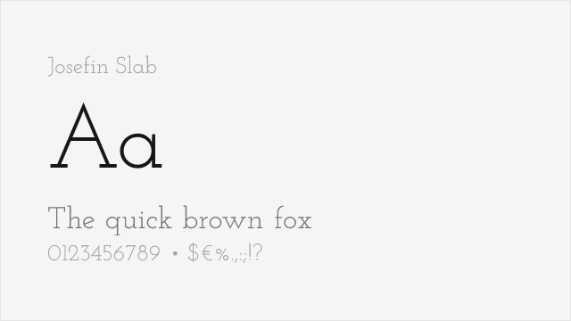
Elegant geometric slab with vintage character and clean modern feel
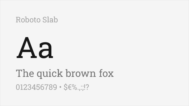
Modern geometric slab optimized for digital interfaces
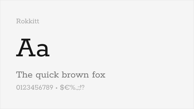
Geometric slab with a friendly personality and a full nine-weight variable family
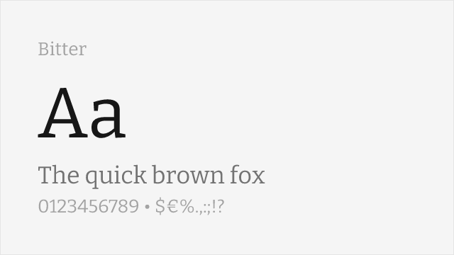
Contemporary slab drawn for on-screen reading, with sturdy low-contrast strokes
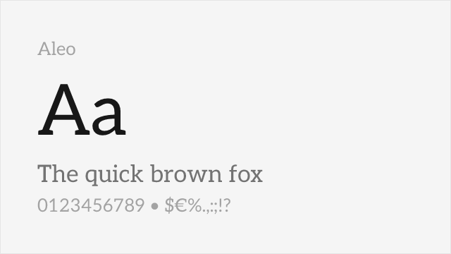
Rounded semi-slab with humanist warmth, a companion to Lato
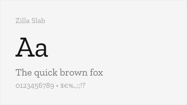
Mozilla's humanist slab with bracketed Clarendon-style serifs
Compare the alternatives
See how Museo Slab compares to its top alternatives — and how those alternatives compare to each other — side by side.
See where Museo Slab is used in the wild and swap to free alternatives live.
Install FontSwap →Replacement Summary
Source: FontAlternatives.com
Premium font: Museo Slab
Best free alternative: Josefin Slab
FontAlternatives similarity score: 82%
Replacement difficulty: Medium
Best for: fashion and lifestyle, editorial design, wedding materials, vintage-modern projects
Notable users: Startup & SaaS marketing, Small-studio & independent branding, Packaging & poster design
Not recommended when: Brand consistency with Startup & SaaS marketing requires exact letterforms
What is the best free alternative to Museo Slab?
Josefin Slab is the best free alternative to Museo Slab with a FontAlternatives similarity score of 82%.
Josefin Slab shares similar proportions, stroke characteristics, and intended use with Museo Slab. It is available under the OFL-1.1 license, which permits both personal and commercial use at no cost.
This alternative works particularly well for: fashion and lifestyle, editorial design, wedding materials, vintage-modern projects.
Can I safely replace Museo Slab with Josefin Slab?
Yes, with some considerations. Josefin Slab achieves a FontAlternatives similarity score of 82%, indicating good structural compatibility for most use cases.
Licensing: Josefin Slab is licensed under OFL-1.1, which allows commercial use without licensing fees or royalties.
Weight coverage: All 4 weights have exact matches available.
When should I NOT replace Museo Slab?
While Josefin Slab is a strong alternative, there are situations where replacing Museo Slab may not be appropriate:
- Optical precision requirements: Josefin Slab has measurable structural differences from Museo Slab that may be visible in precise design work.
- Strict compliance: Verify that OFL-1.1 terms meet your specific legal and compliance requirements.
Weight-Matching Guide
Map Museo Slab weights to their closest free alternatives for accurate font substitution.
Josefin Slab
| Museo Slab | Josefin Slab | Match |
|---|---|---|
| 100 | Thin (100) | exact |
| 300 | Light (300) | exact |
| 500 | Medium (500) | exact |
| 700 | Bold (700) | exact |
Roboto Slab
| Museo Slab | Roboto Slab | Match |
|---|---|---|
| 100 | Thin (100) | exact |
| 300 | Light (300) | exact |
| 500 | Medium (500) | exact |
| 700 | Bold (700) | exact |
Rokkitt
| Museo Slab | Rokkitt | Match |
|---|---|---|
| 100 | Thin (100) | exact |
| 300 | Light (300) | exact |
| 500 | Medium (500) | exact |
| 700 | Bold (700) | exact |
Bitter
| Museo Slab | Bitter | Match |
|---|---|---|
| 100 | Thin (100) | exact |
| 300 | Light (300) | exact |
| 500 | Medium (500) | exact |
| 700 | Bold (700) | exact |
Aleo
| Museo Slab | Aleo | Match |
|---|---|---|
| 100 | Thin (100) | exact |
| 300 | Light (300) | exact |
| 500 | Medium (500) | exact |
| 700 | Bold (700) | exact |
Zilla Slab
| Museo Slab | Zilla Slab | Match |
|---|---|---|
| 300 | Light (300) | exact |
| 500 | Medium (500) | exact |
| 700 | Bold (700) | exact |
Performance Guide
Production performance metrics for each alternative.
How to Use Josefin Slab
Copy these code snippets to quickly add Josefin Slab to your project.
CSS code for Josefin Slab
@import url('https://fonts.googleapis.com/css2?family=Josefin+Slab:wght@100..900&display=swap');HTML code for Josefin Slab
<link rel="preconnect" href="https://fonts.googleapis.com">
<link rel="preconnect" href="https://fonts.gstatic.com" crossorigin>
<link href="https://fonts.googleapis.com/css2?family=Josefin+Slab:wght@100..900&display=swap" rel="stylesheet">
Tailwind code for Josefin Slab
// tailwind.config.js
module.exports = {
  theme: {
    extend: {
      fontFamily: {
        'josefin-slab': ['"Josefin Slab"', 'sans-serif'],
      },
    },
  },
}

// Usage in HTML:
// <p class="font-josefin-slab">Your text here</p>
Next.js code for Josefin Slab
// Using next/font (Next.js 13+)
import { Josefin_Slab } from 'next/font/google';

const josefin_slab = Josefin_Slab({
  subsets: ['latin'],
  weight: ['100', '200', '300', '400', '500', '600', '700', '800', '900'],
});

export default function Component() {
  return (
    <p className={josefin_slab.className}>
      Your text here
    </p>
  );
}

// Or using inline styles with Google Fonts link:
// <p style={{ fontFamily: '"Josefin Slab"' }}>Your text</p>
Expo and React Native code for Josefin Slab
// Install: npx expo install @expo-google-fonts/josefin-slab expo-font
import { useFonts, Josefin_Slab_400Regular } from '@expo-google-fonts/josefin-slab';

export default function App() {
  const [fontsLoaded] = useFonts({
    Josefin_Slab_400Regular,
  });

  if (!fontsLoaded) return null;

  return (
    <Text style={{ fontFamily: 'Josefin_Slab_400Regular' }}>
      Your text here
    </Text>
  );
}
Recommended Font Pairings
These free fonts pair well with Josefin Slab Museo Slab for headlines, body text, or accent use.
Nunito Sans's rounded geometric forms echo Museo Slab's humanized geometry, creating cohesive tech-forward brand typography
Lato's professional humanist character complements Museo Slab's clean geometric slabs for modern editorial and SaaS marketing layouts
Open Sans's neutral sans-serif forms provide versatile body text that pairs naturally with Museo Slab's contemporary slab serif headlines
Browse Alternatives by Context
Find Museo Slab alternatives filtered by specific use case, style, or language support.
By Use Case
By Script
Frequently Asked Questions
What is the best free alternative to Museo Slab?
Josefin Slab is the best free alternative to Museo Slab with a FontAlternatives similarity score of 82%. It shares similar proportions and characteristics while being available under the OFL-1.1 license for both personal and commercial use at no cost.
Is there a free version of Museo Slab?
There is no official free version of Museo Slab. However, Josefin Slab is available under the OFL-1.1 open-source license and achieves a FontAlternatives similarity score of 82%. It includes variable weights and supports latin, latin-extended.
What Google Font looks like Museo Slab?
The Google Fonts most similar to Museo Slab are Josefin Slab, Roboto Slab, Rokkitt. Among these alternatives, Josefin Slab offers the closest match with a FontAlternatives similarity score of 82% and includes variable weights for flexible typography options.
Can I use Josefin Slab commercially?
Yes, Josefin Slab can be used commercially. It is licensed under OFL-1.1, which allows free use in websites, applications, print materials, and commercial projects without purchasing a license or paying royalties.
Is Josefin Slab similar enough to Museo Slab?
Josefin Slab achieves a FontAlternatives similarity score of 82% compared to Museo Slab. While not identical, it offers comparable letterforms, proportions, and visual style. Most designers find it works excellently as a substitute in web and print projects.
What are the main differences between Museo Slab and its free alternatives?
Free alternatives to Museo Slab may differ in subtle details like letter spacing, curve refinements, and available weights. Premium fonts typically include more OpenType features, extended language support, and optimized screen rendering. However, for most projects, these differences are negligible.
Where can I download free alternatives to Museo Slab?
Download Josefin Slab directly from Google Fonts. Click the "Get Font" button on any alternative listed above to visit the official download page. Google Fonts also provides convenient embed codes for seamless web integration.