 Install FontSwap
Free Alternatives to Museo Slab with Modern Style
Museo Slab is known for its modern aesthetic. If you're looking for a free serif font with a similar modern feel, these 6 alternatives offer comparable characteristics. We've identified 5 that are especially well-suited for this context. All are available under open-source licenses for unrestricted commercial use.
Top Picks
Comparison Table
| Font | Relevance ⓘ
How well this alternative fits the specific context (use-case or trait) of this page. Score 0–100 based on matching keywords, industries, and font characteristics. Alternatives scoring 25+ are highlighted.
| Similarity ⓘ
How visually similar this free font is to the premium original. Score 0–100 based on x-height, width, stroke contrast, use-case overlap, and language coverage.
Learn more → | Weights | Variable | License | Source |
|---|---|---|---|---|---|---|
| Roboto Slab | 65 | 75% | Variable | Yes | Apache-2.0 | Google Fonts ↗ |
| Rokkitt | 64 | 72% | Variable | Yes | OFL-1.1 | Google Fonts ↗ |
| Aleo | 64 | 68% | Variable | Yes | OFL-1.1 | Google Fonts ↗ |
| Zilla Slab | 53 | 65% | 5 | No | OFL-1.1 | Google Fonts ↗ |
| Josefin Slab | 26 | 82% | Variable | Yes | OFL-1.1 | Google Fonts ↗ |
| Bitter | 24 | 70% | Variable | Yes | OFL-1.1 | Google Fonts ↗ |
Most Relevant (5)
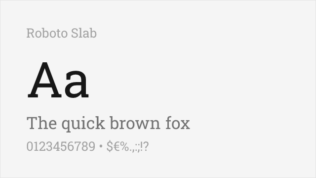
[Google Fonts] · Apache-2.0 · Variable
Modern geometric slab optimized for digital interfaces
Why it matches: Roboto Slab provides a more utilitarian geometric slab with excellent digital optimization. While less distinctive than Museo Slab, it shares the geometric foundations and clean aesthetics. For projects prioritizing web performance over unique character, Roboto Slab delivers superior technical implementation with familiar geometric slab presence.
digital interfacesAndroid ecosystemweb headlinesdata visualization
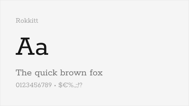
[Google Fonts] · OFL-1.1 · Variable
Geometric slab with a friendly personality and a full nine-weight variable family
Why it matches: Rokkitt is built on the same circle-and-line geometry as Museo Slab, and its rounded, open letterforms carry a similar friendly warmth rather than the industrial stamp of a Rockwell. Where Museo Slab tops out at a handful of weights, Rokkitt ships a continuous 100–900 variable axis, so you can dial in a match for Museo Slab's Light and Medium and still have heavier display cuts to spare.
tech brandingweb headlineseditorial displayresponsive weight matching
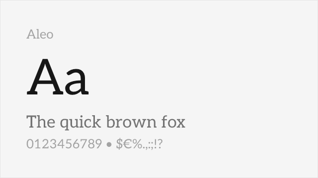
[Google Fonts] · OFL-1.1 · Variable
Rounded semi-slab with humanist warmth, a companion to Lato
Why it matches: Aleo pairs rounded terminals with semi-organic curves, giving it the same approachable warmth that keeps Museo Slab from feeling cold or mechanical. Its slabs are gently bracketed rather than blunt, echoing Museo Slab's softened geometry, and the full 100–900 variable range covers everything from hairline captions to heavy headings. It trades a little of Museo Slab's geometric precision for extra friendliness.
approachable brandingeditorialweb contentfriendly headlines
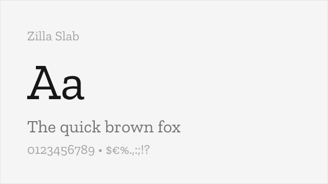
[Google Fonts] · OFL-1.1 · 5 weights
Mozilla's humanist slab with bracketed Clarendon-style serifs
Why it matches: Zilla Slab was drawn for Mozilla as a strong-but-friendly brand face, a brief close to Museo Slab's own balance of authority and warmth. Its serifs are bracketed in the Clarendon tradition rather than purely geometric, so it lands a little more editorial than Museo Slab, but the two share the same confident, trustworthy presence in headlines. It's a static family of five weights rather than a variable font.
headlines and titlestech brandingopen-source projectsdisplay
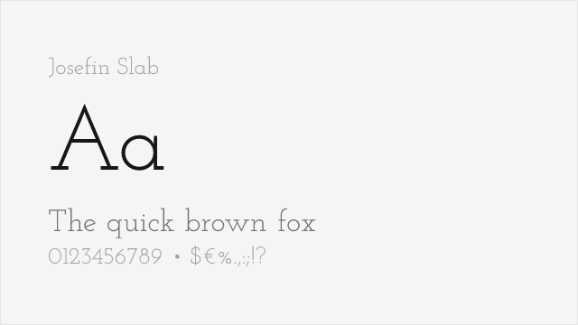
[Google Fonts] · OFL-1.1 · Variable
Elegant geometric slab with vintage character and clean modern feel
Why it matches: Josefin Slab shares Museo Slab's elegant geometric construction with slightly condensed proportions and clean modern aesthetics. Both feature distinctive character that stands apart from utilitarian geometric slabs. Josefin Slab's vintage-modern sensibility provides warmth similar to Museo Slab's humanized geometric approach.
fashion and lifestyleeditorial designwedding materialsvintage-modern projects
Other Alternatives (1)
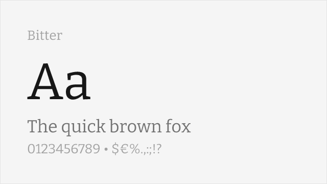
[Google Fonts] · OFL-1.1 · Variable
Contemporary slab drawn for on-screen reading, with sturdy low-contrast strokes
Why it matches: Bitter was engineered for text on screens, which is exactly where Museo Slab's low-contrast slabs tend to struggle. It keeps the even color and squared-off slab feet that make Museo Slab feel solid, but opens the spacing and counters so paragraphs stay legible at small sizes. The result reads as a close cousin that happens to be better behaved in body copy.
long-form readingblog and article bodyscreen texteditorial