Free Alternatives to Clarendon for Signage

6 alternatives | 2 highly relevant | serif | Best match: Roboto Slab (73%)

Looking for a free serif font for signage projects? Clarendon by Linotype is a popular choice, but its licensing cost can be prohibitive. We've curated 6 free alternatives that work well in signage contexts. We've identified 2 that are especially well-suited for this context. Each alternative is scored by visual similarity and contextual relevance, and ships under an open-source license for both personal and commercial use.

Top Picks

Comparison Table

Font Relevance Similarity Weights Variable License Source
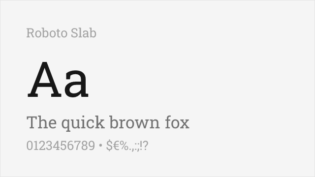
Roboto Slab 43 73% Variable Yes Apache-2.0 Google Fonts ↗
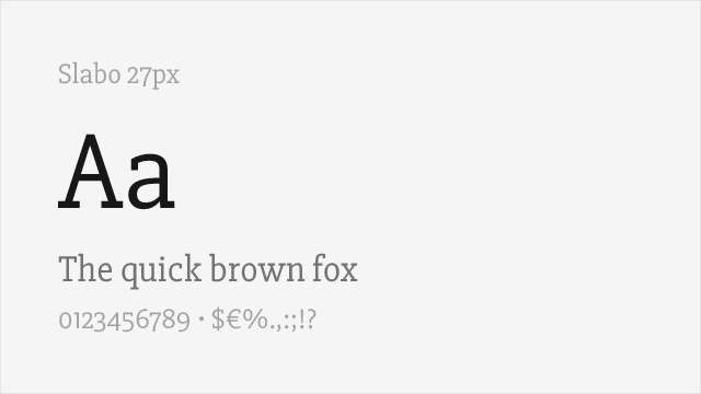
Slabo 27px 38 75% 1 No OFL-1.1 Google Fonts ↗
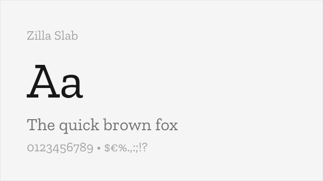
Zilla Slab 18 82% 5 No OFL-1.1 Google Fonts ↗
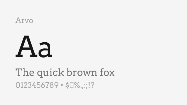
Arvo 16 64% 2 No OFL-1.1 Google Fonts ↗
Bitter 15 70% Variable Yes OFL-1.1 Google Fonts ↗
Aleo 7 67% Variable Yes OFL-1.1 Google Fonts ↗

Most Relevant (2)

#1 Roboto Slab 73% Relevant
[Google Fonts] · Apache-2.0 · Variable

Sturdy, widely-used slab serif with a full variable weight range
Why it matches: Roboto Slab pairs the familiar Roboto skeleton with substantial slab serifs, giving it Clarendon's sturdy, readable presence in a thoroughly modern, screen-ready package. Its serifs are more squared than Clarendon's bracketed ones, but the weight, warmth, and workhorse legibility are close.
web headlines and bodyeditorial UIbranding
Get Font ↗
#2 Slabo 27px 75% Relevant
[Google Fonts] · OFL-1.1 · 1 weights

Web-optimized slab with bracketed serifs for excellent screen readability

Why it matches: Slabo 27px captures Clarendon's bracketed slab serif aesthetic in a size-specific design optimized for 27-pixel rendering. While limited to a single weight, its precision at the target size delivers exceptional clarity. For web headings at 27px where Clarendon's character is needed, Slabo offers pixel-perfect rendering.
web headings at 27pxnavigation menusUI elementscall-to-action buttons
Get Font ↗

Other Alternatives (4)

#3 Zilla Slab 82%
[Google Fonts] · OFL-1.1 · 5 weights

Mozilla's slab serif with contemporary refinement and strong branding presence
Why it matches: Zilla Slab shares Clarendon's characteristic bracketed slab serifs—the curved transitions between stems and serifs that define the Clarendon style. Both feature sturdy construction with warm, readable character. Zilla Slab's contemporary refinement and digital optimization provide a modern interpretation of Clarendon's 19th-century foundations.
tech brandingweb headlinesdigital productsopen source projects
Get Font ↗
#4 Arvo 64%
[Google Fonts] · OFL-1.1 · 2 weights

Geometric slab serif, clean and even, good for headlines
Why it matches: Arvo is a geometric slab serif with even, blocky serifs. It is more mechanical than Clarendon's bracketed forms — closer to the Egyptian slabs Clarendon refined — but for bold, sturdy headlines it delivers a comparable solid, confident presence at no cost.
headlinespostersdisplay
Get Font ↗
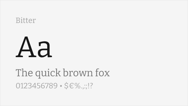
#5 Bitter 70%
[Google Fonts] · OFL-1.1 · Variable

Contemporary slab serif designed for comfortable on-screen reading
Why it matches: Bitter is a slab serif drawn specifically for screen reading, with a warm, sturdy texture close to Clarendon's. Its serifs are slab but gently finished, and its generous x-height keeps it legible at text sizes where a heavier Clarendon can feel dense.
body textlong-form editorialscreen reading
Get Font ↗
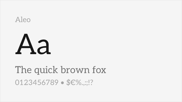
#6 Aleo 67%
[Google Fonts] · OFL-1.1 · Variable

Semi-rounded slab with a touch of contrast and a full weight range

Why it matches: Aleo is a contemporary slab serif with lightly rounded details and a hint of stroke contrast, giving it some of the warmth Clarendon's brackets provide. It is friendlier and less heavy than Clarendon, but shares the sturdy, approachable slab-serif register.
brandingheadlines and short textfriendly editorial
Get Font ↗

Related Pages