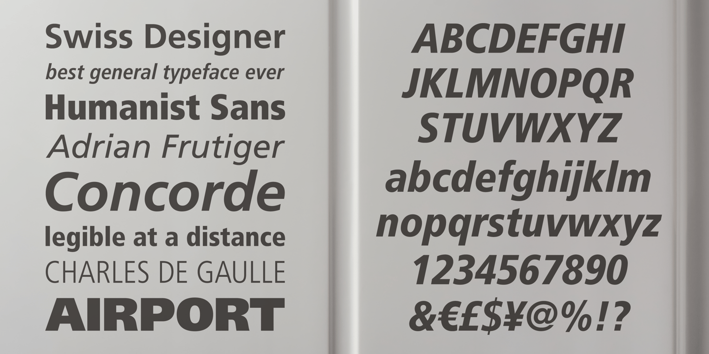
Frutiger vs Open Sans
This Frutiger vs Open Sans breakdown focuses on the details that usually matter: proportions, texture, and where each one fits best. With 80% similarity, Open Sans captures Frutiger's humanist proportions with similar emphasis on digital legibility. Open Sans keeps the neutral vibe but is tuned for modern digital typography.
Design DNA
Design overlap:40%
Frutiger
Open Sans
Highlighted traits are shared between both fonts
Visual Comparison
Frutiger
Premium
Open Sans
FreeAa Bb Cc 123
The quick brown fox jumps over the lazy dog
ABCDEFGHIJKLMNOPQRSTUVWXYZ
abcdefghijklmnopqrstuvwxyz
0123456789 !@#$%^&*()
Feature Comparison
| Feature | Frutiger | Open Sans |
|---|---|---|
| Type | Premium | Free |
| Classification | sans-serif | sans-serif |
| Variable Font | No | Yes |
| Weights | Multiple | Variable (100-900) |
| Italics | Yes | Yes |
| License | Commercial License Required | Apache-2.0 |
| Language Support | latin, latin-extended, cyrillic, greek | latin, latin-extended, cyrillic, cyrillic-extended, greek, greek-extended, vietnamese |
| Source | Linotype | Google Fonts |
Best Use Cases
Typography for wayfinding, environmental graphics, and public signage. Signage f...
Typography for navigation systems, directional signage, and environmental graphi...
Typography for established businesses, enterprise software, and professional ser...
Typography for medical, wellness, and healthcare applications. Healthcare fonts ...
Typography optimized for user interfaces, design systems, and digital products. ...
Typography suited for magazines, newspapers, and long-form content. Editorial fo...
Fonts that establish strong brand identity with distinctive character and versat...
Typography for desktop and web applications, software interfaces, and digital to...
Performance Comparison
| Metric | Frutiger | Open Sans |
|---|---|---|
| Score | N/A | 54/100 |
| File Size | N/A | 706.8 KB |
| Weights | N/A | 9 (var) |
| Italics | N/A | Yes |
| Variable Font | N/A | Yes (1 axes) |
| Language Groups | N/A | 7 |
| CDN Delivery | N/A | Yes |
| x-Height Ratio | N/A | 0.535 |
| Cap Height Ratio | N/A | 0.714 |
Where You'll See These Fonts
Frutiger
- Airport signage
- Healthcare systems
- Transportation
- Government forms
- Pharmaceutical packaging
Which Should You Choose?
Consider: Frutiger
- Shares Frutiger's readable, warm character
- Particularly suited for web applications and corporate communications
- Variable font with continuous weight adjustment
- Supports 7 scripts including cyrillic and cyrillic-extended
- Delivers a clean, professional, friendly aesthetic
Recommended: Open Sans
- Original design with refined typographic details
- Designed specifically for signage and wayfinding
- Used by Airport signage, Healthcare systems
- Commercial license with professional support
Browse by Context
Free Alternatives to Consider
Other free alternatives to Frutiger