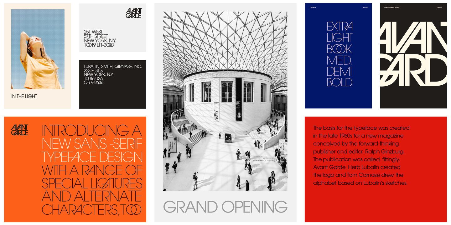
ITC Avant Garde vs Poppins
Here’s how Poppins compares to ITC Avant Garde when you care about day-to-day usability more than pedigree. With 72% similarity, Poppins shares ITC Avant Garde's geometric foundations with circular letter forms and modern proportions. Poppins typically gives you a wider weight range, which helps when you need tighter hierarchy control.
Design DNA
Design overlap:0%
ITC Avant Garde
Poppins
Visual Comparison
ITC Avant Garde
Premium
Poppins
FreeAa Bb Cc 123
The quick brown fox jumps over the lazy dog
ABCDEFGHIJKLMNOPQRSTUVWXYZ
abcdefghijklmnopqrstuvwxyz
0123456789 !@#$%^&*()
Feature Comparison
| Feature | ITC Avant Garde | Poppins |
|---|---|---|
| Type | Premium | Free |
| Classification | display | sans-serif |
| Variable Font | No | No |
| Weights | Multiple | 100, 200, 300, 400, 500, 600, 700, 800, 900 |
| Italics | Yes | Yes |
| License | Commercial License Required | OFL-1.1 |
| Language Support | latin, latin-extended, cyrillic | latin, latin-extended, devanagari |
| Source | ITC | Google Fonts |
Best Use Cases
Fonts that establish strong brand identity with distinctive character and versat...
Typography designed to grab attention at large sizes. Display fonts feature dist...
Typography for fashion brands, style publications, and luxury apparel. Fashion f...
Typography suited for magazines, newspapers, and long-form content. Editorial fo...
Typography designed specifically for titles, headers, and attention-grabbing tex...
Typography for established businesses, enterprise software, and professional ser...
Fonts optimized for mobile interfaces with excellent small-size legibility, clea...
Typography for medical, wellness, and healthcare applications. Healthcare fonts ...
Typography optimized for online retail, marketplaces, and shopping experiences. ...
Performance Comparison
| Metric | ITC Avant Garde | Poppins |
|---|---|---|
| Score | N/A | 59/100 |
| File Size | N/A | 162.4 KB |
| Weights | N/A | 9 |
| Italics | N/A | Yes |
| Variable Font | N/A | No |
| Language Groups | N/A | 3 |
| CDN Delivery | N/A | Yes |
| x-Height Ratio | N/A | 0.548 |
| Cap Height Ratio | N/A | 0.698 |
Where You'll See These Fonts
ITC Avant Garde
- Avant Garde magazine logo
- 1970s graphic design
- Album covers
- Fashion editorial
- Logo design
Which Should You Choose?
Consider: ITC Avant Garde
- Particularly suited for tech branding and web applications
- 9 weight options for flexible typography
- Delivers a friendly, modern, clean aesthetic
- Popular in education-academia and healthcare-medical design
- Versatile enough to replace 37+ premium fonts
Recommended: Poppins
- Original design with refined typographic details
- Designed specifically for branding and display
- Used by Avant Garde magazine logo, 1970s graphic design
- Commercial license with professional support
Browse by Context
Free Alternatives to Consider
Other free alternatives to ITC Avant Garde