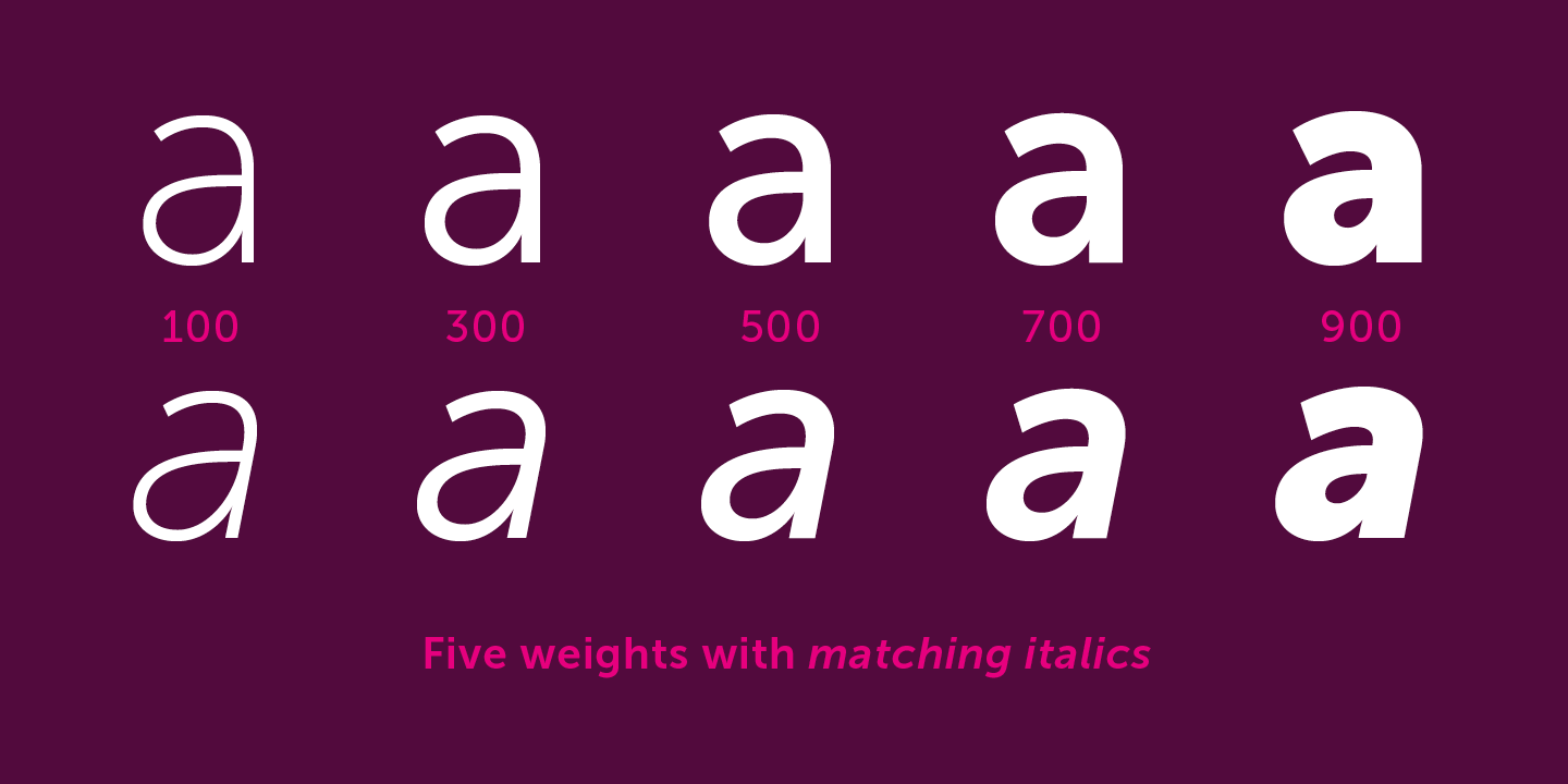
Museo Sans vs Lato
Here’s how Lato compares to Museo Sans when you care about day-to-day usability more than pedigree. With 82% similarity, Lato captures Museo Sans's duality of appearing neutral in body text while revealing warm character at display sizes. If you want the same structure with a friendlier vibe, Lato usually gets you there.
Design DNA
Design overlap:0%
Museo Sans
Lato
Visual Comparison
Museo Sans
Premium
Lato
FreeAa Bb Cc 123
The quick brown fox jumps over the lazy dog
ABCDEFGHIJKLMNOPQRSTUVWXYZ
abcdefghijklmnopqrstuvwxyz
0123456789 !@#$%^&*()
Feature Comparison
| Feature | Museo Sans | Lato |
|---|---|---|
| Type | Premium | Free |
| Classification | sans-serif | sans-serif |
| Variable Font | No | No |
| Weights | Multiple | 100, 300, 400, 700, 900 |
| Italics | Yes | Yes |
| License | Commercial License Required | OFL-1.1 |
| Language Support | latin, latin-extended, cyrillic | latin, latin-extended |
| Source | Exljbris | Google Fonts |
Best Use Cases
Typography for established businesses, enterprise software, and professional ser...
Fonts that establish strong brand identity with distinctive character and versat...
Typography suited for magazines, newspapers, and long-form content. Editorial fo...
Typography optimized for websites, landing pages, and web applications. Web font...
Typography for startups, tech companies, and venture-backed businesses. Startup ...
Fonts optimized for mobile interfaces with excellent small-size legibility, clea...
Typography for medical, wellness, and healthcare applications. Healthcare fonts ...
Typography optimized for online retail, marketplaces, and shopping experiences. ...
Typography for business documents, reports, and professional communications. Doc...
Performance Comparison
| Metric | Museo Sans | Lato |
|---|---|---|
| Score | N/A | 60/100 |
| File Size | N/A | 85.9 KB |
| Weights | N/A | 5 |
| Italics | N/A | Yes |
| Variable Font | N/A | No |
| Language Groups | N/A | 2 |
| CDN Delivery | N/A | Yes |
| x-Height Ratio | N/A | 0.506 |
| Cap Height Ratio | N/A | 0.717 |
Where You'll See These Fonts
Museo Sans
- Tech startup branding
- SaaS applications
- Corporate presentations
- Web interfaces
- Marketing materials
Which Should You Choose?
Consider: Museo Sans
- Particularly suited for corporate communications and website body text
- Delivers a friendly, professional, clean aesthetic
- Popular in education-academia and healthcare-medical design
- Rated as an easy replacement
- Versatile enough to replace 13+ premium fonts
Recommended: Lato
- Original design with refined typographic details
- Designed specifically for corporate and branding
- Used by Tech startup branding, SaaS applications
- Commercial license with professional support
Browse by Context
Free Alternatives to Consider
Other free alternatives to Museo Sans