Accessible Fonts
Typography designed for maximum readability across all abilities. WCAG compliance, low vision support, and cognitive accessibility are the primary considerations.
Typography Requirements
Source-backed compliance information for accessibility applications.
WCAG 2.1 Contrast Requirements
- • 4.5:1 contrast ratio for normal text (under 18pt)
- • 3:1 contrast ratio for large text (18pt+ or 14pt bold)
- • Text should be resizable to 200% without loss of functionality
- • No images of text except for logos and decorative purposes
Source: WCAG 2.1 Contrast Understanding (retrieved 2026-01-14)
WebAIM Typography Guidance
- • Use relative units (em, rem) for font sizing
- • Maintain adequate line spacing (1.5x recommended)
- • Avoid full justification which creates uneven spacing
- • Ensure sufficient word spacing
Source: WebAIM Fonts Guide (retrieved 2026-01-14)
Stanford Accessibility Guidelines
- • Minimum 12pt for printed documents
- • Avoid all-caps for extended text
- • Use bold for emphasis instead of italics
- • Maintain consistent heading hierarchy
Source: Stanford Typography Accessibility (retrieved 2026-01-14)
Note: Requirements may vary by jurisdiction. Consult relevant authorities for your specific context.
Font Selection Checklist
Key questions to consider when choosing fonts for accessibility applications.
What WCAG level are you targeting?
AA requires 4.5:1 contrast for normal text. AAA requires 7:1. Most organizations target AA as a baseline.
Will users with low vision be part of your audience?
Low vision users benefit from larger fonts, high contrast, and fonts with open letterforms. Test at various zoom levels.
Do users need to resize text?
Use relative units (em, rem) not fixed pixels. Test at 200% zoom without horizontal scrolling.
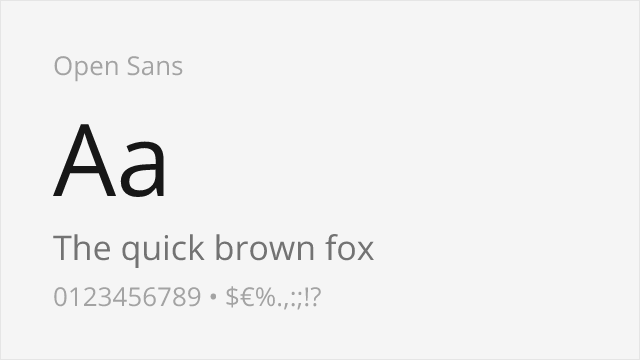
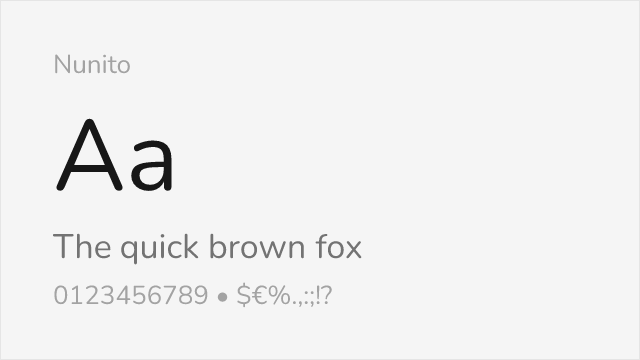
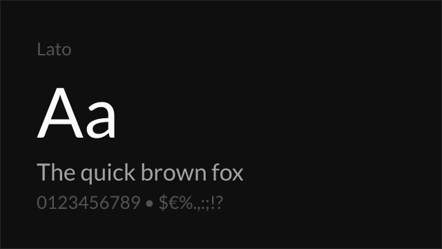
Recommended Fonts
Curated free fonts well-suited for accessibility applications.


More Options
Additional fonts tagged for accessibility applications.
Migrating from Premium Fonts?
Common premium fonts used in accessibility and their free alternatives.
| Premium Font | Free Alternative | Match |
|---|---|---|
| Verdana | DejaVu Sans | 85% |
| Tahoma | DejaVu Sans | 90% |
| Calibri | Lato | 88% |
| Frutiger | Hind | 82% |
| Helvetica | Inter | 88% |
Frequently Asked Questions
What is the WCAG contrast requirement for text?
WCAG 2.1 Level AA requires a minimum contrast ratio of 4.5:1 for normal text and 3:1 for large text (18pt or 14pt bold). Level AAA requires 7:1 for normal text and 4.5:1 for large text. These ratios ensure readability for users with low vision.
Which fonts are best for low vision users?
Fonts designed for accessibility like Atkinson Hyperlegible (created by the Braille Institute) and Lexend are excellent choices. Key features include high x-height, open letterforms, clear distinction between similar characters (l/1/I, O/0), and good spacing. Variable fonts allow users to adjust weight for their needs.
Related Industries
Sources
- WCAG 2.1 Contrast Understanding — Retrieved 2026-01-14
- WebAIM Fonts Guide — Retrieved 2026-01-14
- Stanford Typography Accessibility — Retrieved 2026-01-14