Absolut Vodka Uses Futura
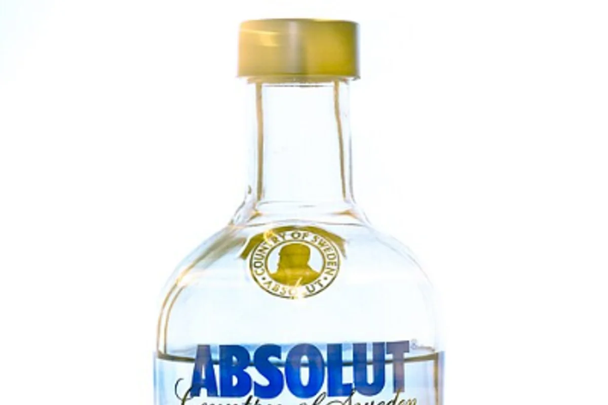
Absolut Vodka's bottle label is a study in controlled deviation. The logotype is clearly derived from Futura Extra Bold Condensed — the geometric skeleton, the circular bowls, the even stroke weight are all Renner's work.
But someone added tiny flare serifs to select terminals, creating a hybrid that sits between sans-serif austerity and serif tradition. The effect is a typeface that looks engineered and handcrafted simultaneously.
The Futura-based logotype dates to the late 1970s, when Absolut was redesigned for its international launch. The bottle shape and label became the product's primary advertising medium — most famously in the TBWA campaign that ran from 1980 to 2007, producing over 1,500 individual ads.
In every one, the Futura-derived logotype held its position on the bottle, steady and geometric amid surrealist photography, pop-art interpretations, and fashion collaborations.
Why Futura Works for Absolut
Purity as product, purity as type. Vodka is a deliberately neutral spirit. Its selling proposition is the absence of flavor, color, and impurity. Futura mirrors this typographically — geometric purity, zero decoration. The typeface tastes like nothing, which is exactly the point.
The bottle dictates the weight. Labels have constrained real estate, and "ABSOLUT" needs to fill its space completely without overflowing:
- Condensed letterforms solve the width problem mechanically
- Extra Bold weight ensures the name reads through frosted glass
- The combination is optimized for liquor store shelf lighting at arm's length
The flare serifs are the critical departure. They give the logotype a hint of Scandinavian craft that pure Futura would not provide. Sweden's design tradition values objects that show evidence of human decision-making, even in industrial production. Those tiny terminal flourishes are the typographic equivalent of a visible weld seam — proof that this was shaped by a hand, not purely by a compass and straightedge.
Stefan Hattenbach formalized the custom font as "Absolut Headline" in 2008. Letters from Sweden redrew it again in 2020, preserving the Futura bones while refining details for digital contexts.
Free Alternative: Jost
Jost in ExtraBold weight with condensed tracking (letter-spacing: -0.03em) gets you into the same geometric territory as Absolut's base typeface.
The flare serifs are proprietary and can't be replicated without custom type design, but for projects inspired by Absolut's overall aesthetic — clean, bold, geometric spirits branding — Jost delivers the foundation. For the condensed width specifically, Josefin Sans in Bold is also worth testing, as its Art Deco proportions share DNA with Futura Condensed variants.
