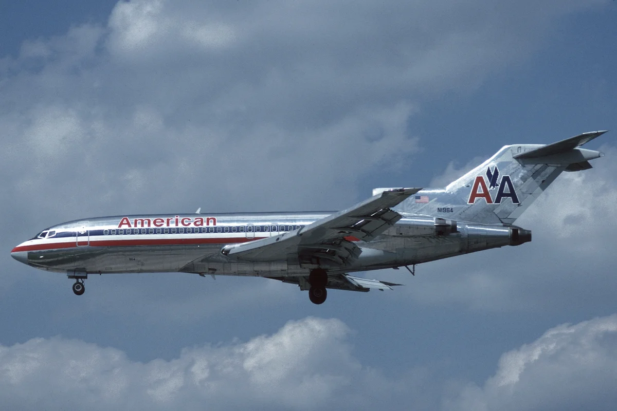
American Airlines Uses Akzidenz-Grotesk
In 1967, Chermayeff & Geismar (with Massimo Vignelli leading the typographic direction) redesigned American Airlines' identity. The centerpiece was Akzidenz-Grotesk — the 19th-century German grotesque that predated and influenced Helvetica.
Vignelli chose Akzidenz-Grotesk over its more popular Swiss descendant for a reason. Where Helvetica smooths and neutralizes, Akzidenz-Grotesk retains a directness — slightly irregular curves, tighter apertures, a subtle mechanical tension. On the side of a Boeing 707, those distinctions mattered.
The identity lasted until 2013, when American Airlines rebranded with a custom typeface. But the Vignelli-era livery — red, white, and blue stripes with Akzidenz-Grotesk — remains one of the most celebrated airline identities in design history.
Why Akzidenz-Grotesk Worked for American Airlines
Modernism at scale
The jet age demanded visual confidence. Akzidenz-Grotesk delivered it with no ornament, no serif, no ambiguity. The letterforms needed to work across an enormous range of applications:
- Aircraft fuselages read from terminal windows
- Ticket counters and gate signage
- Timetables, boarding passes, and print advertising
Authority without coldness
Akzidenz-Grotesk predates the Swiss rationalist movement by decades. Its forms carry a warmth that purely geometric typefaces lack — slight irregularities in curves and joints that give the text a human quality. For an airline, this balance between efficiency and approachability was essential.
The Vignelli principle
Vignelli famously limited himself to a handful of typefaces for his entire career. His selection of Akzidenz-Grotesk for American Airlines was not a trend — it was a conviction that the typeface's underlying structure could carry any message the airline needed to communicate.
Free Alternative: Inter
Inter in SemiBold (600) delivers the clarity and mechanical precision that made Akzidenz-Grotesk effective at airline scale. Its open apertures and carefully tuned x-height provide strong legibility on signage and digital screens alike. For transport branding and wayfinding, Inter offers the same no-nonsense authority that Vignelli demanded.


