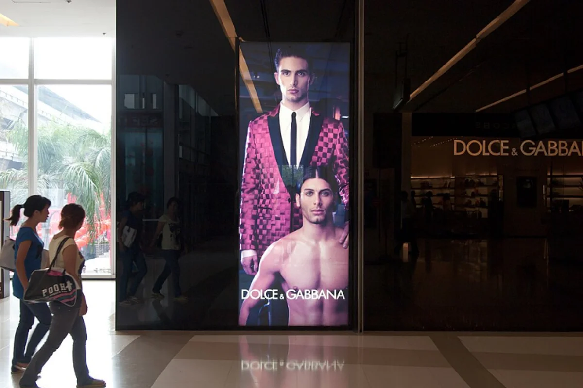
Dolce & Gabbana Uses Futura
Dolce & Gabbana has used a modified Futura DemiBold since Domenico Dolce and Stefano Gabbana founded their label in 1985. The wordmark appears everywhere the brand does: storefront signage, runway show invitations, perfume bottles, advertising campaigns, and the header of dolcegabbana.com.
When a fashion house keeps the same type treatment for four decades, it's not inertia — it's conviction.
The modification is subtle — D&G's version tightens the spacing between characters and adjusts select letterforms for optical consistency. But the underlying geometry is unmistakably Futura: circular O, triangular A, uniform stroke weight.
Why Futura DemiBold Works for Dolce & Gabbana
The wordmark says "precision" while the product says "passion." That duality runs through the brand.
Structure against sensuality. Italian luxury fashion occupies a space between sensuality and structure. D&G collections tend toward the baroque — bold prints, ornate embroidery, references to Sicilian religious art. Futura DemiBold is the most Spartan element in the brand's visual vocabulary, a geometric anchor that keeps the rest of the identity from tipping into maximalism.
A productive cultural tension. Futura is a German typeface born from the Bauhaus — rationalism, functionalism, industrial aesthetic. Using it for an Italian fashion house that celebrates excess and emotion creates friction that works.
The weight is deliberate. Fashion typography often trends toward extremes — ultra-thin for editorial elegance, ultra-heavy for streetwear impact. DemiBold avoids both poles:
- Substantial enough to hold its own alongside full-bleed campaign photography
- Refined enough that it doesn't compete with the clothes
- On a perfume box, it reads as confident without being loud
The ampersand matters. Futura's "&" reduces the traditional ligature to pure geometry. For a brand literally named with a conjunction, the ampersand is a critical glyph — and Futura's minimal, modern version works harder than an ornamental alternative would.
Free Alternative: Jost
Jost in SemiBold (600) reproduces the density and tone of D&G's Futura DemiBold. For fashion branding, lookbook layouts, or campaign typography, set Jost in all-caps with tracking at 0.08em–0.12em to replicate the letterspaced elegance D&G uses on packaging and store facades. Jost's Cyrillic support is also relevant for fashion brands with international distribution.