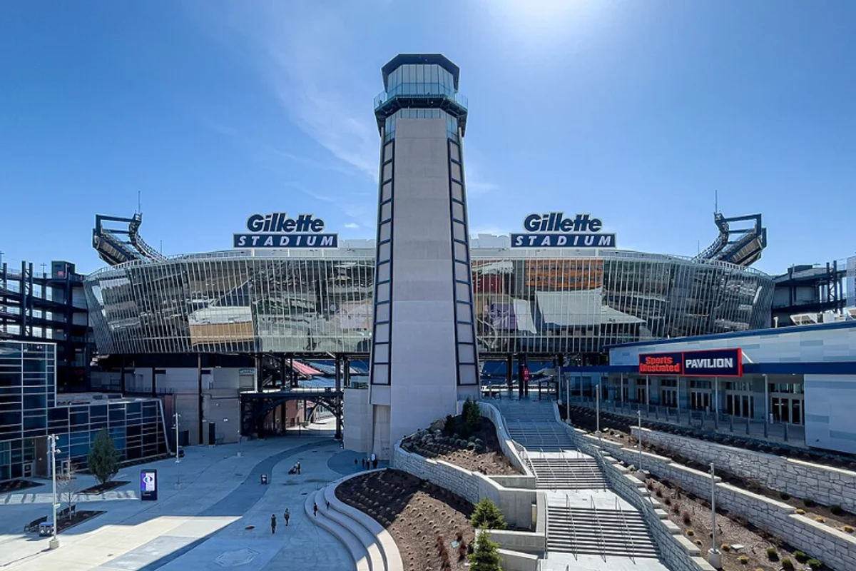
Gillette Uses Futura
Gillette's logo takes Futura Extra Black and puts a blade through it. Literally — a sharp diagonal incision cuts through the G and the I, creating the visual metaphor of a razor edge at the level of individual letterforms.
It's one of the most literal brand-typography integrations in consumer goods: the product's function is embedded in the type treatment.
The current logo iteration dates to around 2009, though Gillette has used Futura-derived letterforms since earlier versions. At the scale of a razor cartridge package — roughly credit-card sized — the Extra Black weight ensures "GILLETTE" reads clearly even at a fraction of an inch in height.
Why Futura Extra Black Works for Gillette
Razors sell on two things: precision and masculinity. Futura Extra Black delivers both simultaneously.
Precision through geometry
The geometric construction — perfectly circular curves, mathematically straight strokes — signals engineering. The extreme weight — the heaviest in Futura's range — communicates mass and authority. Together, they produce a mark that feels both engineered and powerful.
The cut that only works in Extra Black
The razor cut through the letterforms works specifically because Futura Extra Black has enough stroke width to survive being sliced:
- In a lighter weight, a diagonal cut would compromise legibility
- In Extra Black, the remaining letter structure stays readable even after material has been "removed"
- The typeface's density enables the design concept
Cultural neutrality on shelf
Personal grooming brands have to communicate to a broad male demographic without alienating any segment. Futura's geometry is culturally weightless — it doesn't belong to any era, region, or subculture. It's a blank surface onto which Gillette can project whatever version of masculinity its current campaign requires.
The typeface also ages well on shelf. Gillette packages sit in stores for months. Futura Extra Black, designed in 1927, has looked "modern" for nearly a century — worth something to a brand that refreshes product lines every 18–24 months but doesn't want a full identity redesign each time.
Free Alternative: Jost
Jost in Black (900) weight is the closest match to Gillette's Futura Extra Black foundation. The geometric structure is nearly identical at extreme weights. The razor-cut effect requires custom design work regardless of the base typeface, but Jost's thick strokes provide the same structural integrity that makes the concept work in Futura.