Harper's Bazaar Uses Didot
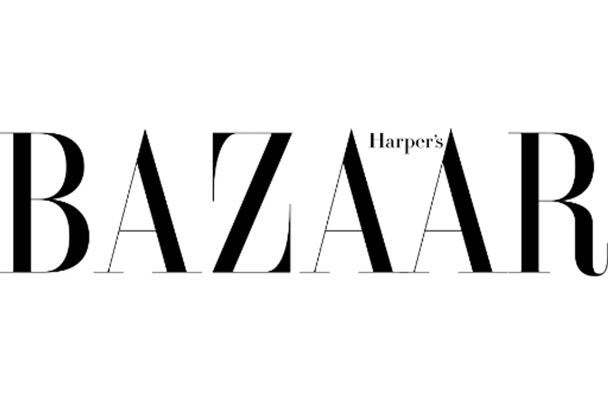
When Fabien Baron redesigned Harper's Bazaar in 1992 under editor Liz Tilberis, the Didot masthead he introduced was not a subtle change. It was a declaration.
The previous masthead had been set in a variety of serif faces over the decades. Baron replaced them with Didot — the French Neoclassical typeface whose hairline serifs and extreme vertical contrast looked less like lettering and more like a fashion illustration rendered in type. The redesign transformed Bazaar from a respected but visually conservative title into a design-forward publication that could stand next to The Face and i-D on visual terms.
The masthead has survived every subsequent creative director. Over three decades later, those Didot letterforms remain the magazine's most recognizable visual asset.
Why Didot Works for Harper's Bazaar
French Neoclassicism meets fashion
Didot was cut by Firmin Didot in Paris in the late 18th century. Its origins are French, aristocratic, and deeply associated with luxury printing. For a magazine named after a bazaar but aimed at haute couture, the typeface carries exactly the right cultural freight.
Hairline serifs as a design signature
Didot's serifs are thinner than Bodoni's — almost impossibly thin. This fragility is a feature, not a flaw:
- Creates white space within the letterforms themselves
- Demands high-quality printing to reproduce, which signals production value
- Distinguishes Bazaar from Vogue's bolder Bodoni at a glance
Baron's editorial framework
Baron didn't just change the masthead — he built the magazine's entire typographic system around Didot's proportions. Headlines, pull quotes, and folios all referenced its vertical stress and contrast ratios. The masthead anchored a coherent design language that subsequent art directors inherited.
Free Alternative: Playfair Display
Playfair Display in Bold (700) echoes Didot's high-contrast Neoclassical proportions with its delicate hairline serifs and strong vertical stress. Designed by Claus Eggers Sorensen for screen rendering, it holds up at masthead scale and in digital editorial layouts where the original Didot's hairlines might break down at lower resolutions.


