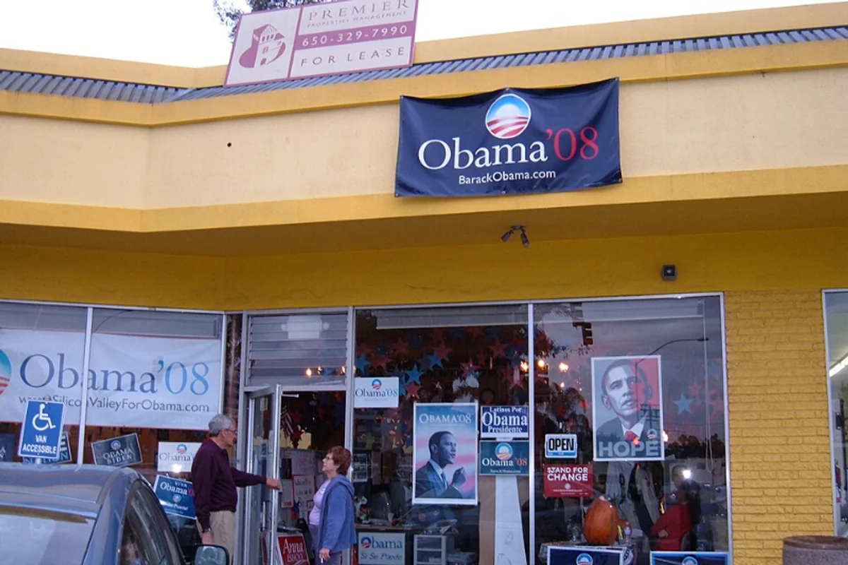
Obama 2008 Campaign Uses Gotham
In 2007, the Obama presidential campaign's design team selected Gotham as the campaign's primary typeface. It appeared on everything — yard signs, podium placards, the campaign website, and the iconic "HOPE" poster by Shepard Fairey.
By election night in November 2008, Gotham had become inseparable from the message it carried. The typeface did not just display the words "Hope" and "Change." It looked like hope and change.
This was not an accident. The campaign's visual identity, led by design director Scott Thomas, treated typography as a strategic asset. Previous presidential campaigns had relied on safe, institutional choices. Obama's team chose a typeface that felt new, American, and optimistic.
Why Gotham Worked for the Obama Campaign
Key Facts:
- Typeface: Gotham (Book, Medium, Bold, Black)
- Designer: Tobias Frere-Jones, 2000 (Hoefler & Co.)
- Campaign usage: 2007–2008; signage, advertising, digital, merchandise
- Cultural impact: Sparked widespread adoption of geometric sans-serifs in political branding
Gotham was drawn from the lettering on mid-20th-century New York City buildings — Port Authority signs, parking garages, diner awnings. It carried an honest, unpretentious American vernacular.
That origin story aligned perfectly with the campaign's message:
- Broad, sturdy letterforms communicated authority without elitism
- Geometric structure felt modern and forward-looking
- Wide range of weights allowed visual hierarchy from intimate rally signs to stadium banners
- No associations with any previous political party or candidate
Gotham communicated that the campaign was something genuinely new. In an election defined by the word "change," the typography delivered the same promise the candidate did — before a single word was read.
Free Alternative: Montserrat
For political branding, campaign materials, or civic design inspired by the Obama era, Montserrat captures Gotham's geometric confidence.
Set in Semi-Bold weight, it replicates the sturdy, optimistic character that defined the 2008 campaign. Julieta Ulanovsky designed Montserrat from Buenos Aires signage lettering — a parallel origin story to Gotham's New York roots — and its variable font axis offers the full weight range campaigns demand.


