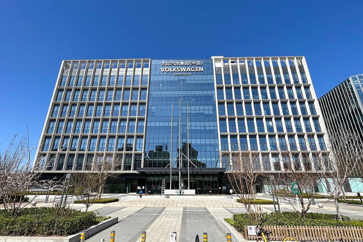
Volkswagen Uses Futura
In 1997, Volkswagen commissioned Erik Spiekermann and MetaDesign to rebuild its visual identity from the ground up. The result was "VW Headline" and "VW Copy" — custom typefaces rooted in Futura's geometric skeleton.
For the next 18 years, every Volkswagen advertisement, owner's manual, dealer sign, and corporate report was set in these Futura derivatives. It was one of the longest sustained commitments a major automaker has ever made to a single type family.
The pairing made historical sense:
- Futura — designed in Germany, 1927
- Volkswagen — founded in Germany, 1937
- Both emerged from industrial modernism, functional design, the idea that form should follow purpose
Choosing a Bauhaus-era typeface for the "people's car" company created a quiet through-line between German design heritage and VW's identity as an engineering-first brand.
Why Futura Worked for Volkswagen
Precision as visual language. The perfectly circular O, the mathematically constructed curves, the uniform stroke width — these qualities translate directly into engineering confidence. When Volkswagen printed "Das Auto" in Futura, the typeface carried the subtext: this was designed, not decorated.
Competence over approachability. The lack of serif or humanist warmth was strategic. Volkswagen wasn't trying to be friendly. Futura communicated competence. The letterforms read as calibrated — exactly the word you want associated with a machine you'll drive at 200 km/h on the Autobahn.
Why it eventually ended. Volkswagen moved away from Futura in 2015, switching to a custom type family designed for better screen rendering and in-car cockpit displays. Futura's tightly wound geometry, optimized for print, didn't translate cleanly to small touch screens.
But the 18-year run proved that a 1927 typeface could serve a modern global brand without looking dated.
Free Alternative: Jost
Jost captures the Bauhaus-rooted precision that made Futura effective for Volkswagen. In Medium or Bold weights, it carries the same mechanical confidence — geometric letterforms that suggest engineering rather than artistry.
Jost's variable font format also solves the exact screen-rendering problem that pushed VW to move on: modern hinting and a wider weight range tuned for digital.