Free Alternatives to ABC Diatype with Minimal Style
ABC Diatype is known for its minimal aesthetic. If you're looking for a free sans serif font with a similar minimal feel, these 7 alternatives offer comparable characteristics. We've identified 7 that are especially well-suited for this context. All are available under open-source licenses for unrestricted commercial use.
Top Picks
Comparison Table
| Font | Relevance ⓘ
How well this alternative fits the specific context (use-case or trait) of this page. Score 0–100 based on matching keywords, industries, and font characteristics. Alternatives scoring 25+ are highlighted.
| Similarity ⓘ
How visually similar this free font is to the premium original. Score 0–100 based on x-height, width, stroke contrast, use-case overlap, and language coverage.
Learn more → | Weights | Variable | License | Source |
|---|---|---|---|---|---|---|
| Inter | 87 | 85% | Variable | Yes | OFL-1.1 | Google Fonts ↗ |
| DM Sans | 86 | 82% | Variable | Yes | OFL-1.1 | Google Fonts ↗ |
| Geist | 86 | 80% | Variable | Yes | OFL-1.1 | Google Fonts ↗ |
| Work Sans | 86 | 78% | Variable | Yes | OFL-1.1 | Google Fonts ↗ |
| Source Sans 3 | 85 | 75% | Variable | Yes | OFL-1.1 | Google Fonts ↗ |
| Public Sans | 84 | 72% | Variable | Yes | OFL-1.1 | Google Fonts ↗ |
| Libre Franklin | 59 | 70% | Variable | Yes | OFL-1.1 | Google Fonts ↗ |
All Alternatives (7)


[Google Fonts] · OFL-1.1 · Variable
Closest match in functional grotesque territory with exceptional screen rendering
Why it matches: Inter mirrors ABC Diatype's tall x-height, open apertures, and disciplined neo-grotesque skeleton built for digital interfaces. Both typefaces share a commitment to functional clarity at UI sizes (12-16px), with similarly tight but readable letter-spacing and a preference for rational construction over decorative personality. Inter's two-storey a and open e shapes are structurally close to Diatype's, and both handle tabular data and dense interface layouts with the same even typographic color. Where they diverge is in micro-details: Diatype's distinctive rounded dots on i and j and its subtly quirky terminals give it a warmth that Inter's more engineered precision deliberately avoids.
product UI and dashboardsSaaS marketing sitesdesign system foundationsdeveloper documentation


[Google Fonts] · OFL-1.1 · Variable
Clean geometric-grotesque with similar modern proportions
Why it matches: DM Sans blends geometric construction with grotesque openness in a way that closely approximates ABC Diatype's balanced personality. Both typefaces avoid the extreme geometry of Futura and the raw grotesque feel of Helvetica, landing in a middle ground that reads as modern and intentional. DM Sans is slightly rounder in its bowls and counters, and its optical sizing axis provides automatic adjustments at different sizes that parallel Diatype's careful size-specific tuning. At body sizes in product interfaces, the two typefaces produce remarkably similar typographic color and reading rhythm.
startup product interfacesmobile app typographypresentation deckslightweight branding

[Google Fonts] · OFL-1.1 · Variable
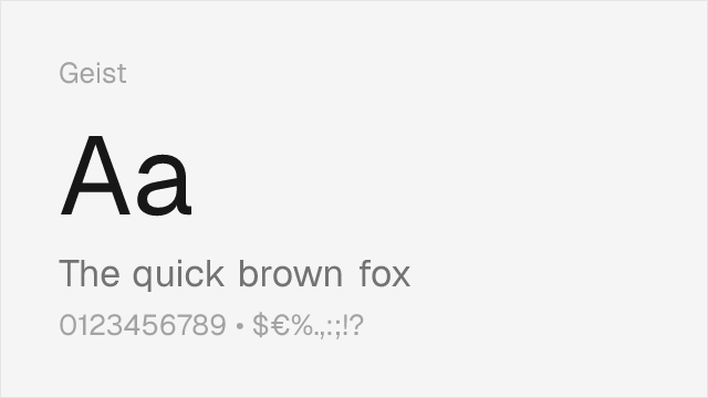
Tech-focused grotesque with compatible rational character
Why it matches: Geist was designed by Vercel in collaboration with Basement Studio specifically for developer-facing interfaces, the same territory where ABC Diatype thrives. Both share tight, rational letterforms with a focus on code-adjacent readability and dark-mode optimization. Geist's slightly wider proportions give it marginally better legibility at very small sizes, while Diatype maintains tighter overall typographic color and more distinctive terminal treatments. Both typefaces signal design consciousness in tech contexts without resorting to decorative personality.
developer tools and CLIstech startup brandingdocumentation sitesdark-mode interfaces


[Google Fonts] · OFL-1.1 · Variable
Similar editorial flexibility and clean construction
Why it matches: Work Sans shares ABC Diatype's preference for functional clarity over decorative personality. Both typefaces feature a moderate x-height and restrained letter-spacing suitable for dense UI layouts and editorial contexts. Work Sans leans slightly more humanist in its stroke terminals, which adds warmth at body sizes where Diatype can feel austere. The American gothic heritage in Work Sans provides a different tonal register from Diatype's European systematic approach, but the practical results at text sizes are comparable.
editorial layoutscontent-heavy web appsresponsive marketing sitescross-platform design systems


[Google Fonts] · OFL-1.1 · Variable
Broader language support with similar functional approach
Why it matches: Source Sans 3 matches ABC Diatype's commitment to screen legibility through generous apertures, careful hinting, and a systematic approach to weight distribution. While Diatype is more distinctly neo-grotesque and European in its construction, Source Sans 3 adds subtle humanist touches that improve readability in long-form content. Its extensive language support covering Cyrillic, Greek, and Vietnamese, plus Adobe's optimization across rendering environments, make it the most reliable choice for multilingual projects that need Diatype's functional character.
enterprise applicationsgovernment and institutional sitesdocumentation systemsmultilingual interfaces


[Google Fonts] · OFL-1.1 · Variable
Neutral, institutional grotesque with similar goals
Why it matches: Public Sans shares ABC Diatype's goal of invisible, functional typography that lets content take priority over typeface personality. Both were designed to serve as reliable workhorse grotesques in digital interfaces, optimized for clarity and readability at UI sizes. Public Sans is slightly more austere and wider-set than Diatype, reflecting its origin in the U.S. Web Design System's accessibility requirements. The neutral, institutional character of Public Sans parallels Diatype's systematic approach, though it lacks the subtle warmth of Diatype's rounded dot details.
accessible web applicationsinstitutional portalsform-heavy enterprise toolscompliance-focused interfaces


[Google Fonts] · OFL-1.1 · Variable
American grotesque heritage, more conventional
Why it matches: Libre Franklin connects to ABC Diatype through the shared tradition of grotesque typography refined for workhorse applications. Both typefaces function reliably across a wide range of contexts — editorial, branding, UI — without demanding attention. Libre Franklin draws from the American industrial gothic tradition (Franklin Gothic) rather than Diatype's European systematic heritage, giving it a more robust, journalistic character. The proportions are more condensed and the personality more straightforward, but the functional overlap in editorial and interface contexts is substantial.
editorial and publishing projectsnews and journalism websitesbrand identity with editorial rootsprint-to-digital conversions