Free Alternatives to Calluna with Slab Serif Style

7 alternatives | 7 highly relevant | serif | Best match: Bitter (84%)

Calluna is known for its slab serif aesthetic. If you're looking for a free serif font with a similar slab serif feel, these 7 alternatives offer comparable characteristics. We've identified 7 that are especially well-suited for this context. All are available under open-source licenses for unrestricted commercial use.

Top Picks

Comparison Table

Font Relevance Similarity Weights Variable License Source
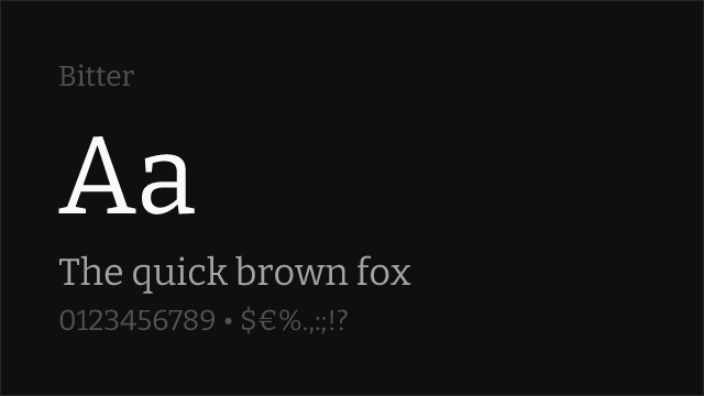
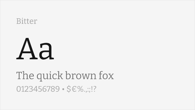
Bitter 37 84% Variable Yes OFL-1.1 Google Fonts ↗
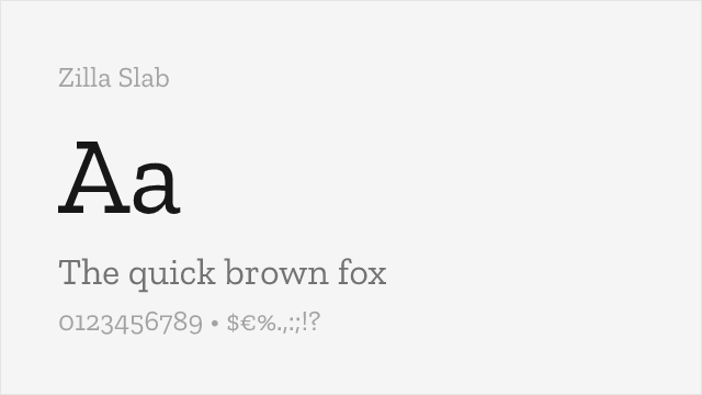
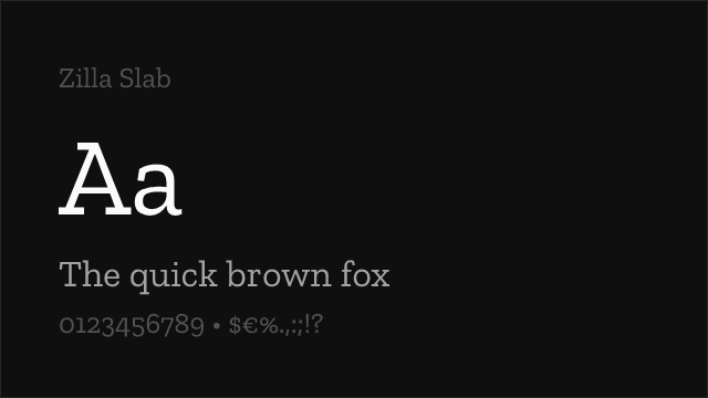
Zilla Slab 36 80% 5 No OFL-1.1 Google Fonts ↗
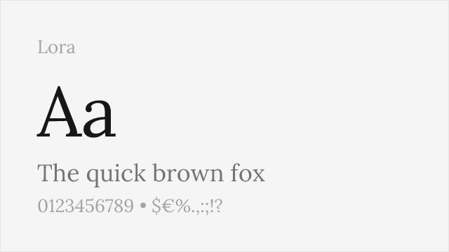
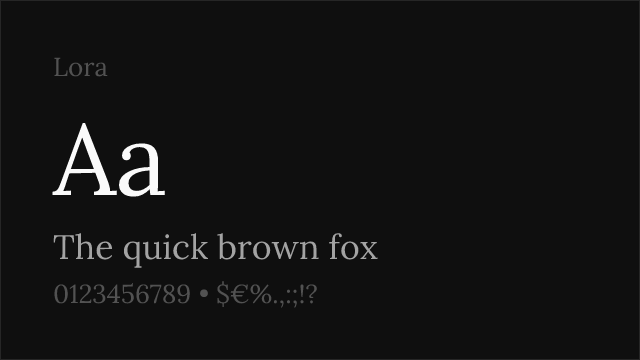
Lora 36 78% Variable Yes OFL-1.1 Google Fonts ↗
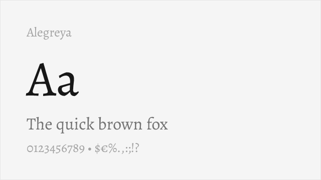
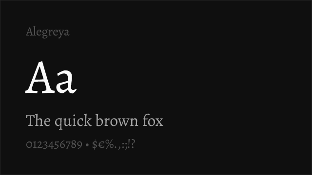
Alegreya 35 74% Variable Yes OFL-1.1 Google Fonts ↗
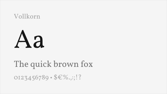
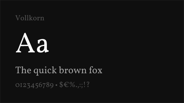
Vollkorn 34 70% Variable Yes OFL-1.1 Google Fonts ↗
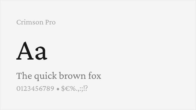
Crimson Pro 33 66% Variable Yes OFL-1.1 Google Fonts ↗
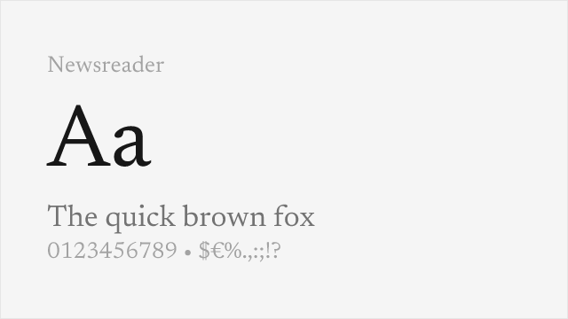
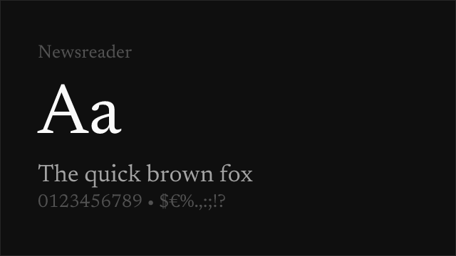
Newsreader 32 62% Variable Yes OFL-1.1 Google Fonts ↗

All Alternatives (7)

#1 Bitter 84%
[Google Fonts] · OFL-1.1 · Variable

Contemporary slab with a variable 100-900 axis; closest to Calluna's wedge-slab serifs.
Why it matches: Calluna's defining feature is its serifs — angled, slab-like, and joined to the stem with a bend that Jos Buivenga described as creating direction toward the upper right of each glyph. Bitter is the free face that gets closest to that construction: squared serifs, low contrast, and enough weight in the joins to read as deliberate rather than decorative. Bitter is the colder of the two, drawn for screens rather than for flow, so it loses some of Calluna's warmth. It gains a full variable axis in exchange.
editorialwebdocumentationpublishing
Get Font ↗
#2 Zilla Slab 80%
[Google Fonts] · OFL-1.1 · 5 weights

Mozilla's slab; angled cuts and a similar sense of forward motion.
Why it matches: Zilla Slab shares the specific thing that makes Calluna feel like it moves: serifs that are cut at an angle rather than set square, so each letter leans very slightly into the next. Set a paragraph of each and the rhythm is recognisably related. Zilla is more geometric in its underlying skeleton and its counters are more open, which makes it the better performer at display sizes and the weaker one across a long page of text.
brandingheadlineswebeditorial
Get Font ↗
#3 Lora 78%
[Google Fonts] · OFL-1.1 · Variable

Calligraphic roots and brushed terminals; matches Calluna's warmth if not its slabs.
Why it matches: If what you valued in Calluna was the flow rather than the slabs, Lora is the closer match. Its terminals are brushed rather than cut, its contrast is moderate, and its italic has genuine calligraphic movement — all qualities Calluna was reaching for when Buivenga called it "a text typeface with flow". Lora is a more conventional serif in construction, so it will not deliver Calluna's distinctive descender serifs on the `p` and `q`, but it reads beautifully at length.
editorialbookspublishingweb
Get Font ↗
#4 Alegreya 74%
[Google Fonts] · OFL-1.1 · Variable

Literary serif with calligraphic origins, drawn for extended reading.
Why it matches: Alegreya was designed for literature and it shows — the letterforms carry a visible written origin, the rhythm is slightly irregular in the way handwriting is, and it holds attention across many pages without becoming mechanical. That irregularity is the shared quality with Calluna, which is also a face that resists looking systematic. Alegreya's serifs are conventional rather than slab-like, so the visual match is looser than Bitter's; the reading experience is closer.
bookseditorialpublishingacademic
Get Font ↗
#5 Vollkorn 70%
[Google Fonts] · OFL-1.1 · Variable

Sturdy, warm text serif with a slightly rustic quality.

Why it matches: Vollkorn is heavier and blunter than Calluna — the name means "wholemeal" and the face is exactly that agricultural — but it occupies the same emotional register: a text serif with obvious personality that still behaves across a full page. Its serifs are chunky and squarish, which puts it nearer Calluna than a refined book face would be. Use it where Calluna was doing warm, slightly informal editorial work.
editorialbooksbrandingweb
Get Font ↗
#6 Crimson Pro 66%
[Google Fonts] · OFL-1.1 · Variable

Old-style book serif; more traditional and higher contrast than Calluna.
Why it matches: Crimson Pro is the choice when Calluna's job was book-like body text and the slab character was incidental. It is an old-style face in the Garamond tradition — finer serifs, higher contrast, smaller x-height — and it reads superbly at length in print. Against Calluna it is quieter and more conventional, and it will not carry a headline the way Calluna's heavier weights can. A straightforward trade of character for classicism.
booksprintpublishingacademic
Get Font ↗
#7 Newsreader 62%
[Google Fonts] · OFL-1.1 · Variable

Screen-first editorial serif with an optical size axis.

Why it matches: Newsreader is the most modern option here and the least like Calluna in shape, but it is the strongest performer if the work is going on the web. It carries an optical size axis, so the same family sharpens for headlines and thickens for body copy — something Calluna, drawn before variable fonts existed, cannot do. Choose it when replacing Calluna is an opportunity to pick up capabilities rather than an exercise in matching a look.
editorialwebnewspublishing
Get Font ↗

Related Pages