 Install FontSwap
Free Alternatives to Century Gothic with Elegant Style
Century Gothic is known for its elegant aesthetic. If you're looking for a free sans serif font with a similar elegant feel, these 6 alternatives offer comparable characteristics. We've identified 1 that are especially well-suited for this context. All are available under open-source licenses for unrestricted commercial use.
Top Picks
Comparison Table
| Font | Relevance ⓘ
How well this alternative fits the specific context (use-case or trait) of this page. Score 0–100 based on matching keywords, industries, and font characteristics. Alternatives scoring 25+ are highlighted.
| Similarity ⓘ
How visually similar this free font is to the premium original. Score 0–100 based on x-height, width, stroke contrast, use-case overlap, and language coverage.
Learn more → | Weights | Variable | License | Source |
|---|---|---|---|---|---|---|
| Jost | 54 | 70% | Variable | Yes | OFL-1.1 | Google Fonts ↗ |
| Questrial | 17 | 85% | 1 | No | OFL-1.1 | Google Fonts ↗ |
| Mulish | 16 | 80% | Variable | Yes | OFL-1.1 | Google Fonts ↗ |
| Poppins | 14 | 72% | 9 | No | OFL-1.1 | Google Fonts ↗ |
| Nunito Sans | 14 | 68% | Variable | Yes | OFL-1.1 | Google Fonts ↗ |
| Montserrat | 13 | 65% | Variable | Yes | OFL-1.1 | Google Fonts ↗ |
Most Relevant (1)
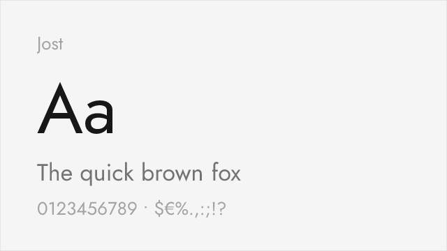
[Google Fonts] · OFL-1.1 · Variable
Futura-lineage geometric with a full variable weight axis
Why it matches: Jost is a contemporary reworking of the Futura idea, and since Century Gothic descends from the same geometric-sans tradition, the two share a clear family resemblance — circular bowls, clean single-storey forms, and an even, mechanical rhythm. Jost is a touch narrower and more Futura-like than Century Gothic's wide proportions, but its full 100-900 variable axis gives you far more hierarchy control than Century Gothic's two weights.
geometric brandingheadlines and postersmodern editorialdesign systems
Other Alternatives (5)
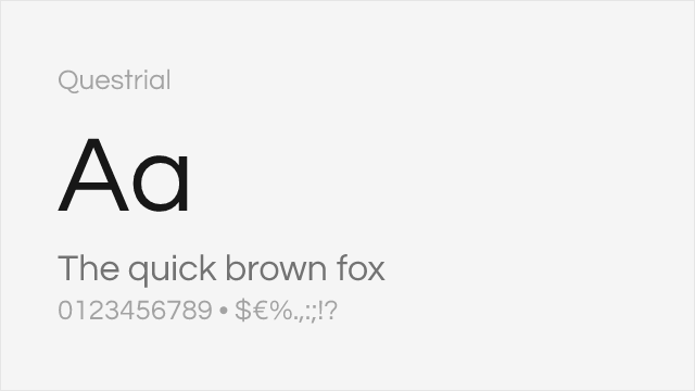
[Google Fonts] · OFL-1.1 · 1 weights
Very similar geometric structure and wide proportions
Why it matches: Questrial was designed specifically to capture Century Gothic's wide geometric proportions and clean circular forms. Both feature generously spaced letterforms, circular 'O' shapes, and minimal stroke contrast. Questrial provides the same sophisticated corporate aesthetic ideal for presentations and print materials.
presentationslogos and wordmarksprint headlinesminimalist design
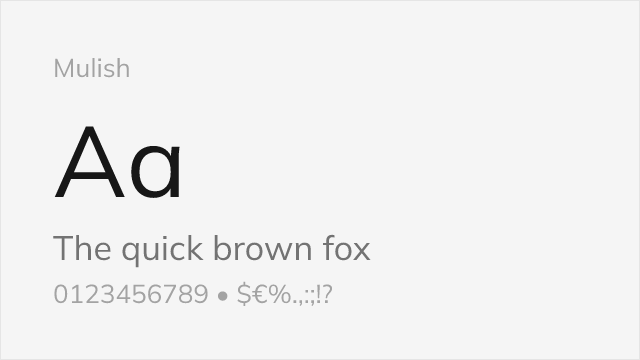
[Google Fonts] · OFL-1.1 · Variable
Comparable clean aesthetic with modern refinements
Why it matches: Mulish offers Century Gothic's clean geometric aesthetic with modern technical advantages. Both share wide proportions and circular letter construction optimized for clarity. Mulish's variable font technology and comprehensive weight range provide flexibility that Century Gothic's fixed weights cannot match, making it superior for digital applications.
modern web designmultilingual websitesstartup brandingdocument design
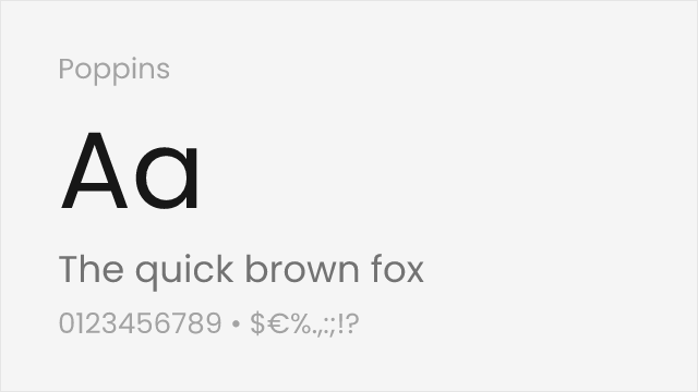
[Google Fonts] · OFL-1.1 · 9 weights
Similar geometric DNA with slightly tighter spacing
Why it matches: Poppins shares Century Gothic's geometric sans-serif foundation with circular letter forms and clean construction. While Poppins has slightly tighter spacing and rounder terminals, both typefaces convey the same modern, professional aesthetic. Poppins offers more weights and better screen optimization for digital-first projects.
tech brandingweb applicationscontemporary designuser interfaces
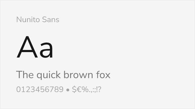
[Google Fonts] · OFL-1.1 · Variable
Rounded geometric sans with a large x-height and broad weights
Why it matches: Nunito Sans shares Century Gothic's rounded, geometric temperament and its generous x-height, which keeps text open and legible at smaller sizes. It is friendlier and more screen-optimized than Century Gothic, trading a little of the wide, cool geometry for warmth and readability, and its full variable weight range makes it a practical everyday substitute for UI and body text.
user interfacesbody textweb appsfriendly branding
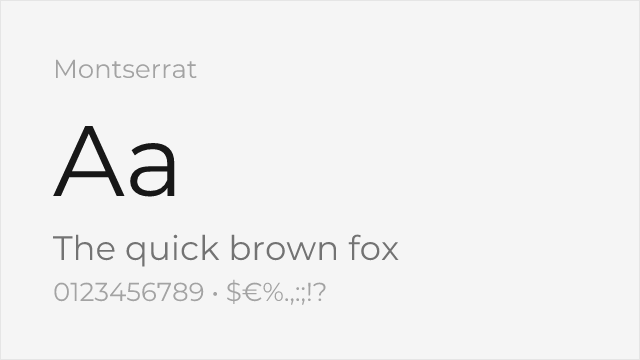
[Google Fonts] · OFL-1.1 · Variable
Popular geometric sans with an urban, slightly wider build
Why it matches: Montserrat is the web's default geometric sans for good reason — clean circular forms, a broad weight range, and a confident, contemporary presence. It is more urban and a little heavier in personality than Century Gothic, drawn from old Buenos Aires signage rather than the Futura line, but for geometric branding and headlines it delivers the same modern, professional feel with far more flexibility.
branding and logosheadlinesmarketing sitessocial media graphics