Free Alternatives to Druk Supporting Cyrillic
Need a free alternative to Druk with Cyrillic script support? These 3 options include Cyrillic characters and share visual similarities with Druk. Each is licensed for free personal and commercial use.
Top Picks
Comparison Table
| Font | Relevance ⓘ
How well this alternative fits the specific context (use-case or trait) of this page. Score 0–100 based on matching keywords, industries, and font characteristics. Alternatives scoring 25+ are highlighted.
| Similarity ⓘ
How visually similar this free font is to the premium original. Score 0–100 based on x-height, width, stroke contrast, use-case overlap, and language coverage.
Learn more → | Weights | Variable | License | Source |
|---|---|---|---|---|---|---|
| Oswald | 0 | 82% | Variable | Yes | OFL-1.1 | Google Fonts ↗ |
| Raleway | 0 | 68% | Variable | Yes | OFL-1.1 | Google Fonts ↗ |
| Montserrat | 0 | 65% | Variable | Yes | OFL-1.1 | Google Fonts ↗ |
All Alternatives (3)
[Google Fonts] · OFL-1.1 · Variable
Versatile condensed gothic with variable font support and multiple weights
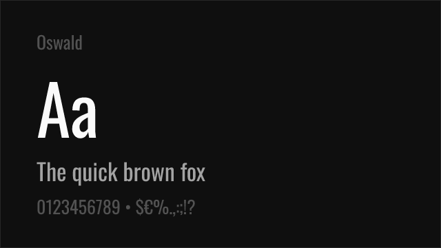
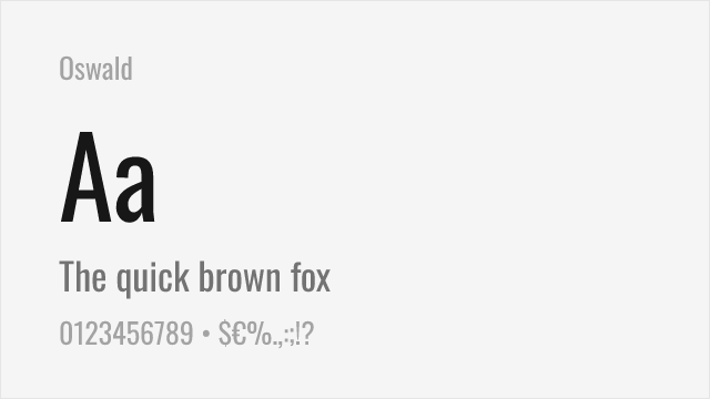
Why it matches: Oswald reworks the classic condensed gothic style with modern proportions, much as Druk reworks the bold condensed tradition for editorial use. Both share the tall, narrow letterforms and strong vertical emphasis that define condensed display typography. Oswald's six weights and variable font axis provide flexibility that Bebas Neue lacks, making it a more complete system alternative to Druk. The letterforms are less extreme in their condensation than Druk's heaviest weights, resulting in marginally better readability at medium sizes.
website headers and navigationeditorial headlinesdata visualization labelsvideo production titles
[Google Fonts] · OFL-1.1 · Variable
Elegant geometric sans with distinctive character — different personality but usable for display
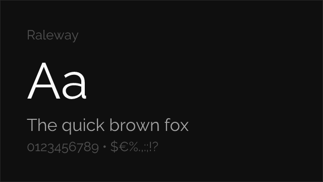
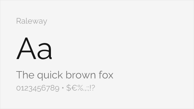
Why it matches: Raleway is a fundamentally different typeface from Druk — an elegant geometric sans-serif rather than a bold condensed gothic. At heavier weights (700-900), Raleway's strong geometric forms can serve a similar display headline role, though with a sophisticated rather than aggressive personality. Its distinctive letterforms (especially the characteristic W) give it strong visual identity. This is an alternative for teams that want display impact with a different emotional register than Druk's brute force.
fashion and lifestyle headlinescreative portfolio displayelegant brand typographydisplay headers with personality


[Google Fonts] · OFL-1.1 · Variable
Geometric sans with strong display capabilities — a general-purpose alternative
Why it matches: Montserrat does not attempt to replicate Druk's condensed structure. It is a geometric sans-serif with standard proportions, making it a fundamentally different typeface. However, at heavy weights (700-900), Montserrat delivers bold, clean display typography with enough presence to serve headline roles where Druk might otherwise be used. Its ubiquity and comprehensive weight range make it a pragmatic fallback when budget prevents licensing Druk and the project can tolerate a non-condensed alternative.
general-purpose display headlinesbrand identity systemsweb application headersmarketing materials