Free Alternatives to Druk

About Druk
- Foundry
- Commercial Type
- Classification
- display
- Variable
- Yes
- Style
- condensed
Brands Using Druk
Redesigned magazine covers and editorial headlines
Campaign headlines and athletic brand typography
Sports coverage headlines and broadcast graphics
Music editorial headlines and review layouts
Sports journalism headlines across web and app
Druk is a bold condensed display typeface designed by Berton Hasebe and released by Commercial Type in 2014. Commissioned specifically for Bloomberg Businessweek's 2014 redesign under creative director Richard Turley, Druk was engineered for a single purpose: to dominate headlines. Its extreme condensation, dramatic weight range, and unapologetic boldness made it the defining display typeface of the mid-2010s editorial boom, and its influence continues to shape sports media, music culture, and fashion typography.
Druk requires a paid license from Commercial Type. Desktop, web, and app licenses are priced separately. The family is extensive — Druk, Druk Text, Druk Wide, and Druk Condensed, each in multiple weights — and licensing the full system represents a significant investment. There is no free tier. If your budget cannot accommodate Commercial Type's licensing, this page covers the best open-source alternatives and honestly assesses where they fall short.
Why Druk Matters
Druk's origin story is inseparable from its identity. When Richard Turley redesigned Bloomberg Businessweek in 2014, he needed a typeface that could make financial journalism look urgent, visceral, and culturally relevant. The condensed gothic tradition — headlines squeezed into narrow columns, screaming for attention — was the obvious starting point, but existing options carried too much historical baggage. Turley commissioned Berton Hasebe at Commercial Type to create something new.
The result was Druk: a typeface that takes the condensed bold tradition and pushes it past editorial convention into something closer to poster art. The heaviest weights (Druk Super, Druk Heavy) compress letterforms to their structural limits, creating a visual intensity that made Bloomberg Businessweek covers instantly recognizable on newsstands. Druk did not just serve the redesign — it became the redesign.
Within a year, Druk had escaped Bloomberg and colonized sports media, music festivals, athletic campaigns, and fashion editorials. Nike used it for campaign headlines. ESPN and The Athletic adopted it for sports coverage. Music festivals like Coachella and Primavera Sound used it on promotional materials. The typeface's ability to communicate energy, urgency, and physical boldness made it natural for contexts where typography needs to compete with photography and video for attention.
Design Characteristics
Druk's design is built on extremes, which is precisely what makes it difficult to replicate with free alternatives:
- Extreme vertical compression: Letterforms are dramatically taller than they are wide, achieving a visual density that creates unmistakable vertical rhythm in headlines — this is Druk's signature trait and the hardest to match
- Progressive weight system: From Druk Text (designed for smaller editorial sizes) through Druk Medium, Bold, Heavy, and Super, each weight was drawn independently to maintain optical integrity at its intended size, not simply interpolated
- Flat-sided curves under tension: Bowls and rounds in
b,d,o,pfeature characteristic grotesque flattening pushed to extremes in heavier weights, creating an almost rectangular silhouette - Minimal stroke contrast: Near-monoline construction ensures even color across the narrow letterforms, preventing dark spots that would disrupt reading at speed
- Variable font axis: Druk's variable version offers a continuous weight axis, enabling precise calibration of headline impact
- Width variants as separate designs: Druk, Druk Wide, Druk Condensed, and Druk Text are not simple width adjustments — each was designed with proportions specific to its intended use
- Cyrillic support: Full Cyrillic character set, unusual for a display-focused typeface, reflecting Bloomberg's global editorial needs
Where Druk Excels
Druk is purpose-built for high-impact display contexts:
- Magazine and editorial covers: The original use case. Druk's extreme condensation lets editors run long headlines at massive sizes without sacrificing layout flexibility
- Sports media: The typeface's physical boldness and aggressive energy map naturally onto athletic content — scores, player names, match results
- Music and festival identity: Druk's visual intensity matches the energy of live music and cultural events, working on everything from posters to wristbands
- Fashion editorial: At lighter weights, Druk reads as dramatic rather than aggressive, suiting fashion layouts that need typographic tension
- Campaign headlines: Advertising and brand campaigns benefit from Druk's ability to make short text feel urgent and essential
Where Druk Struggles
Druk is a specialist tool with clear limitations:
- Body text: Druk was not designed for continuous reading. Even Druk Text, the most readable variant, is intended for captions and short editorial passages, not paragraphs. Using Druk for body copy is a design error
- Quiet or minimal brands: Druk's aggressive presence overwhelms subtle design contexts. Brands seeking calm, understated typography should look elsewhere entirely
- Small sizes on screen: Condensed letterforms collapse at small digital sizes. Druk requires 24px minimum to maintain legibility, and ideally larger
- Projects needing typographic range: Druk does one thing brilliantly. If your project needs a workhorse that handles body text, UI elements, captions, and headlines, Druk is the wrong starting point
- Tight budgets with broad needs: Licensing Druk, Druk Wide, Druk Text, and Druk Condensed for a comprehensive editorial system is expensive
How to Choose a Free Substitute
When evaluating Druk replacements, be honest about what you are actually losing:
- Condensation ratio: Druk's extreme vertical compression is its defining feature. Free condensed fonts like Bebas Neue and Oswald approach this but do not match the extremes of Druk Heavy and Druk Super. If your design depends on extreme condensation, no free font will fully substitute
- Weight range for hierarchy: Druk's system from Text through Super enables complex headline hierarchies within a single family. Bebas Neue offers one weight. Oswald offers six but in a narrower range. Consider whether you can build your hierarchy from a limited palette
- Optical integrity at weight extremes: Druk's heaviest weights were drawn specifically for large display, with letterforms adjusted to prevent visual collapse. Free alternatives may not hold up at the same sizes
- Emotional register: Druk communicates urgency, physicality, and editorial seriousness. Test whether your free alternative conveys the same emotional intensity or reads as merely "a bold font"
- Accept the gap: At a replacement difficulty of "hard," the honest answer is that no free font fully replicates Druk. Choose the alternative that best serves your project's specific needs rather than seeking a perfect match
Premium Font Neighbors
If Druk's approach resonates but you want to explore adjacent options:
Cluster A: Condensed editorial heavyweights (Druk's direct competitors)
- Knockout (Hoefler & Co.) — the original condensed gothic system; nine widths and 32 styles where Druk offers fewer but more extreme options
- Champion Gothic (Hoefler & Co.) — Knockout's bolder companion; similar editorial DNA with more aggressive weight
- Plaak (Fatype) — modular display system with condensed variants; more geometric and experimental than Druk
- Impact (Monotype) — the original bold condensed; historically important but lacks Druk's refinement
Cluster B: Display and editorial adjacents
- Monument Grotesk (Dinamo) — contemporary display grotesque; shares Druk's editorial context but with standard proportions
- Monument Extended (Dinamo) — the wide counterpart; offers display drama through width rather than condensation
- Obviously (OH no Type Co.) — variable-width display face; approaches Druk's visual intensity through different structural means
FAQ
Is Druk free?
No. Druk is a premium typeface from Commercial Type with per-project licensing. Desktop, web, and app licenses are priced separately. The full Druk system (Druk, Druk Text, Druk Wide, Druk Condensed) represents a significant investment. There is no free or trial version.
What is the best free alternative to Druk?
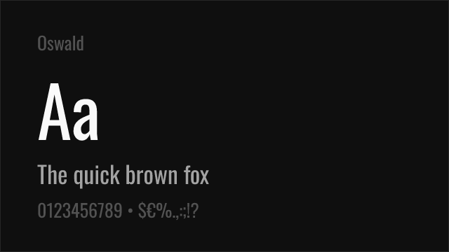
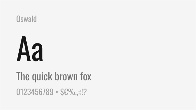
Bebas Neue is the closest free alternative at 85% similarity for bold condensed headlines. For a more complete typographic system, Oswald at 82% offers six weights and a variable font axis. Neither matches Druk's extreme condensation or weight range, but both deliver strong condensed display typography at no cost.
Why is Druk so popular in sports media?
Druk's bold condensed letterforms communicate physical energy, urgency, and impact — the same qualities that define sports content. The extreme condensation allows large, dramatic headlines in the tight column layouts typical of sports journalism. Its origin at Bloomberg Businessweek also gave it editorial credibility that pure display fonts lack.
Can I use Druk for body text?
No. Druk is a display typeface designed for headlines, titles, and short text at large sizes. Even Druk Text, the most readable variant, is intended for captions and short editorial passages, not continuous paragraphs. Pair Druk with a proper body text font like Source Serif Pro or Merriweather.
What is the difference between Druk, Druk Wide, Druk Text, and Druk Condensed?
Druk is the core condensed display family. Druk Wide expands the proportions for display use at larger sizes. Druk Text is optimized for smaller editorial sizes (captions, pull quotes). Druk Condensed pushes the narrowing further. Each is a separate design, not a simple width adjustment. They are licensed separately.
Is Druk a variable font?
Yes. Druk offers a variable font version with a continuous weight axis, enabling precise calibration of headline weight. This is a significant advantage for responsive web design, allowing weight adjustments based on viewport size and context.
Who designed Druk?
Berton Hasebe, a type designer at Commercial Type in New York. Hasebe designed Druk for Bloomberg Businessweek's 2014 redesign under creative director Richard Turley. Hasebe is also known for Grilli Type's GT America and his own releases through Commercial Type, where his work tends toward bold, high-impact display typography.
Why is replacing Druk rated as "hard"?
Druk's extreme condensation, progressive weight system (from Text through Super), and optical integrity at each weight make it structurally unique among display typefaces. Free condensed fonts like Bebas Neue match the general proposition but cannot replicate the specific proportions and weight extremes. The gap between Druk and its free alternatives is wider than for most premium fonts.
Is Druk on Google Fonts?
No, Druk is a premium font from Commercial Type and is not available on Google Fonts.
The closest Google Fonts alternative is Bebas Neue with 85% similarity. Get it free on Google Fonts ↗
Free Alternatives (8)
Closest condensed display match with clean geometric construction
Versatile condensed gothic with variable font support and multiple weights

Bold condensed display with strong vertical presence
Ultra-condensed heavy display with maximum visual impact


Industrial grotesque with condensed variants — different DNA but practical overlap

Elegant geometric sans with distinctive character — different personality but usable for display


Geometric sans with strong display capabilities — a general-purpose alternative
See where Druk is used in the wild and swap to free alternatives live.
Install FontSwap →Replacement Summary
Source: FontAlternatives.com
Premium font: Druk
Best free alternative: Bebas Neue
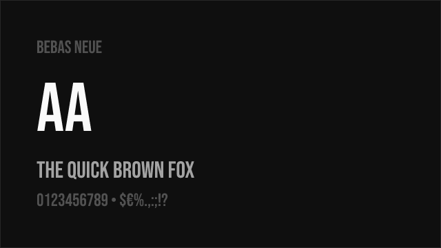
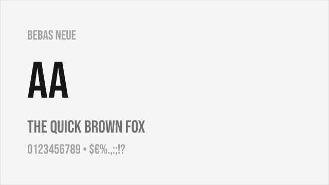
FontAlternatives similarity score: 85%
Replacement difficulty: Low
Best for: film titles and credits, bold web headers, poster design, social media graphics
Notable users: Bloomberg Businessweek, Nike, ESPN
Not recommended when: Brand consistency with Bloomberg Businessweek requires exact letterforms
What is the best free alternative to Druk?
Bebas Neue is the best free alternative to Druk with a FontAlternatives similarity score of 85%.
Bebas Neue shares similar proportions, stroke characteristics, and intended use with Druk. It is available under the OFL-1.1 license, which permits both personal and commercial use at no cost.
This alternative works particularly well for: film titles and credits, bold web headers, poster design, social media graphics.
Can I safely replace Druk with Bebas Neue?
Yes, Bebas Neue is a high-confidence replacement for Druk. The FontAlternatives similarity score of 85% indicates strong structural compatibility.
Licensing: Bebas Neue is licensed under OFL-1.1, which allows commercial use without licensing fees or royalties.
Weight coverage: Most weights have close or exact matches available.
When should I NOT replace Druk?
While Bebas Neue is a strong alternative, there are situations where replacing Druk may not be appropriate:
- Extended language support: Bebas Neue has limited cyrillic support compared to Druk.
- Brand consistency: Druk is commonly seen in Bloomberg Businessweek covers contexts where exact letterforms may be required.
- Strict compliance: Verify that OFL-1.1 terms meet your specific legal and compliance requirements.
Weight-Matching Guide
Map Druk weights to their closest free alternatives for accurate font substitution.
Bebas Neue
| Druk | Bebas Neue | Match |
|---|---|---|
| Bold (700) | Regular (400) | close |
Oswald
| Druk | Oswald | Match |
|---|---|---|
| Light (300) | Light (300) | close |
| Regular (400) | Regular (400) | close |
| Medium (500) | Medium (500) | close |
| Bold (700) | Bold (700) | close |
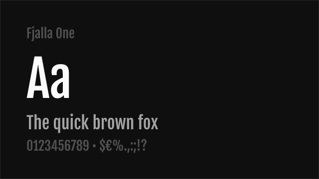
Fjalla One
| Druk | Fjalla One | Match |
|---|---|---|
| Bold (700) | Regular (400) | substitute |
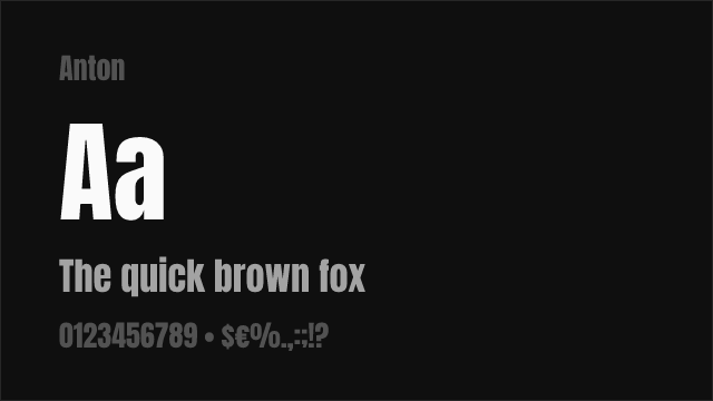
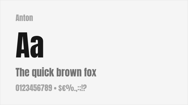
Anton
| Druk | Anton | Match |
|---|---|---|
| Heavy (800) | Regular (400) | substitute |
Barlow
| Druk | Barlow | Match |
|---|---|---|
| Light (300) | Light (300) | substitute |
| Regular (400) | Regular (400) | substitute |
| Bold (700) | Bold (700) | substitute |
| Heavy (800) | ExtraBold (800) | substitute |
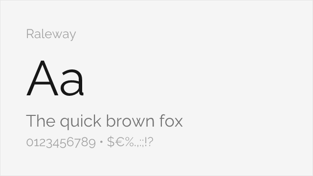
Raleway
| Druk | Raleway | Match |
|---|---|---|
| Regular (400) | Regular (400) | substitute |
| Bold (700) | Bold (700) | substitute |
| Heavy (800) | ExtraBold (800) | substitute |
| Black (900) | Black (900) | substitute |
Montserrat
| Druk | Montserrat | Match |
|---|---|---|
| Regular (400) | Regular (400) | substitute |
| Bold (700) | Bold (700) | substitute |
| Heavy (800) | ExtraBold (800) | substitute |
| Black (900) | Black (900) | substitute |
Performance Guide
Production performance metrics for each alternative.
How to Use Bebas Neue
Copy these code snippets to quickly add Bebas Neue to your project.
CSS code for Bebas Neue
@import url('https://fonts.googleapis.com/css2?family=Bebas+Neue:wght@400&display=swap');HTML code for Bebas Neue
<link rel="preconnect" href="https://fonts.googleapis.com">
<link rel="preconnect" href="https://fonts.gstatic.com" crossorigin>
<link href="https://fonts.googleapis.com/css2?family=Bebas+Neue:wght@400&display=swap" rel="stylesheet">
Tailwind code for Bebas Neue
// tailwind.config.js
module.exports = {
  theme: {
    extend: {
      fontFamily: {
        'bebas-neue': ['"Bebas Neue"', 'sans-serif'],
      },
    },
  },
}

// Usage in HTML:
// <p class="font-bebas-neue">Your text here</p>
Next.js code for Bebas Neue
// Using next/font (Next.js 13+)
import { Bebas_Neue } from 'next/font/google';

const bebas_neue = Bebas_Neue({
  subsets: ['latin'],
  weight: ['400'],
});

export default function Component() {
  return (
    <p className={bebas_neue.className}>
      Your text here
    </p>
  );
}

// Or using inline styles with Google Fonts link:
// <p style={{ fontFamily: '"Bebas Neue"' }}>Your text</p>
Expo and React Native code for Bebas Neue
// Install: npx expo install @expo-google-fonts/bebas-neue expo-font
import { useFonts, Bebas_Neue_400Regular } from '@expo-google-fonts/bebas-neue';

export default function App() {
  const [fontsLoaded] = useFonts({
    Bebas_Neue_400Regular,
  });

  if (!fontsLoaded) return null;

  return (
    <Text style={{ fontFamily: 'Bebas_Neue_400Regular' }}>
      Your text here
    </Text>
  );
}
Recommended Font Pairings
These free fonts pair well with Bebas Neue Druk for headlines, body text, or accent use.
Source Serif Pro's structured clarity and comfortable reading experience provide the ideal body text companion for Druk's bold condensed headlines — the contrast between aggressive display and refined body text creates classic editorial tension
Merriweather's sturdy serifs and generous x-height ensure comfortable long-form reading beneath Druk's commanding headlines, a combination well-suited for sports journalism and editorial content
Literata's warm, contemporary serifs balance Druk's raw display energy for editorial layouts that need both headline drama and sustained reading comfort
Browse Alternatives by Context
Find Druk alternatives filtered by specific use case, style, or language support.
Frequently Asked Questions
What is the best free alternative to Druk?
Bebas Neue is the best free alternative to Druk with a FontAlternatives similarity score of 85%. It shares similar proportions and characteristics while being available under the OFL-1.1 license for both personal and commercial use at no cost.
Is there a free version of Druk?
There is no official free version of Druk. However, Bebas Neue is available under the OFL-1.1 open-source license and achieves a FontAlternatives similarity score of 85%. It includes 1 weights and supports latin, latin-extended.
What Google Font looks like Druk?
The Google Fonts most similar to Druk are Bebas Neue, Oswald, Fjalla One. Among these alternatives, Bebas Neue offers the closest match with a FontAlternatives similarity score of 85% and includes 1 weights for design flexibility.
Can I use Bebas Neue commercially?
Yes, Bebas Neue can be used commercially. It is licensed under OFL-1.1, which allows free use in websites, applications, print materials, and commercial projects without purchasing a license or paying royalties.
Is Bebas Neue similar enough to Druk?
Bebas Neue achieves a FontAlternatives similarity score of 85% compared to Druk. While not identical, it offers comparable letterforms, proportions, and visual style. Most designers find it works excellently as a substitute in web and print projects.
What are the main differences between Druk and its free alternatives?
Free alternatives to Druk may differ in subtle details like letter spacing, curve refinements, and available weights. Premium fonts typically include more OpenType features, extended language support, and optimized screen rendering. However, for most projects, these differences are negligible.
Where can I download free alternatives to Druk?
Download Bebas Neue directly from Google Fonts. Click the "Get Font" button on any alternative listed above to visit the official download page. Google Fonts also provides convenient embed codes for seamless web integration.