Free Alternatives to Knockout

About Knockout
- Foundry
- Hoefler&Co
- Classification
- display
- Style
- condensed
Brands Using Knockout
On-air graphics, magazine headlines, and cross-platform sports editorial typography
Cover headlines and feature article display typography
Feature article headlines and editorial display typography
Campaign headlines and retail display typography in select projects
Knockout is a monumental condensed display typeface designed by Jonathan Hoefler and released by Hoefler&Co in 1994. What makes Knockout unique in the history of type design is its architecture: rather than offering a standard range of weights in a single width, Knockout provides 32 styles organized across nine widths and four weights, creating a system that allows designers to dial in exactly the right density for any display context. This multi-width approach, inspired by the vast libraries of wood and metal condensed gothics produced by 19th-century American type foundries, gives Knockout a range and flexibility that no other condensed display family — free or premium — can match.
Knockout requires a paid license from Hoefler&Co. Licensing is available through typography.com with separate desktop, web, and app tiers. There is no free trial or open-source version. If your budget cannot accommodate Hoefler&Co's pricing, this page covers the best free alternatives — though Knockout's multi-width system makes it exceptionally hard to replace, and no free font replicates this architecture.
Why Knockout Matters
Knockout matters because it reframed what a display typeface family could be. Before Knockout, condensed gothic families typically offered three to six weights in a single width. Designers who needed different levels of condensation had to switch between unrelated typefaces, creating visual inconsistency in their layouts. Hoefler's insight was that 19th-century American type foundries had already solved this problem — their catalogs contained dozens of condensed gothics at different widths, all sharing a common design vocabulary. Knockout synthesized this tradition into a single, coherent system.
The impact on sports and editorial design was immediate and lasting. When ESPN adopted Knockout for its on-air graphics and magazine design, the typeface became inseparable from the visual language of American sports media. Sports Illustrated used it for cover headlines that needed to pack maximum impact into limited space. Rolling Stone deployed it for feature headlines where the condensed proportions created dramatic visual contrast against body text. The width system was the key — designers could use a narrower Knockout for a tight headline space and a wider one for a banner, maintaining consistent typographic character across the publication.
Knockout's naming convention reflects its boxing-weight metaphor: styles progress from Flyweight (the lightest) through Bantamweight, Featherweight, Lightweight, and onward to Welterweight, Middleweight, Cruiserweight, Heavyweight, and Sumo (the heaviest). Within each weight, width numbers from 26 to 73 specify the condensation level. Knockout No. 47 Bantamweight is a different typeface than Knockout No. 68 Bantamweight — same weight, different width, different design expression. This specificity gives designers unprecedented control over display typography.
The typeface's cultural association with sports media, event branding, and editorial impact has made it a standard reference in display typography. When designers describe wanting "something like Knockout," they typically mean they want condensed display type with athletic energy and typographic density — a category that Knockout essentially defined for the digital era.
Design Characteristics
Knockout's design draws from the American gothic tradition while applying contemporary refinement:
- Nine-width system: From ultra-condensed (No. 26) to extended (No. 73), Knockout provides nine distinct width positions, each independently designed rather than mechanically compressed — the proportions, spacing, and stroke relationships are tuned for each width
- Four-weight structure: Lightweight, Middleweight, Cruiserweight, and Heavyweight provide density variation within each width, creating a two-axis system (width x weight) of 32 distinct styles
- Flat-sided gothic construction: The letterforms follow the American gothic tradition of flat-sided bowls and squared proportions, creating the dense, industrial character that defines Knockout's personality
- Minimal stroke contrast: Nearly monoline construction ensures that Knockout's heavy weights maintain visual density without the thin-stroke fragility that affects high-contrast condensed faces
- Compact, efficient proportions: Each width is designed to maximize character density — fitting as many characters as possible into a given space while maintaining readability and visual impact
- Uniform color across weights: The four weights are carefully calibrated so that switching between them changes the density without disrupting the overall typographic rhythm of a layout
- Industrial, all-American personality: The gothic construction, combined with the boxing-weight naming, gives Knockout a distinctly American character — direct, powerful, no-nonsense — that resonates in sports, entertainment, and editorial display contexts
Where Knockout Excels
Knockout is at its best in contexts that demand condensed display impact:
- Sports media and broadcasting: ESPN, Sports Illustrated, and similar outlets rely on Knockout's condensed density for headlines, scores, and graphics where space is tight and impact must be maximum
- Magazine cover lines and headlines: The width system allows designers to fit headlines precisely within cover layouts, adjusting condensation to match the available space without compromising visual impact
- Event posters and promotional materials: Concert posters, fight cards, and event promotions benefit from Knockout's ability to stack dense lines of type with maximum visual energy
- Editorial feature headlines: Publications use Knockout for feature articles where the headline needs to dominate the page and signal editorial importance
- Packaging and product branding: The condensed proportions and industrial character work well for product packaging where real estate is limited
- Environmental and signage design: Knockout's sturdy construction and clear letterforms perform at scale for wayfinding and environmental typography
Where Knockout Struggles
Knockout's condensed display orientation creates limitations:
- Body text of any kind: Knockout is a display typeface — it is not designed for, and should never be used at, text sizes. The condensed proportions, minimal spacing, and monoline construction make it exhausting to read beyond a few words
- Warm, approachable brand contexts: Knockout's industrial, athletic personality reads as aggressive and masculine for brands targeting gentle, nurturing, or inclusive audiences
- Refined luxury branding: Despite its sophistication, Knockout's condensed gothic character is fundamentally industrial — it conflicts with the refined, high-contrast aesthetics of luxury fashion and premium hospitality
- Projects requiring extensive language support: Knockout supports Latin scripts only, with no Cyrillic, Greek, or extended Unicode coverage
- Variable font workflows: Knockout ships as 32 static files with no variable font axis. Modern workflows that expect continuous weight and width adjustment cannot be served
- Contexts where the full width system is overkill: Many projects only need one or two condensed display weights. Licensing the entire Knockout system for a single headline weight is cost-ineffective, and free alternatives serve single-width needs adequately
How to Choose a Free Substitute
When evaluating Knockout replacements, accept upfront that no free font replicates the multi-width system. Instead, identify which specific width and weight you are replacing:
- Identify the Knockout style you are matching: Knockout No. 47 Middleweight is a different typeface than Knockout No. 68 Heavyweight. Before selecting a free alternative, determine the specific width and weight you need to replace. Oswald best matches the middle widths; Bebas Neue and Anton match the narrowest, heaviest styles
- Evaluate condensed proportions: Set your alternative alongside a Knockout sample at the same size. The character-per-line density should be comparable. Free alternatives are generally less condensed than Knockout's narrowest styles
- Test display impact at intended sizes: Knockout is designed for 24pt and above. Set your alternative in a realistic headline context and verify that it commands comparable attention. Bebas Neue and Fjalla One deliver the most raw impact
- Consider the width system need: If your project genuinely needs multiple widths, Barlow is the only free alternative with width variants (standard, Semi Condensed, Condensed). For single-width needs, Oswald with its variable weight axis provides adequate flexibility
- Verify pairing compatibility: Knockout pairs with editorial serifs for the classic sports-magazine look. Test your condensed alternative against your body text serif to ensure the contrast is dramatic enough without creating visual dissonance
Premium Font Neighbors
If Knockout's condensed display approach resonates but you want to explore adjacent options:
Cluster A: Condensed display families with systematic width variation
- Champion Gothic (Hoefler&Co) — Knockout's sibling; shares the multi-width architecture with a slightly different gothic personality
- Druk (Commercial Type) — Berton Hasebe's display family with width variation from Condensed to Wide; the contemporary alternative to Knockout's approach
- Action Condensed (Hoefler&Co) — extreme condensed display from the same foundry; narrower than Knockout's narrowest styles
Cluster B: Condensed gothic display faces for sports and editorial
- Plaak (NaN) — multi-width condensed system inspired by the same 19th-century gothic tradition as Knockout
- Trade Gothic (Linotype) — the classic American condensed gothic; less systematic than Knockout but from the same tradition
- Gotham Condensed (Hoefler&Co) — Gotham's condensed variant; a different personality but similar editorial display function
- DIN (various) — German industrial condensed; more rational than Knockout but used in similar display contexts
- Franklin Gothic (various) — the original American gothic from which Knockout draws inspiration
FAQ
Is Knockout free?
No. Knockout is a premium typeface from Hoefler&Co, available through typography.com. The full family of 32 styles is licensed per project, with separate desktop, web, and app tiers. There is no free trial. For free alternatives, Oswald (82% similarity) is the closest single-width match.
What is the best free alternative to Knockout?
Oswald is the closest free alternative at 82% similarity. It matches Knockout's middle-width condensed styles well, with variable font support providing continuous weight adjustment from 200-700. However, no free font replicates Knockout's defining feature — the nine-width system that allows designers to dial in precise levels of condensation while maintaining consistent typographic character.
What makes Knockout's design unique?
Knockout's multi-width architecture is its defining innovation. Rather than offering weights in a single width (like most font families), Knockout provides 32 styles across nine widths and four weights. Each width is independently designed — not mechanically compressed — so the proportions, spacing, and stroke relationships are optimized for each specific condensation level. This system was inspired by the vast libraries of condensed gothics produced by 19th-century American type foundries.
How many styles does Knockout have?
Knockout contains 32 styles organized across nine widths (numbered 26 through 73) and four weights (Lightweight, Middleweight, Cruiserweight, and Heavyweight). Each combination is a distinct design, creating a two-dimensional system of width and weight that gives designers unprecedented control over condensed display typography.
Can I use Knockout on the web?
Yes, with a web font license from Hoefler&Co. Web licenses are priced by monthly page views. Given the 32-style family, most web projects subset to the specific width and weight combinations they need rather than loading the full system. Knockout is not available on Google Fonts or Adobe Fonts.
Why is Knockout rated as "hard" to replace?
The multi-width system is Knockout's defining feature, and no free font replicates it. Free condensed gothics like Oswald offer a single width with weight variation, but Knockout's ability to provide nine distinct width positions — each independently designed — is unique. Projects that rely on a single Knockout width can be replaced reasonably well, but projects that use the width system for editorial layout flexibility have no free equivalent.
What is the Knockout naming system?
Knockout uses a boxing-weight metaphor for its weight names (Lightweight, Middleweight, Cruiserweight, Heavyweight) and numerical width designators from 26 (most condensed) to 73 (widest). A full style name reads like "Knockout No. 47 Bantamweight" — No. 47 specifies the width, and Bantamweight specifies the weight. This poetic naming reflects the typeface's athletic, American personality.
What brands use Knockout?
ESPN is the most prominent Knockout user, deploying it across on-air graphics, magazine design, and digital properties. Sports Illustrated has used it for cover headlines. Rolling Stone has used it for feature article display typography. Nike has used it in select campaign materials. The typeface's athletic, high-impact character has made it a standard in sports and entertainment design.
How does Knockout compare to Oswald?
Oswald matches one width of Knockout well — approximately the middle condensed styles (No. 49-50). But Knockout offers nine widths, each independently designed, giving designers a much broader palette. Oswald compensates with variable font support (continuous weight from 200-700), broader language coverage (including Cyrillic), and zero cost. For single-width condensed display needs, Oswald is an excellent substitute. For multi-width display systems, there is no free equivalent to Knockout.
Is Knockout only for sports design?
No, though its cultural association with sports media is strong. Knockout is equally effective in editorial headlines, event posters, packaging, and any context that benefits from condensed display typography with industrial character. The width system makes it versatile beyond sports — fashion editorials, music publications, and architectural signage all use Knockout for its typographic density and visual impact.
Is Knockout on Google Fonts?
No, Knockout is a premium font from Hoefler&Co and is not available on Google Fonts.
The closest Google Fonts alternative is Oswald with 82% similarity. Get it free on Google Fonts ↗
Free Alternatives (8)
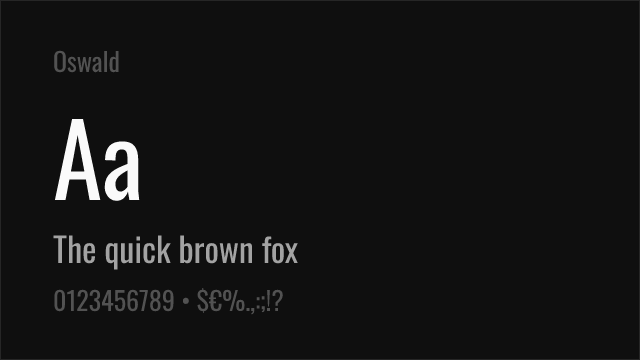
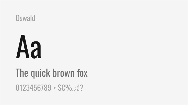
Closest free condensed gothic with strong display character and variable font support
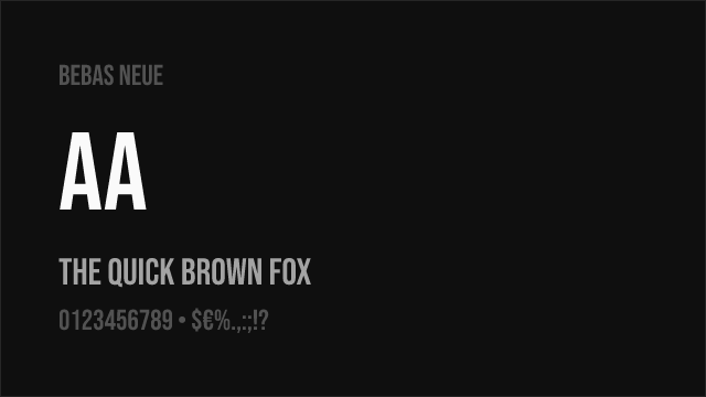
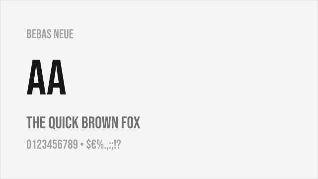
Bold condensed all-caps display font with strong impact and widespread recognition


Versatile sans-serif family with condensed variant matching Knockout's narrower widths

Condensed display sans-serif with commanding presence for headlines
Ultra-condensed display sans with maximum headline impact
Geometric display sans with elegant proportions available in condensed styles
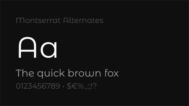
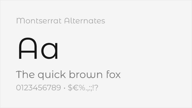
Montserrat variant with softer, curved alternate letterforms


Geometric sans-serif with strong display presence and comprehensive weight range
See where Knockout is used in the wild and swap to free alternatives live.
Install FontSwap →Replacement Summary
Source: FontAlternatives.com
Premium font: Knockout
Best free alternative: Oswald
FontAlternatives similarity score: 82%
Replacement difficulty: Medium
Best for: sports and athletic headlines, condensed display typography, editorial feature headlines, poster and event display
Notable users: ESPN, Sports Illustrated, Rolling Stone
Not recommended when: Brand consistency with ESPN requires exact letterforms
What is the best free alternative to Knockout?
Oswald is the best free alternative to Knockout with a FontAlternatives similarity score of 82%.
Oswald shares similar proportions, stroke characteristics, and intended use with Knockout. It is available under the OFL-1.1 license, which permits both personal and commercial use at no cost.
This alternative works particularly well for: sports and athletic headlines, condensed display typography, editorial feature headlines, poster and event display.
Can I safely replace Knockout with Oswald?
Yes, with some considerations. Oswald achieves a FontAlternatives similarity score of 82%, indicating good structural compatibility for most use cases.
Licensing: Oswald is licensed under OFL-1.1, which allows commercial use without licensing fees or royalties.
Weight coverage: Most weights have close or exact matches available.
When should I NOT replace Knockout?
While Oswald is a strong alternative, there are situations where replacing Knockout may not be appropriate:
- Optical precision requirements: Oswald has measurable structural differences from Knockout that may be visible in precise design work.
- Brand consistency: Knockout is commonly seen in Sports magazine covers and headlines contexts where exact letterforms may be required.
- Strict compliance: Verify that OFL-1.1 terms meet your specific legal and compliance requirements.
Weight-Matching Guide
Map Knockout weights to their closest free alternatives for accurate font substitution.
Oswald
| Knockout | Oswald | Match |
|---|---|---|
| Lightweight (300) | Light (300) | close |
| Middleweight (400) | Regular (400) | close |
| Cruiserweight (500) | Medium (500) | close |
| Heavyweight (700) | Bold (700) | close |
Bebas Neue
| Knockout | Bebas Neue | Match |
|---|---|---|
| Heavyweight (700) | Regular (400) | substitute |
Barlow
| Knockout | Barlow | Match |
|---|---|---|
| Featherweight (100) | Thin (100) | close |
| Middleweight (400) | Regular (400) | close |
| Cruiserweight (500) | Medium (500) | close |
| Heavyweight (700) | Bold (700) | close |
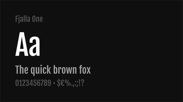
Fjalla One
| Knockout | Fjalla One | Match |
|---|---|---|
| Heavyweight (700) | Regular (400) | substitute |
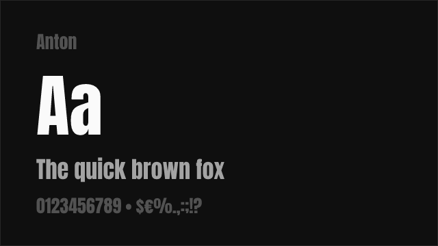
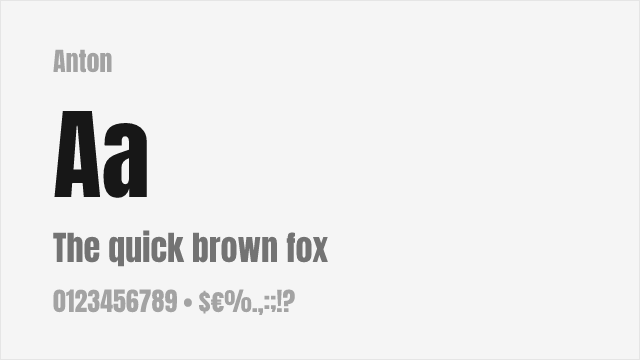
Anton
| Knockout | Anton | Match |
|---|---|---|
| Sumo (900) | Regular (400) | substitute |
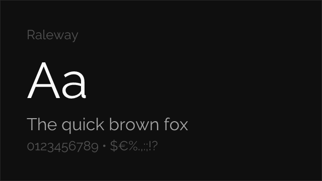
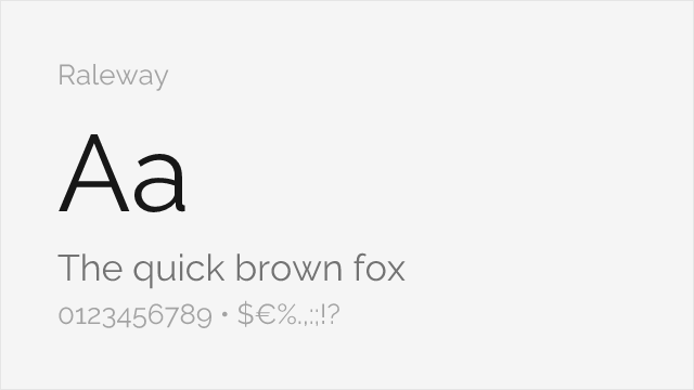
Raleway
| Knockout | Raleway | Match |
|---|---|---|
| Featherweight (100) | Thin (100) | close |
| Middleweight (400) | Regular (400) | close |
| Cruiserweight (600) | SemiBold (600) | close |
| Sumo (900) | Black (900) | close |
Montserrat
| Knockout | Montserrat | Match |
|---|---|---|
| Featherweight (100) | Thin (100) | close |
| Middleweight (400) | Regular (400) | close |
| Cruiserweight (600) | SemiBold (600) | close |
| Sumo (900) | Black (900) | close |
Performance Guide
Production performance metrics for each alternative.
How to Use Oswald
Copy these code snippets to quickly add Oswald to your project.
CSS code for Oswald
@import url('https://fonts.googleapis.com/css2?family=Oswald:wght@100..900&display=swap');HTML code for Oswald
<link rel="preconnect" href="https://fonts.googleapis.com">
<link rel="preconnect" href="https://fonts.gstatic.com" crossorigin>
<link href="https://fonts.googleapis.com/css2?family=Oswald:wght@100..900&display=swap" rel="stylesheet">
Tailwind code for Oswald
// tailwind.config.js
module.exports = {
  theme: {
    extend: {
      fontFamily: {
        'oswald': ['Oswald', 'sans-serif'],
      },
    },
  },
}

// Usage in HTML:
// <p class="font-oswald">Your text here</p>
Next.js code for Oswald
// Using next/font (Next.js 13+)
import { Oswald } from 'next/font/google';

const oswald = Oswald({
  subsets: ['latin'],
  weight: ['100', '200', '300', '400', '500', '600', '700', '800', '900'],
});

export default function Component() {
  return (
    <p className={oswald.className}>
      Your text here
    </p>
  );
}

// Or using inline styles with Google Fonts link:
// <p style={{ fontFamily: "'Oswald'" }}>Your text</p>
Expo and React Native code for Oswald
// Install: npx expo install @expo-google-fonts/oswald expo-font
import { useFonts, Oswald_400Regular } from '@expo-google-fonts/oswald';

export default function App() {
  const [fontsLoaded] = useFonts({
    Oswald_400Regular,
  });

  if (!fontsLoaded) return null;

  return (
    <Text style={{ fontFamily: 'Oswald_400Regular' }}>
      Your text here
    </Text>
  );
}
Recommended Font Pairings
These free fonts pair well with Oswald Knockout for headlines, body text, or accent use.
Source Serif Pro's warm transitional serifs provide editorial body text that balances Knockout's aggressive condensed headlines — a classic sports-editorial formula pairing high-impact display with comfortable reading typography
Lora's calligraphic warmth creates compelling contrast beneath Knockout's mechanical condensed forms, a pairing that works for editorial publications needing dramatic headline impact with sophisticated body text
Barlow's condensed variants complement Knockout's display presence by providing supporting text in a compatible condensed vocabulary, creating cohesive layouts where the condensed proportions carry through from headlines to subheads and captions
Browse Alternatives by Context
Find Knockout alternatives filtered by specific use case, style, or language support.
By Use Case
By Style
By Script
Frequently Asked Questions
What is the best free alternative to Knockout?
Oswald is the best free alternative to Knockout with a FontAlternatives similarity score of 82%. It shares similar proportions and characteristics while being available under the OFL-1.1 license for both personal and commercial use at no cost.
Is there a free version of Knockout?
There is no official free version of Knockout. However, Oswald is available under the OFL-1.1 open-source license and achieves a FontAlternatives similarity score of 82%. It includes variable weights and supports latin, latin-extended.
What Google Font looks like Knockout?
The Google Fonts most similar to Knockout are Oswald, Bebas Neue, Barlow. Among these alternatives, Oswald offers the closest match with a FontAlternatives similarity score of 82% and includes variable weights for flexible typography options.
Can I use Oswald commercially?
Yes, Oswald can be used commercially. It is licensed under OFL-1.1, which allows free use in websites, applications, print materials, and commercial projects without purchasing a license or paying royalties.
Is Oswald similar enough to Knockout?
Oswald achieves a FontAlternatives similarity score of 82% compared to Knockout. While not identical, it offers comparable letterforms, proportions, and visual style. Most designers find it works excellently as a substitute in web and print projects.
What are the main differences between Knockout and its free alternatives?
Free alternatives to Knockout may differ in subtle details like letter spacing, curve refinements, and available weights. Premium fonts typically include more OpenType features, extended language support, and optimized screen rendering. However, for most projects, these differences are negligible.
Where can I download free alternatives to Knockout?
Download Oswald directly from Google Fonts. Click the "Get Font" button on any alternative listed above to visit the official download page. Google Fonts also provides convenient embed codes for seamless web integration.