Free Alternatives to Impact

About Impact
- Foundry
- Stephenson Blake
- Classification
- display
- Style
- ultra-condensed
Brands Using Impact
De facto standard typeface for image macro memes since 2007
Impact was used in the game franchise's logo until its 2023 rebrand
Its original 1960s purpose — maximum words per line for headlines and billboards
Condensed heavy display for scoreboards, posters, and broadcast lower-thirds
 See Impact live on these sites with FontSwap →
Impact is an ultra-heavy, condensed sans-serif typeface designed by Geoffrey Lee in 1965 for the Stephenson Blake foundry in Sheffield, England. Originally intended for headlines and advertising, Impact achieved unexpected cultural immortality as the default typeface for internet memes.
History and Design
Geoffrey Lee designed Impact during Britain's typographic renaissance of the 1960s, when the advertising industry demanded typefaces that commanded attention in increasingly crowded visual environments. The design maximizes vertical stroke weight while minimizing horizontal space—creating a typeface that shouts without actually increasing letter size.
Impact's condensed proportions and extreme weight made it ideal for newspaper headlines and billboard advertising, where space was precious but attention was essential. The design strips away any decorative elements, focusing purely on legibility and presence.
Stephenson Blake, the Sheffield foundry that released it, was one of the last of the great British metal-type houses, and Impact arrived near the end of that era. It was drawn for a specific commercial problem: a headline typeface so dense that it could dominate a page or a poster at a distance while still fitting a full phrase on a single line. Lee achieved that by pushing two variables — stroke weight and condensation — to extremes that most designers avoided, accepting the resulting tightness of the counters as the price of sheer presence. The name itself, "Impact," is a plain statement of intent rather than a reference to any historical model; it exists to hit hard.
From Headlines to Memes
Microsoft bundled Impact with Windows (from Windows 98) as part of its Core fonts for the Web package, giving millions of home users access to a professional-grade display typeface. This accessibility, combined with Impact's distinctive appearance, led to its adoption as the de facto typeface for image macros and internet memes from the late 2000s onward. The white text with black outline became so ubiquitous that "Impact font" became synonymous with meme culture itself.
The reason was as much technical as aesthetic. When early meme creators needed to overlay text on a photograph and have it stay legible over any background — light or dark, busy or plain — Impact's heavy strokes plus a black outline solved the problem better than any other font that happened to be pre-installed on a typical PC. The "top text / bottom text" caption convention grew directly out of that constraint, and formats from advice animals to demotivational posters all inherited it. The result is one of the strangest afterlives in type history: a serious 1965 advertising face that most people now encounter only as the voice of a joke, its original purpose almost entirely eclipsed by an accident of software bundling and internet folk culture.
Why Impact Matters
Impact represents display typography at its most functional — maximum attention in minimum space. Its whole design philosophy is compression: cram the most legible shout into the least horizontal room, so a headline can be enormous without running off the page. For decades that made it a workhorse of newspapers and advertising, exactly the job Geoffrey Lee drew it for.
Then the internet gave it a second life it was never designed for. Bundled with Windows and therefore available to everyone, Impact became the default voice of the image macro — white text, black outline, top and bottom of a picture — and "Impact font" turned into shorthand for meme culture itself. That accidental ubiquity is a double-edged inheritance: it made Impact one of the most recognized typefaces on earth, and it simultaneously loaded it with so much cultural baggage that using it seriously now reads as either ironic or naïve.
Who is it for? Honestly, in professional work, increasingly no one — which is the real reason this page exists. Designers who want Impact's compressed, attention-grabbing power without the meme association reach for one of the free condensed display faces below, all of which deliver the visual punch with a clean slate.
There is still a lesson worth taking from Impact even if you never set a word in it. It is the purest demonstration in the standard font menu of a single design principle taken to its limit — that if a typeface's only job is to grab attention in a tight space, everything else can and should be sacrificed to that end. The best modern condensed display faces did not reject that idea; they refined it, keeping the compression and the weight while adding the graded weights, cleaner counters, and screen tuning that Impact lacks. When you choose Anton or Barlow Condensed over Impact, you are choosing the same instinct executed with fifty more years of craft.
Design Characteristics
Most typefaces balance competing demands — readability against character, weight against elegance. Impact refuses that balance entirely and optimizes for one thing: being seen. Understanding it means understanding that every apparent flaw (the cramped counters, the lack of weights, the bluntness) is a deliberate concession to that single goal. It is less a versatile family than a specialized instrument, and it plays exactly one very loud note:
- Extreme condensation: Letters are squeezed narrow so a headline fits far more characters per line than a normal sans.
- Ultra-heavy strokes: Thick verticals with minimal internal space create maximum blackness and presence at a glance.
- Tiny counters and apertures: The enclosed spaces inside letters are minimized to keep the strokes as heavy as possible, which is also why it struggles at small sizes.
- A single weight: Impact ships essentially one weight — there is no light or regular — because the whole point is maximum impact.
- Tall x-height: A large lowercase relative to the caps keeps text readable despite the condensation.
- No decoration: Every ornamental element is stripped away; it is pure functional loudness, with nothing to distract from the single job of being seen and read at a glance.
Where Impact Excels
Impact is a specialist, and inside its specialty — big, loud, space-efficient display — it is genuinely excellent. The trick is to use it only at the scale and in the contexts where its density is an asset and its meme association either doesn't matter or is the point:
- Headlines: Maximum words in minimum space — its original and still strongest use.
- Advertising and billboards: High-visibility messaging designed to be read fast and from far away.
- Sports, event, and poster graphics: Where bold, compressed, shouting type is exactly the point.
- Digital media and thumbnails: Strong screen presence at large sizes, which is why it dominates video thumbnails and — yes — memes.
Where Impact Struggles
Everything that makes Impact powerful at 96 points works against it almost everywhere else. Its limitations are the flip side of its single-mindedness, and two of them — small-size illegibility and the meme association — are effectively disqualifying for most professional work:
- Body text and small sizes: The extreme weight and tiny counters make it nearly illegible below headline scale; it is display-only.
- Professional credibility: Its meme association now overshadows serious use, so in most branding contexts it reads as a joke rather than a bold choice.
- Hierarchy and nuance: With a single heavy weight, Impact cannot build the graded hierarchy a full family offers — it is one volume, and that volume is maximum.
- Refinement: Its metal-and-photocomposition-era forms are blunt by design; where a project wants elegance or subtlety, Impact has none to give.
How to Choose a Free Substitute
Replacing Impact is easy, because what you actually want from it — narrow, heavy, attention-grabbing display type — is well covered by free fonts that carry none of the meme baggage.
For the closest single-weight punch, Anton is the definitive pick: ultra-condensed, heavy, and screen-optimized. If you want a full condensed family with graded weights for real hierarchy, Oswald and Barlow Condensed are the flexible choices, and Saira adds a variable width-and-weight system for the most control. For an all-caps, filmic feel, Bebas Neue is the go-to, and Fjalla One offers a slightly more moderate condensed headline face that stays readable at smaller sizes.
The main thing to test is weight and counter size at your actual display scale — Impact's specific density is hard to match exactly, so set your headline at its real size and check that the substitute still reads as loud rather than merely bold. In most cases Anton gets closest; the others win when you need a family rather than a single shout. And if your goal is specifically to evoke the meme aesthetic — deliberately, and with an audience that will read the reference — remember that the white-fill-black-outline treatment does most of that work, so almost any heavy condensed face styled that way will land the joke without Impact itself.
Premium Font Neighbors
If you want a commercial condensed display face with more craft than Impact, its neighborhood is rich. Knockout (Hoefler&Co) is the definitive modern condensed-grotesque system, with a huge range of widths and weights. Champion Gothic offers a similarly powerful set of heavyweight display styles, and Helvetica Inserat is the classic ultra-bold condensed Helvetica built for advertising. For workhorse condensed grotesques, Franklin Gothic and Trade Gothic (in their bold condensed cuts) and DIN deliver space-efficient headline power, while Bank Gothic and Cooper Black round out the bundled-era display faces Impact is often grouped with.
FAQ
What is the best free alternative to Impact?
Anton is the best free alternative to Impact, offering an ultra-condensed, heavy sans-serif designed specifically for the screen. Created by Vernon Adams for Google Fonts, Anton provides similar high-impact presence with cleaner digital rendering. Its single weight matches Impact's intensity while offering better web performance and modern optimization.
Can I use Anton commercially?
Yes, Anton is licensed under the SIL Open Font License (OFL-1.1), permitting unlimited commercial use without licensing fees. You can use it for websites, applications, print materials, advertising, and products. The license allows modification and redistribution, only requiring attribution when redistributing the font files themselves.
How similar is Anton to Impact?
Anton achieves approximately 90% similarity to Impact, matching the ultra-condensed proportions and heavy weight that define Impact's character. Anton features slightly more refined details and better screen optimization than Impact. Both typefaces share the goal of maximum visibility in minimal horizontal space.
What are the main differences between Impact and Anton?
Impact was designed in 1965 for metal type and photocomposition, carrying subtle artifacts from those technologies. Anton was designed specifically for digital screens, with optimized hinting and cleaner curves. Impact has broader cultural associations (particularly memes); Anton offers a fresh start without that baggage while maintaining the typographic presence.
Where can I download Anton for free?
Anton is available for free download from Google Fonts at fonts.google.com/specimen/Anton. The font includes a single heavy weight optimized for headlines and display use. Google Fonts provides easy embedding via CSS links or import statements, and the font can be downloaded for desktop use. Oswald, Bebas Neue, Fjalla One, Barlow Condensed, and Saira are all on Google Fonts too.
Why is Impact the meme font?
Impact became the default meme typeface for a practical reason: Microsoft bundled it with Windows, so it was already installed on nearly every home computer when image macros took off in the 2000s. Its extreme weight and condensed shape also made white-text-with-black-outline captions readable over almost any image, which cemented the top-and-bottom caption style as a visual convention.
Should I use Impact for professional design?
Usually not. Impact's overwhelming association with memes means that in most branding, editorial, or advertising contexts it now reads as ironic or amateurish rather than boldly confident. If you want its compressed, high-impact power for serious work, a clean free alternative like Anton or Barlow Condensed delivers the same visual punch without the cultural baggage.
Is Impact good for body text?
No. Impact is a display-only typeface — its ultra-heavy strokes and tiny counters make it very hard to read below headline sizes. For any running text, pair an Impact-style headline with a neutral, readable body font like Open Sans or Roboto, and keep Impact strictly for large, short bursts of text.
Is Impact on Google Fonts?
No, Impact is a premium font from Stephenson Blake and is not available on Google Fonts.
The closest Google Fonts alternative is Anton with 90% similarity. Get it free on Google Fonts ↗
Free Alternatives (6)
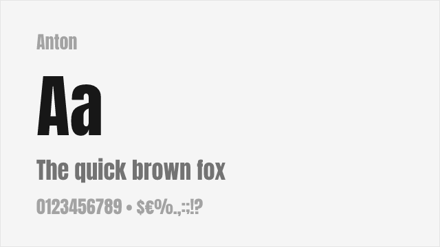
Free condensed sans-serif with excellent weight and similar high-impact presence
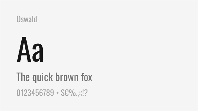
Modern condensed sans-serif with multiple weights and variable font option
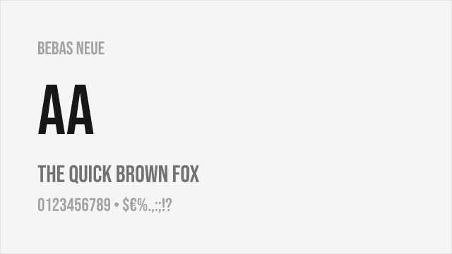
Condensed display font with all-caps design and strong visual presence
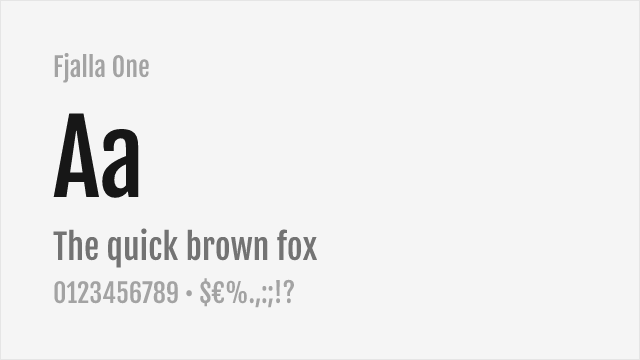
Condensed display sans-serif with strong headline presence
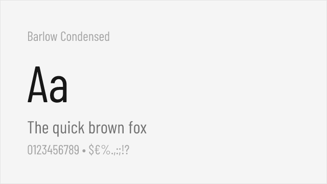
Condensed sans with a full weight range for flexible display use
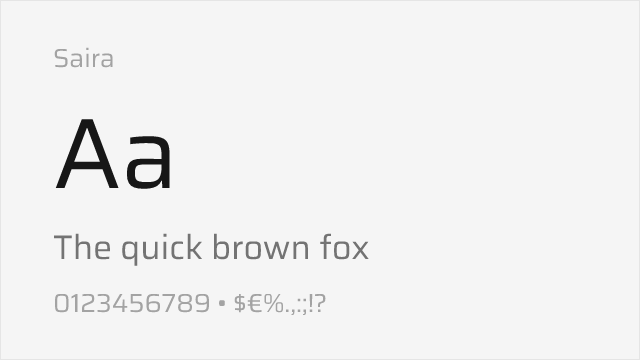
Variable grotesque whose heavy and condensed cuts approach Impact's weight
Compare the alternatives
See how Impact compares to its top alternatives — and how those alternatives compare to each other — side by side.
See where Impact is used in the wild and swap to free alternatives live.
Install FontSwap →Replacement Summary
Source: FontAlternatives.com
Premium font: Impact
Best free alternative: Anton
FontAlternatives similarity score: 90%
Replacement difficulty: Low
Best for: headlines, banner text, poster design, social media graphics
Notable users: Internet Memes, Call of Duty, Newspaper & advertising headlines
Not recommended when: Brand consistency with Internet Memes requires exact letterforms
What is the best free alternative to Impact?
Anton is the best free alternative to Impact with a FontAlternatives similarity score of 90%.
Anton shares similar proportions, stroke characteristics, and intended use with Impact. It is available under the OFL-1.1 license, which permits both personal and commercial use at no cost.
This alternative works particularly well for: headlines, banner text, poster design, social media graphics.
Can I safely replace Impact with Anton?
Yes, Anton is a high-confidence replacement for Impact. The FontAlternatives similarity score of 90% indicates strong structural compatibility.
Licensing: Anton is licensed under OFL-1.1, which allows commercial use without licensing fees or royalties.
Weight coverage: All 1 weights have exact matches available.
When should I NOT replace Impact?
While Anton is a strong alternative, there are situations where replacing Impact may not be appropriate:
- Extended language support: Anton has limited cyrillic support compared to Impact.
- Strict compliance: Verify that OFL-1.1 terms meet your specific legal and compliance requirements.
Weight-Matching Guide
Map Impact weights to their closest free alternatives for accurate font substitution.
Anton
| Impact | Anton | Match |
|---|---|---|
| Regular | Regular (400) | exact |
Oswald
| Impact | Oswald | Match |
|---|---|---|
| Regular | Bold (700) | close |
Bebas Neue
| Impact | Bebas Neue | Match |
|---|---|---|
| Regular | Regular (400) | close |
Fjalla One
| Impact | Fjalla One | Match |
|---|---|---|
| Regular | Regular (400) | close |
Barlow Condensed
| Impact | Barlow Condensed | Match |
|---|---|---|
| Regular | Bold (700) | close |
Saira
| Impact | Saira | Match |
|---|---|---|
| Regular | Black (900) | close |
Performance Guide
Production performance metrics for each alternative.
How to Use Anton
Copy these code snippets to quickly add Anton to your project.
CSS code for Anton
@import url('https://fonts.googleapis.com/css2?family=Anton:wght@400&display=swap');HTML code for Anton
<link rel="preconnect" href="https://fonts.googleapis.com">
<link rel="preconnect" href="https://fonts.gstatic.com" crossorigin>
<link href="https://fonts.googleapis.com/css2?family=Anton:wght@400&display=swap" rel="stylesheet">
Tailwind code for Anton
// tailwind.config.js
module.exports = {
  theme: {
    extend: {
      fontFamily: {
        'anton': ['Anton', 'sans-serif'],
      },
    },
  },
}

// Usage in HTML:
// <p class="font-anton">Your text here</p>
Next.js code for Anton
// Using next/font (Next.js 13+)
import { Anton } from 'next/font/google';

const anton = Anton({
  subsets: ['latin'],
  weight: ['400'],
});

export default function Component() {
  return (
    <p className={anton.className}>
      Your text here
    </p>
  );
}

// Or using inline styles with Google Fonts link:
// <p style={{ fontFamily: "'Anton'" }}>Your text</p>
Expo and React Native code for Anton
// Install: npx expo install @expo-google-fonts/anton expo-font
import { useFonts, Anton_400Regular } from '@expo-google-fonts/anton';

export default function App() {
  const [fontsLoaded] = useFonts({
    Anton_400Regular,
  });

  if (!fontsLoaded) return null;

  return (
    <Text style={{ fontFamily: 'Anton_400Regular' }}>
      Your text here
    </Text>
  );
}
Recommended Font Pairings
These free fonts pair well with Anton Impact for headlines, body text, or accent use.
Open Sans's neutral proportions provide calm, readable body text that balances Impact's extreme condensed weight in headline-body combinations
Roboto's geometric clarity offers a modern counterpoint to Impact's heavy industrial character for digital layouts
Source Sans Pro's refined legibility grounds Impact's aggressive display presence with professional, screen-optimized body text
Browse Alternatives by Context
Find Impact alternatives filtered by specific use case, style, or language support.
By Use Case
By Style
By Script
Frequently Asked Questions
What is the best free alternative to Impact?
Anton is the best free alternative to Impact with a FontAlternatives similarity score of 90%. It shares similar proportions and characteristics while being available under the OFL-1.1 license for both personal and commercial use at no cost.
Is there a free version of Impact?
There is no official free version of Impact. However, Anton is available under the OFL-1.1 open-source license and achieves a FontAlternatives similarity score of 90%. It includes 1 weights and supports latin, latin-extended.
What Google Font looks like Impact?
The Google Fonts most similar to Impact are Anton, Oswald, Bebas Neue. Among these alternatives, Anton offers the closest match with a FontAlternatives similarity score of 90% and includes 1 weights for design flexibility.
Can I use Anton commercially?
Yes, Anton can be used commercially. It is licensed under OFL-1.1, which allows free use in websites, applications, print materials, and commercial projects without purchasing a license or paying royalties.
Is Anton similar enough to Impact?
Anton achieves a FontAlternatives similarity score of 90% compared to Impact. While not identical, it offers comparable letterforms, proportions, and visual style. Most designers find it works excellently as a substitute in web and print projects.
What are the main differences between Impact and its free alternatives?
Free alternatives to Impact may differ in subtle details like letter spacing, curve refinements, and available weights. Premium fonts typically include more OpenType features, extended language support, and optimized screen rendering. However, for most projects, these differences are negligible.
Where can I download free alternatives to Impact?
Download Anton directly from Google Fonts. Click the "Get Font" button on any alternative listed above to visit the official download page. Google Fonts also provides convenient embed codes for seamless web integration.