Free Alternatives to Trade Gothic

About Trade Gothic
- Foundry
- Linotype
- Classification
- sans-serif
- Style
- american-gothic
Brands Using Trade Gothic
Editorial and brand typography across the magazine and media group
Set the YouTube wordmark until the 2017 rebrand to YouTube Sans
A long-running staple of mid-century and later book and record typography
Its original commercial home — condensed cuts for space-tight display
 See Trade Gothic live on these sites with FontSwap →
Trade Gothic is a workhorse American sans-serif typeface designed by Jackson Burke and released by Linotype between 1948 and 1960. It is one of the definitive American gothics, prized above all for its exceptionally useful condensed cuts. Known for its utilitarian character and exceptional condensed variants, it became a staple of American graphic design and advertising. For designers needing typography that works hard in tight spaces while maintaining authority and presence, Trade Gothic remains a go-to choice.
History and Design
Jackson Burke developed Trade Gothic over more than a decade at Linotype, with the initial release in 1948 followed by additional weights and widths through 1960. The name is generally understood to refer to commercial "trade" printing—the everyday work of advertising, packaging, and publications—an unpretentious label for an unpretentious face. It is often compared with, and treated as a more systematic alternative to, Morris Fuller Benton's earlier American gothics such as News Gothic and Franklin Gothic.
Trade Gothic's design features characteristic American gothic traits: sturdy construction, moderate contrast, and honest, workmanlike letterforms that prioritize function over decoration. What distinguished the family was its particularly useful range of condensed and extended variants. While competitors offered a few widths, Burke built Trade Gothic from the ground up to handle space-constrained applications where every character width matters.
The family structure eventually grew to include 14 styles spanning multiple weights and widths. The condensed variants became especially popular, allowing designers to fit headlines and label copy into tight spaces without sacrificing impact or legibility.
Around 2008–2009, Linotype released Trade Gothic Next, a comprehensive revision by Akira Kobayashi and Tom Grace that expanded the family to 17 styles, refined character shapes, and improved consistency across weights. This update ensured Trade Gothic remained relevant for digital typography while honoring the original's industrial character.
Jackson Burke's own position gives the design its unusual coherence. As director of type development at Mergenthaler Linotype from 1949, he was drawing Trade Gothic not as an outside artist but as the person responsible for the type library of one of the two dominant typesetting-machine companies in America. That vantage point mattered: Linotype's machines set the newspapers, magazines, and commercial print of the era, and a face designed by the man overseeing that catalog could be built to slot directly into the real production workflows of the day. Trade Gothic was never meant to be admired in a specimen book; it was meant to be composed, cast, and printed by the thousand, and it was drawn accordingly.
That practical origin fits the name. "Trade" printing was the everyday jobbing work — the advertisements, forms, packaging, and publications that kept commercial printers busy — as opposed to fine or book printing. Naming the family Trade Gothic was a statement of intent: this was type for work, not for show. Decades later, that honesty is exactly what designers prize in it, but at the time it was simply an accurate description of the job it was built to do.
Why Trade Gothic Matters
Trade Gothic earned its reputation through decades of practical application rather than any single striking idea. Unlike typefaces chosen for aesthetic statement, it was selected because it worked — it fit in the space available, remained legible at various sizes, and communicated with straightforward authority. It is, in the best sense, a working typeface, and that is precisely why it has endured while flashier faces have come and gone.
Its edge over its great rival, Franklin Gothic, was system. Where Franklin Gothic accreted its widths and weights piecemeal over the decades, Jackson Burke set out to build Trade Gothic as a coordinated family with a genuinely useful range of condensed and extended cuts. That planning paid off in exactly the places American design needed it most: the condensed weights became a secret weapon for art directors and packaging designers who had to pack punchy, legible type into unforgiving spaces. Trade Gothic Condensed, and especially the heavy Bold Condensed, turned up on magazine covers, product labels, and advertising layouts for half a century.
There is also the matter of tone. Trade Gothic conveys honest utility — a typeface that works for a living — and where geometric sans-serifs project sleek modernity, it projects no-nonsense professionalism. That workmanlike quality paradoxically became stylish: fashion brands, editorial designers, and lifestyle companies adopted it precisely because it looked authentic and unfussy rather than designed. Around 2008–2009 Linotype released Trade Gothic Next, a comprehensive revision by Akira Kobayashi and Tom Grace that grew the family to 17 harmonized styles and refined its character for the digital era.
There is a subtle irony worth noting in how Trade Gothic reads today. A face designed to be invisible and hardworking has, over time, acquired a strong cultural signal of its own: because it is so plainly not trying to be fashionable, using it now reads as a knowing choice, a rejection of slick geometric branding in favor of something that looks earned and real. Streetwear labels, independent magazines, and craft brands reach for it precisely to borrow that air of authenticity. It is a nice demonstration that in typography, as in dress, studied plainness can become its own kind of style.
Who is it for? Projects that need type to work hard in tight spaces with plain, industrial authority — packaging, editorial, wayfinding, advertising, and sports design — rather than anything after elegance, warmth, or a distinctly contemporary-tech feel. If your headlines have to fit and your layout values honesty over polish, Trade Gothic is close to a reference standard.
Design Characteristics
Trade Gothic is built for utility, and its details reflect a designer solving practical problems rather than chasing beauty. It is not a typeface of memorable individual letters — no signature flourish, no trademark quirk — but of a well-judged whole that behaves predictably at every size and width. That restraint is deliberate: a working face earns its keep by never getting in the way, and Trade Gothic's evenness is the quiet craft that makes it so dependable. The specifics:
- American gothic construction: Sturdy, practical letterforms with quiet confidence rather than neutrality.
- A genuinely systematic family: Extended, regular, and multiple condensed widths designed to work together — its defining advantage over rivals.
- Prized condensed cuts: The narrow weights, especially Bold Condensed No. 20, are what most people picture when they think of Trade Gothic.
- Moderate x-height and contrast: Balanced, even proportions that keep it legible across sizes and applications.
- Industrial, honest character: A no-frills aesthetic that reads as authentic and hardworking, which is exactly why brands that want to signal substance over gloss keep returning to it decades after its release.
- Expanded modern family: Trade Gothic Next offers 17 coordinated styles for contemporary work.
Where Trade Gothic Excels
Trade Gothic is at its best wherever type must be efficient, legible, and plainly authoritative — the daily work of commercial design rather than the showpiece:
- Headlines and titles: The condensed weights pack real punch into limited space — its signature strength.
- Packaging design: A utilitarian aesthetic that suits product labels, ingredient lists, and legal copy.
- Editorial layouts: The versatile family handles complex magazine hierarchies within tight columns.
- Wayfinding and signage: Excellent legibility in constrained spaces, a natural fit for its proportions.
- Advertising and sports media: Direct, industrial headlines that command attention without pretension.
Where Trade Gothic Struggles
The plain utility that makes Trade Gothic dependable also limits it, and its age shows on screen. Its weaknesses are the trade-offs of being a workhorse:
- Elegance and luxury: Its industrial honesty is the opposite of refined; it brings nothing to fashion-forward or premium work that wants delicacy.
- Warmth and friendliness: More neutral and utilitarian than a face like Franklin Gothic, it can read as cold in consumer or lifestyle contexts wanting approachability.
- Small-size screen text: A print-era design, its digital cuts are less optimized for interface and body text than screen-first families.
- Distinctiveness: Its very plainness means it rarely sets a brand apart on its own; it is a reliable tool more than a statement.
- Licensing cost: The quality Linotype cuts are commercial and licensed per use, which is exactly why the free alternatives below exist.
How to Choose a Free Substitute
Trade Gothic's value splits cleanly in two — its regular widths and its famous condensed cuts — so match on the part you actually need.
For the regular, workhorse widths, Work Sans is the strongest contemporary match, with American-gothic proportions and variable-font flexibility, and Libre Franklin brings the same journalistic authority from the closely related Franklin Gothic lineage. Roboto is the pragmatic, ubiquitous option for UI and body text. For Trade Gothic's prized condensed side, reach for Barlow (which offers true condensed widths and a signage heritage), Oswald for narrow bold headlines, or BenchNine for genuinely extreme condensation in tight bands.
The key test is condensation. Trade Gothic is chosen as often as not because of its narrow cuts, so if that is your use case, judge candidates on their condensed weights specifically — set a real headline at your real width and check that the substitute stays legible and punchy where space runs out. For regular-width work, Work Sans or Libre Franklin will usually get you there with no one the wiser.
Premium Font Neighbors
Trade Gothic lives in the heart of the American-gothic tradition, so its neighbors are its rivals and relatives. Franklin Gothic is the elder statesman it was built to compete with, and News Gothic is the lighter Benton companion in the same genre. Akzidenz-Grotesk is the European grotesque behind the whole style, while Helvetica and Univers are the neo-grotesques that later dominated. For contemporary and space-efficient neighbors, DIN brings German industrial precision, Knockout (Hoefler&Co) offers a vast condensed-display system, and Interstate carries the same functional, signage-derived DNA drawn from US highway lettering.
FAQ
What is Trade Gothic best used for?
Space-constrained work where typography must be efficient: magazine headlines, packaging labels, wayfinding signage, and advertising copy. Its condensed variants fit more text in tight spaces while staying legible and punchy, and its industrial, no-nonsense character projects authority without pretension — ideal for editorial and commercial design.
What free font is similar to Trade Gothic Condensed?
Barlow (which includes true condensed widths) is the closest free match for Trade Gothic Condensed, sharing its utilitarian, wayfinding-influenced proportions. Oswald is an excellent choice for narrow, bold headlines, and BenchNine covers extreme condensation. All are free under open licenses and cover Trade Gothic's space-efficient use cases.
How is Trade Gothic different from Franklin Gothic?
Both are American gothics, but Trade Gothic (Jackson Burke, Linotype, 1948) was designed from the outset as a coordinated family with a strong range of condensed and extended widths, while Franklin Gothic (Benton, ATF, 1902) grew more piecemeal and has a touch more warmth and stroke contrast. Trade Gothic reads as slightly more neutral and systematic; Franklin Gothic as a bit more characterful. For pure condensed-headline work, Trade Gothic's planned widths often win.
Who designed Trade Gothic, and when?
Jackson Burke designed Trade Gothic for Linotype, developing it over more than a decade with the first release in 1948 and further weights and widths through 1960. Akira Kobayashi and Tom Grace later reworked and expanded the family as Trade Gothic Next, released by Linotype around 2008–2009.
Can I use these free alternatives commercially?
Yes. Work Sans, Libre Franklin, Barlow, Oswald, and BenchNine are all released under the SIL Open Font License, and Roboto under the equally permissive Apache License 2.0. All permit unlimited commercial use — web, app, branding, and print — with attribution required only if you redistribute the font files themselves.
What fonts pair well with Trade Gothic?
Trade Gothic pairs cleanly with a classic serif for body text — a transitional or slab serif under its condensed headlines gives editorial and packaging work a sturdy, honest feel. For an all-sans system, set a lighter Trade Gothic (or a companion like News Gothic) against the bold condensed cuts, keeping everything in the gothic family so the layout stays coherent rather than competing. Because Trade Gothic already spans so many widths and weights, the simplest strong pairing is often Trade Gothic with itself — a discipline that keeps a design unmistakably unified.
Is Trade Gothic on Google Fonts?
No, Trade Gothic is a premium font from Linotype and is not available on Google Fonts.
The closest Google Fonts alternative is Work Sans with 80% similarity. Get it free on Google Fonts ↗
Free Alternatives (6)

Similar industrial character with modern design sensibilities
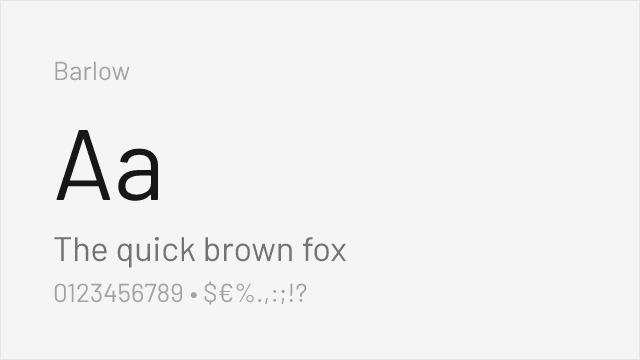
Condensed proportions with comparable utilitarian aesthetic
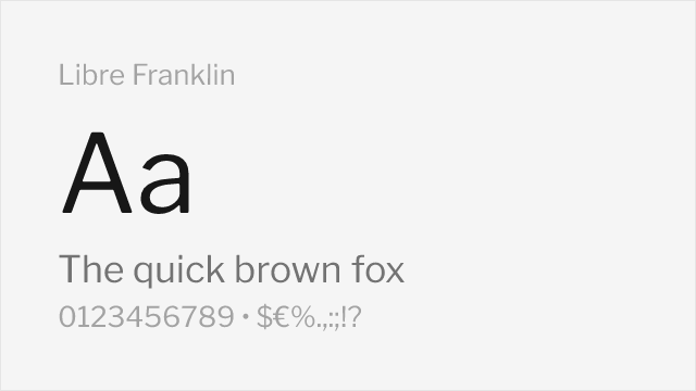
American gothic style with similar editorial applications

Neutral neo-grotesque workhorse with a utilitarian temperament
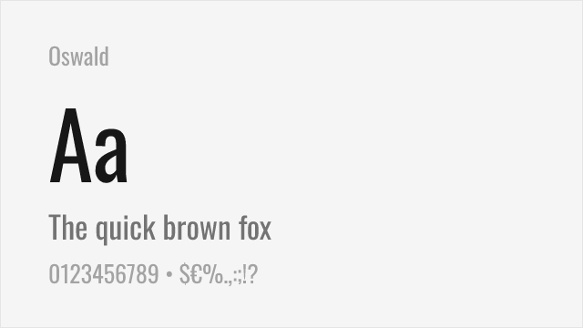
Condensed gothic for Trade Gothic's most-prized narrow headline cuts
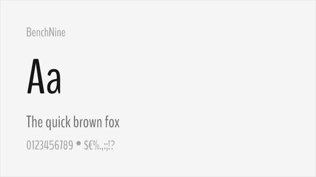
Ultra-condensed sans for extreme space-saving headline work
Compare the alternatives
See how Trade Gothic compares to its top alternatives — and how those alternatives compare to each other — side by side.
See where Trade Gothic is used in the wild and swap to free alternatives live.
Install FontSwap →Replacement Summary
Source: FontAlternatives.com
Premium font: Trade Gothic
Best free alternative: Work Sans
FontAlternatives similarity score: 80%
Replacement difficulty: Medium
Best for: technology brands, editorial design, user interfaces, headlines
Notable users: Vice, YouTube, Paperback & album cover design
Not recommended when: Brand consistency with Vice requires exact letterforms
What is the best free alternative to Trade Gothic?
Work Sans is the best free alternative to Trade Gothic with a FontAlternatives similarity score of 80%.
Work Sans shares similar proportions, stroke characteristics, and intended use with Trade Gothic. It is available under the OFL-1.1 license, which permits both personal and commercial use at no cost.
This alternative works particularly well for: technology brands, editorial design, user interfaces, headlines.
Can I safely replace Trade Gothic with Work Sans?
Yes, with some considerations. Work Sans achieves a FontAlternatives similarity score of 80%, indicating good structural compatibility for most use cases.
Licensing: Work Sans is licensed under OFL-1.1, which allows commercial use without licensing fees or royalties.
Weight coverage: Most weights have close or exact matches available.
When should I NOT replace Trade Gothic?
While Work Sans is a strong alternative, there are situations where replacing Trade Gothic may not be appropriate:
- Optical precision requirements: Work Sans has measurable structural differences from Trade Gothic that may be visible in precise design work.
- Strict compliance: Verify that OFL-1.1 terms meet your specific legal and compliance requirements.
Weight-Matching Guide
Map Trade Gothic weights to their closest free alternatives for accurate font substitution.
Work Sans
| Trade Gothic | Work Sans | Match |
|---|---|---|
| Light | Light (300) | close |
| Regular | Regular (400) | close |
| Bold | Bold (700) | close |
| Black | Black (900) | close |
Barlow
| Trade Gothic | Barlow | Match |
|---|---|---|
| Light | Light (300) | close |
| Regular | Regular (400) | exact |
| Medium | Medium (500) | exact |
| Bold | Bold (700) | close |
Libre Franklin
| Trade Gothic | Libre Franklin | Match |
|---|---|---|
| Light | Light (300) | close |
| Regular | Regular (400) | exact |
| Medium | Medium (500) | exact |
| Bold | Bold (700) | close |
Roboto
| Trade Gothic | Roboto | Match |
|---|---|---|
| Regular | Regular (400) | close |
| Medium | Medium (500) | exact |
| Bold | Bold (700) | close |
Oswald
| Trade Gothic | Oswald | Match |
|---|---|---|
| Medium | Medium (500) | close |
| Bold | Bold (700) | close |
BenchNine
| Trade Gothic | BenchNine | Match |
|---|---|---|
| Light | Light (300) | close |
| Bold | Bold (700) | close |
Performance Guide
Production performance metrics for each alternative.
How to Use Work Sans
Copy these code snippets to quickly add Work Sans to your project.
CSS code for Work Sans
@import url('https://fonts.googleapis.com/css2?family=Work+Sans:wght@100..900&display=swap');HTML code for Work Sans
<link rel="preconnect" href="https://fonts.googleapis.com">
<link rel="preconnect" href="https://fonts.gstatic.com" crossorigin>
<link href="https://fonts.googleapis.com/css2?family=Work+Sans:wght@100..900&display=swap" rel="stylesheet">
Tailwind code for Work Sans
// tailwind.config.js
module.exports = {
  theme: {
    extend: {
      fontFamily: {
        'work-sans': ['"Work Sans"', 'sans-serif'],
      },
    },
  },
}

// Usage in HTML:
// <p class="font-work-sans">Your text here</p>
Next.js code for Work Sans
// Using next/font (Next.js 13+)
import { Work_Sans } from 'next/font/google';

const work_sans = Work_Sans({
  subsets: ['latin'],
  weight: ['100', '200', '300', '400', '500', '600', '700', '800', '900'],
});

export default function Component() {
  return (
    <p className={work_sans.className}>
      Your text here
    </p>
  );
}

// Or using inline styles with Google Fonts link:
// <p style={{ fontFamily: '"Work Sans"' }}>Your text</p>
Expo and React Native code for Work Sans
// Install: npx expo install @expo-google-fonts/work-sans expo-font
import { useFonts, Work_Sans_400Regular } from '@expo-google-fonts/work-sans';

export default function App() {
  const [fontsLoaded] = useFonts({
    Work_Sans_400Regular,
  });

  if (!fontsLoaded) return null;

  return (
    <Text style={{ fontFamily: 'Work_Sans_400Regular' }}>
      Your text here
    </Text>
  );
}
Browse Alternatives by Context
Find Trade Gothic alternatives filtered by specific use case, style, or language support.
By Use Case
By Style
By Script
Frequently Asked Questions
What is the best free alternative to Trade Gothic?
Work Sans is the best free alternative to Trade Gothic with a FontAlternatives similarity score of 80%. It shares similar proportions and characteristics while being available under the OFL-1.1 license for both personal and commercial use at no cost.
Is there a free version of Trade Gothic?
There is no official free version of Trade Gothic. However, Work Sans is available under the OFL-1.1 open-source license and achieves a FontAlternatives similarity score of 80%. It includes variable weights and supports latin, latin-extended.
What Google Font looks like Trade Gothic?
The Google Fonts most similar to Trade Gothic are Work Sans, Barlow, Libre Franklin. Among these alternatives, Work Sans offers the closest match with a FontAlternatives similarity score of 80% and includes variable weights for flexible typography options.
Can I use Work Sans commercially?
Yes, Work Sans can be used commercially. It is licensed under OFL-1.1, which allows free use in websites, applications, print materials, and commercial projects without purchasing a license or paying royalties.
Is Work Sans similar enough to Trade Gothic?
Work Sans achieves a FontAlternatives similarity score of 80% compared to Trade Gothic. While not identical, it offers comparable letterforms, proportions, and visual style. Most designers find it works excellently as a substitute in web and print projects.
What are the main differences between Trade Gothic and its free alternatives?
Free alternatives to Trade Gothic may differ in subtle details like letter spacing, curve refinements, and available weights. Premium fonts typically include more OpenType features, extended language support, and optimized screen rendering. However, for most projects, these differences are negligible.
Where can I download free alternatives to Trade Gothic?
Download Work Sans directly from Google Fonts. Click the "Get Font" button on any alternative listed above to visit the official download page. Google Fonts also provides convenient embed codes for seamless web integration.