Free Alternatives to Franklin Gothic

About Franklin Gothic
- Foundry
- URW Type Foundry
- Classification
- sans-serif
- Style
- american-gothic
Brands Using Franklin Gothic
The MoMA logotype, based on Franklin Gothic No. 2 (Ivan Chermayeff, 1964)
A 20th-century staple of newsroom and editorial display typography
The plain, authoritative American-gothic voice of mid-century advertising
A frequent choice for accessible, trustworthy campaign and civic signage
 See Franklin Gothic live on these sites with FontSwap →
See Franklin Gothic in the Wild

Franklin Gothic is a landmark American sans-serif typeface designed by Morris Fuller Benton and released by American Type Founders (ATF) in 1902. It is the definitive example of the American gothic style. It became one of the most influential American typefaces of the 20th century, defining the "American gothic" style that dominated advertising, editorial, and commercial typography for generations. Franklin Gothic represents the American typographic voice: bold, direct, and unpretentious — a face that has shouted headlines and steadied institutions in equal measure for well over a century.
History and Design
Morris Fuller Benton designed Franklin Gothic during his prolific career at American Type Founders, where he created or supervised over 200 typefaces. Named after Benjamin Franklin—printer, statesman, and embodiment of American practicality—the typeface was intended as an American response to European grotesque types like Akzidenz-Grotesk.
Franklin Gothic's design features characteristic traits of American gothics: moderate stroke contrast that adds warmth, slightly condensed proportions that use space efficiently, and sturdy, workmanlike letterforms that prioritize function over elegance. Unlike the precise, mechanical character of Swiss grotesques, Franklin Gothic has personality—it projects confidence and directness.
The original ATF release included a limited range of weights. The family expanded significantly over the decades, with ITC releasing a comprehensive revival in 1980 (led by Victor Caruso, later extended by David Berlow) that added numerous weights and widths. Today, multiple versions exist: the original ATF designs, ITC Franklin Gothic, and URW's digitization.
Benton's role in all this is worth understanding, because it shaped the typeface's character. As ATF's head of design during the early twentieth century, he was effectively running the type department of the largest American foundry at the moment it was consolidating dozens of smaller foundries and rationalizing their catalogs. Franklin Gothic was not an experimental art project; it was a flagship commercial product, drawn to be sold to jobbing printers and advertising houses across America. That commercial brief — make something bold, legible, versatile, and unmistakably not-European — is exactly what gave Franklin Gothic its plain, confident, workmanlike personality. It was designed to earn its keep, and it did, becoming one of ATF's best-sellers and outliving the foundry itself.
There is also a subtler point of provenance. "Franklin Gothic" was the anchor of a whole related family Benton drew — News Gothic, Lightline Gothic, and others — that together defined the American gothic genre. When designers today reach for a plain, sturdy American sans, they are drawing on a vocabulary Benton largely invented.
Why Franklin Gothic Matters
Franklin Gothic became the voice of American advertising, newspapers, and magazine headlines throughout the 20th century. When art directors wanted headlines that grabbed attention without appearing fancy or European, they reached for Franklin Gothic. Its bold weights achieved iconic status, appearing in countless advertisements, movie posters, and publications.
The typeface captures distinctly American values: pragmatism over theory, directness over subtlety, confidence over hesitation. These qualities made it perfect for political campaigns, sports branding, and news headlines—contexts demanding authority and accessibility simultaneously. Where a European grotesque like Akzidenz-Grotesk reads as cool and neutral, Franklin Gothic reads as plain-spoken and sturdy, with just enough warmth in its slightly modulated strokes to feel human rather than mechanical.
That combination is why it has never really gone out of use. Sports teams, news organizations, and entertainment brands have long favored it, and museums and cultural institutions have adopted it precisely for its unpretentious American authority. The New York Museum of Modern Art (MoMA) built its identity around Franklin Gothic; countless newspapers and magazines have leaned on its bold weights for headlines. Its condensed cuts, in particular, became a default for any context that needed to fit strong, legible type into a tight column.
Who is it for? Projects that want to feel direct, trustworthy, and distinctly American — editorial, news, sports, civic, and cultural work — rather than sleek, European, or minimal. It is a poor fit for anything chasing delicacy, luxury, or a strongly contemporary-tech feel, where its workmanlike sturdiness reads as plain.
Franklin Gothic also occupies an unusual position for a page like this one, because its best free substitute is not an approximation but a genuine revival. Most premium typefaces have no true open-source equivalent, only lookalikes; Franklin Gothic has Libre Franklin, a carefully drawn open version commissioned precisely so that the American gothic could belong to everyone rather than sit behind a licence. That makes Franklin Gothic one of the rare cases where choosing the free option costs you almost nothing — the design intent, the proportions, and the weight range all survive the switch. It is worth knowing that going in, because it changes the calculation: for many projects there is simply no reason to license the commercial cut.
Design Characteristics
Franklin Gothic is the archetype of the American gothic, and its details all serve that plain, sturdy, confident character:
- American gothic construction: Sturdy, no-nonsense letterforms with real presence rather than neutral anonymity.
- Moderate stroke contrast: A subtle thick-thin variation — more than a pure grotesque — that gives it warmth and a hand-made quality.
- Slightly condensed proportions: Space-efficient forms that made it a natural for newspaper and headline work.
- Strong bold weights: The heavier weights are where Franklin Gothic earns its reputation, delivering impact without harshness.
- A distinctive lowercase: The double-storey
g, the open two-storeya, and the sturdy, generous counters are recognizably Benton rather than generic gothic, and they are a large part of why Franklin Gothic reads as characterful where a pure grotesque reads as neutral. - An extensive family: Regular, condensed, and extra-condensed widths across multiple weights, expanded further by ITC's 1980 revival — the condensed cuts, in particular, became a newsroom and advertising staple wherever strong type had to fit a narrow column.
Where Franklin Gothic Excels
Franklin Gothic is at its best wherever plain-spoken authority beats polish — where a headline needs to sound like it means what it says. Its slightly condensed proportions and strong bold weights were built for the demanding, space-constrained world of newspapers and advertising, and that heritage still shows in how confidently it fills a headline. The strongest fits:
- Headlines and display: Bold weights command attention on any page — its defining strength.
- Editorial and news design: Classic newspaper and magazine typography, direct and trustworthy.
- Advertising: An authoritative voice for marketing and promotional work.
- Sports and athletic branding: Strong, competitive character suits the context.
- Cultural and civic identity: Its plain American authority suits museums, institutions, and political campaigns alike.
Where Franklin Gothic Struggles
The plain sturdiness that makes Franklin Gothic trustworthy also caps its range, and its age shows in digital contexts. Most of its weaknesses are the flip side of its virtues — it is a specialist in a particular kind of American directness:
- Delicate or luxury contexts: Its sturdy, workmanlike character is the opposite of refined; it brings no elegance to fashion or premium work.
- Small-size screen text: A print-era design, its digital cuts are less optimized for interface and body text than screen-first families.
- Contemporary-minimal or tech briefs: It reads as classic and American rather than sleek and neutral, so it fights a cool, modern-tech identity.
- Neutral, invisible typography: Franklin Gothic always has a voice; when you want type to disappear, a true neo-grotesque does it better.
- Licensing across versions: With ATF, ITC, and URW variants all in circulation, licensing the "right" Franklin Gothic can be confusing — one reason the free revival below is so useful.
How to Choose a Free Substitute
Franklin Gothic is unusually well-served by free type, because its most faithful revival is itself open-source.
The clear first choice is Libre Franklin, drawn by Pablo Impallari specifically as a faithful open revival of the original, with a full Thin-to-Black range that exceeds many commercial cuts. If you want a more contemporary, screen-first interpretation, Work Sans carries the same American-gothic proportions with variable-font flexibility, and Source Sans 3 offers a cleaner, more neo-grotesque take for corporate and documentation work. Roboto is the pragmatic cross-platform workhorse. For Franklin Gothic's famous condensed side, Oswald captures the narrow headline character, and Barlow splits the difference with a slightly condensed, signage-influenced feel.
In practice, start with Libre Franklin and only look further if you specifically need a variable axis (Work Sans), a condensed headline cut (Oswald), or broader coordination with a serif and mono (Source Sans). The similarity gap between Libre Franklin and everything else is large — it is one of the closest free-to-premium matches on the whole site.
One thing to check regardless of your choice is the weight you actually intend to use. Franklin Gothic's reputation rests largely on its bold and heavy weights, so if your design lives in the headline range, test your substitute's Bold and Black and make sure they carry the same confident heft; a family that feels right at Regular can still fall short where Franklin Gothic is strongest. Set a real headline at your real size before committing, and judge the substitute on the weight that matters to your layout rather than on the specimen as a whole.
Premium Font Neighbors
Franklin Gothic sits at the head of the American-gothic tradition, so its closest relatives are its own family and peers. News Gothic is Benton's own lighter companion at ATF, and Trade Gothic (Jackson Burke, Linotype) is the mid-century American gothic most often used alongside or in place of it. Akzidenz-Grotesk is the European grotesque Franklin Gothic answered, while Helvetica and Univers are the neo-grotesques that later dominated. For contemporary and signage-oriented neighbors, Interstate (drawn from US highway signage), Knockout (Hoefler&Co's condensed-display system), and Gotham (the modern American geometric) all share Franklin Gothic's plain-spoken, distinctly American voice.
FAQ
Is there a free version of Franklin Gothic?
Yes — Libre Franklin, on Google Fonts under the SIL Open Font License. Drawn by Pablo Impallari as a faithful revival, it reaches about 92% similarity to the original with a full weight range from Thin (100) to Black (900), a variable-font option, and true italics. It is one of the closest free-to-premium matches available.
What is Franklin Gothic best used for?
Headlines, advertising, editorial and news design, and sports branding — any context wanting bold, direct, authoritative typography. Its American-gothic character projects confidence without pretension, which suits news media, political campaigns, cultural institutions, and commercial work. The condensed variants are especially good for tight headline spaces.
How is Franklin Gothic different from Helvetica?
Both are sturdy sans-serifs, but Franklin Gothic is an American gothic with a little stroke contrast and warmth, drawn in 1902, while Helvetica is a 1957 Swiss neo-grotesque built for cool, mechanical neutrality. Franklin Gothic has more personality and a slightly condensed, workmanlike feel; Helvetica aims to be invisible. Choose Franklin Gothic when you want the type to have a plain-spoken voice, Helvetica when you want it to recede.
Who designed Franklin Gothic?
Morris Fuller Benton designed it for American Type Founders (ATF), released in 1902. Benton was ATF's chief designer and one of the most prolific type designers in history, responsible for creating or supervising over 200 typefaces. He named Franklin Gothic after Benjamin Franklin, the printer-statesman who embodied the American practicality the typeface projects — a fitting choice for a design meant to be the plain, hardworking voice of American commerce and journalism.
Can I use these free alternatives commercially?
Yes. Libre Franklin, Work Sans, Source Sans 3, Oswald, and Barlow are all released under the SIL Open Font License, and Roboto under the equally permissive Apache License 2.0. All permit unlimited commercial use — websites, apps, branding, and print — with attribution required only if you redistribute the font files themselves.
What fonts pair well with Franklin Gothic?
A classic serif for body text makes the strongest pairing — a transitional or slab serif under Franklin Gothic headlines gives editorial work a timeless, distinctly American feel. When Franklin Gothic carries the whole layout, use a lighter weight or the News Gothic companion for text against its bold headline weights, keeping everything in the same gothic family for coherence.
Is Franklin Gothic on Google Fonts?
No, Franklin Gothic is a premium font from URW Type Foundry and is not available on Google Fonts.
The closest Google Fonts alternative is Libre Franklin with 92% similarity. Get it free on Google Fonts ↗
Free Alternatives (6)
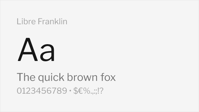
Direct open-source revival with excellent fidelity to the original

Similar American gothic character with modern proportions

Comparable weight range with neo-grotesque refinement
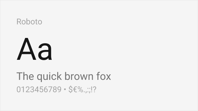
Neutral neo-grotesque with a workhorse temperament close to the gothic tradition
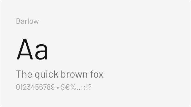
Slightly condensed grotesque with a signage heritage and full weight range
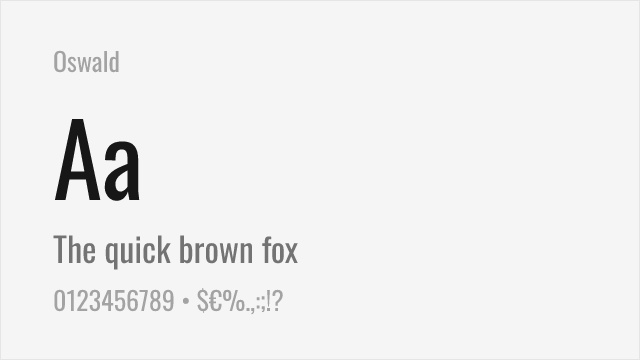
Condensed gothic for the narrow, headline end of the Franklin Gothic family
Compare the alternatives
See how Franklin Gothic compares to its top alternatives — and how those alternatives compare to each other — side by side.
See where Franklin Gothic is used in the wild and swap to free alternatives live.
Install FontSwap →Replacement Summary
Source: FontAlternatives.com
Premium font: Franklin Gothic
Best free alternative: Libre Franklin
FontAlternatives similarity score: 92%
Replacement difficulty: Low
Best for: editorial design, headlines, news publishing, branding
Notable users: MoMA (Museum of Modern Art), American newspaper headlines, 20th-century advertising
Not recommended when: Brand consistency with MoMA (Museum of Modern Art) requires exact letterforms
What is the best free alternative to Franklin Gothic?
Libre Franklin is the best free alternative to Franklin Gothic with a FontAlternatives similarity score of 92%.
Libre Franklin shares similar proportions, stroke characteristics, and intended use with Franklin Gothic. It is available under the OFL-1.1 license, which permits both personal and commercial use at no cost.
This alternative works particularly well for: editorial design, headlines, news publishing, branding.
Can I safely replace Franklin Gothic with Libre Franklin?
Yes, Libre Franklin is a high-confidence replacement for Franklin Gothic. The FontAlternatives similarity score of 92% indicates strong structural compatibility.
Licensing: Libre Franklin is licensed under OFL-1.1, which allows commercial use without licensing fees or royalties.
Weight coverage: Most weights have close or exact matches available.
When should I NOT replace Franklin Gothic?
While Libre Franklin is a strong alternative, there are situations where replacing Franklin Gothic may not be appropriate:
- Strict compliance: Verify that OFL-1.1 terms meet your specific legal and compliance requirements.
Weight-Matching Guide
Map Franklin Gothic weights to their closest free alternatives for accurate font substitution.
Libre Franklin
| Franklin Gothic | Libre Franklin | Match |
|---|---|---|
| Book | Regular (400) | exact |
| Medium | Medium (500) | exact |
| Demi | SemiBold (600) | close |
| Heavy | Bold (700) | close |
| Extra Condensed | ExtraBold (800) | close |
Work Sans
| Franklin Gothic | Work Sans | Match |
|---|---|---|
| Book | Regular (400) | close |
| Medium | Medium (500) | exact |
| Demi | SemiBold (600) | close |
| Heavy | Bold (700) | close |
Source Sans 3
| Franklin Gothic | Source Sans 3 | Match |
|---|---|---|
| Book | Regular (400) | close |
| Medium | Medium (500) | exact |
| Demi | SemiBold (600) | close |
| Heavy | Bold (700) | close |
Roboto
| Franklin Gothic | Roboto | Match |
|---|---|---|
| Book | Regular (400) | close |
| Medium | Medium (500) | exact |
| Heavy | Bold (700) | close |
Barlow
| Franklin Gothic | Barlow | Match |
|---|---|---|
| Book | Regular (400) | close |
| Medium | Medium (500) | exact |
| Heavy | Bold (700) | close |
Oswald
| Franklin Gothic | Oswald | Match |
|---|---|---|
| Medium | Medium (500) | close |
| Heavy | Bold (700) | close |
Performance Guide
Production performance metrics for each alternative.
How to Use Libre Franklin
Copy these code snippets to quickly add Libre Franklin to your project.
CSS code for Libre Franklin
@import url('https://fonts.googleapis.com/css2?family=Libre+Franklin:wght@100..900&display=swap');HTML code for Libre Franklin
<link rel="preconnect" href="https://fonts.googleapis.com">
<link rel="preconnect" href="https://fonts.gstatic.com" crossorigin>
<link href="https://fonts.googleapis.com/css2?family=Libre+Franklin:wght@100..900&display=swap" rel="stylesheet">
Tailwind code for Libre Franklin
// tailwind.config.js
module.exports = {
  theme: {
    extend: {
      fontFamily: {
        'libre-franklin': ['"Libre Franklin"', 'sans-serif'],
      },
    },
  },
}

// Usage in HTML:
// <p class="font-libre-franklin">Your text here</p>
Next.js code for Libre Franklin
// Using next/font (Next.js 13+)
import { Libre_Franklin } from 'next/font/google';

const libre_franklin = Libre_Franklin({
  subsets: ['latin'],
  weight: ['100', '200', '300', '400', '500', '600', '700', '800', '900'],
});

export default function Component() {
  return (
    <p className={libre_franklin.className}>
      Your text here
    </p>
  );
}

// Or using inline styles with Google Fonts link:
// <p style={{ fontFamily: '"Libre Franklin"' }}>Your text</p>
Expo and React Native code for Libre Franklin
// Install: npx expo install @expo-google-fonts/libre-franklin expo-font
import { useFonts, Libre_Franklin_400Regular } from '@expo-google-fonts/libre-franklin';

export default function App() {
  const [fontsLoaded] = useFonts({
    Libre_Franklin_400Regular,
  });

  if (!fontsLoaded) return null;

  return (
    <Text style={{ fontFamily: 'Libre_Franklin_400Regular' }}>
      Your text here
    </Text>
  );
}
Browse Alternatives by Context
Find Franklin Gothic alternatives filtered by specific use case, style, or language support.
By Use Case
By Style
By Script
Frequently Asked Questions
What is the best free alternative to Franklin Gothic?
Libre Franklin is the best free alternative to Franklin Gothic with a FontAlternatives similarity score of 92%. It shares similar proportions and characteristics while being available under the OFL-1.1 license for both personal and commercial use at no cost.
Is there a free version of Franklin Gothic?
There is no official free version of Franklin Gothic. However, Libre Franklin is available under the OFL-1.1 open-source license and achieves a FontAlternatives similarity score of 92%. It includes variable weights and supports latin, latin-extended.
What Google Font looks like Franklin Gothic?
The Google Fonts most similar to Franklin Gothic are Libre Franklin, Work Sans, Source Sans 3. Among these alternatives, Libre Franklin offers the closest match with a FontAlternatives similarity score of 92% and includes variable weights for flexible typography options.
Can I use Libre Franklin commercially?
Yes, Libre Franklin can be used commercially. It is licensed under OFL-1.1, which allows free use in websites, applications, print materials, and commercial projects without purchasing a license or paying royalties.
Is Libre Franklin similar enough to Franklin Gothic?
Libre Franklin achieves a FontAlternatives similarity score of 92% compared to Franklin Gothic. While not identical, it offers comparable letterforms, proportions, and visual style. Most designers find it works excellently as a substitute in web and print projects.
What are the main differences between Franklin Gothic and its free alternatives?
Free alternatives to Franklin Gothic may differ in subtle details like letter spacing, curve refinements, and available weights. Premium fonts typically include more OpenType features, extended language support, and optimized screen rendering. However, for most projects, these differences are negligible.
Where can I download free alternatives to Franklin Gothic?
Download Libre Franklin directly from Google Fonts. Click the "Get Font" button on any alternative listed above to visit the official download page. Google Fonts also provides convenient embed codes for seamless web integration.