 Install FontSwap
Free Alternatives to Franklin Gothic with Bold Style
Franklin Gothic is known for its bold aesthetic. If you're looking for a free sans serif font with a similar bold feel, these 6 alternatives offer comparable characteristics. We've identified 6 that are especially well-suited for this context. All are available under open-source licenses for unrestricted commercial use.
Top Picks
Comparison Table
| Font | Relevance ⓘ
How well this alternative fits the specific context (use-case or trait) of this page. Score 0–100 based on matching keywords, industries, and font characteristics. Alternatives scoring 25+ are highlighted.
| Similarity ⓘ
How visually similar this free font is to the premium original. Score 0–100 based on x-height, width, stroke contrast, use-case overlap, and language coverage.
Learn more → | Weights | Variable | License | Source |
|---|---|---|---|---|---|---|
| Libre Franklin | 78 | 92% | Variable | Yes | OFL-1.1 | Google Fonts ↗ |
| Oswald | 72 | 60% | Variable | Yes | OFL-1.1 | Google Fonts ↗ |
| Barlow | 48 | 65% | 9 | No | OFL-1.1 | Google Fonts ↗ |
| Work Sans | 35 | 75% | Variable | Yes | OFL-1.1 | Google Fonts ↗ |
| Source Sans 3 | 34 | 70% | Variable | Yes | OFL-1.1 | Google Fonts ↗ |
| Roboto | 34 | 68% | Variable | Yes | Apache-2.0 | Google Fonts ↗ |
All Alternatives (6)
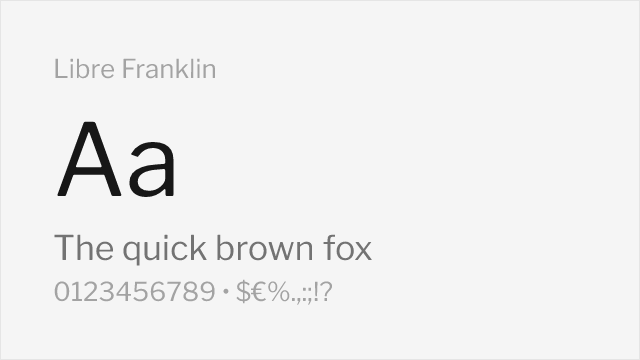
[Google Fonts] · OFL-1.1 · Variable
Direct open-source revival with excellent fidelity to the original
Why it matches: Libre Franklin is a faithful open-source revival specifically designed to capture Franklin Gothic's character. Both share identical American gothic construction, similar proportions, and the same authoritative presence. Libre Franklin offers the comprehensive weight range from Thin to Black that modern designers expect.
editorial designheadlinesnews publishingbranding
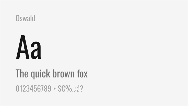
[Google Fonts] · OFL-1.1 · Variable
Condensed gothic for the narrow, headline end of the Franklin Gothic family
Why it matches: Franklin Gothic is as famous for its condensed cuts as its regular widths, and Oswald is the free font that best captures that narrow, headline character — a reworking of the classic condensed gothic style. It is a match for the compressed end of the family rather than the whole thing, but for tight, bold headlines it carries the same American-gothic authority.
condensed headlinessports and newsposterssignage
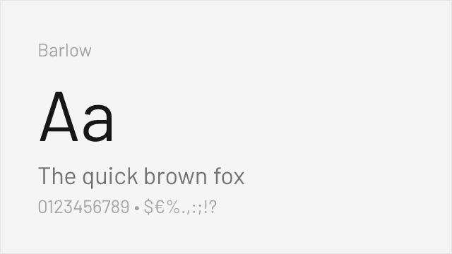
[Google Fonts] · OFL-1.1 · 9 weights
Slightly condensed grotesque with a signage heritage and full weight range
Why it matches: Barlow's slightly condensed, low-contrast forms echo Franklin Gothic's space-efficient, workmanlike proportions, and its full Thin-to-Black range covers the same headline-to-text span. Drawn with a California signage sensibility, it shares the gothic tradition's plain, functional confidence while being tuned for the screen.
headlines and signagedata-dense layoutsproduct marketingeditorial

[Google Fonts] · OFL-1.1 · Variable
Similar American gothic character with modern proportions
Why it matches: Work Sans captures Franklin Gothic's American gothic heritage with contemporary refinements for digital use. Both share the utilitarian character and straightforward presence typical of the style. Work Sans offers excellent variable font support while maintaining the honest, workmanlike quality that defines Franklin Gothic.
technology brandsuser interfaceseditorial designheadlines

[Google Fonts] · OFL-1.1 · Variable
Comparable weight range with neo-grotesque refinement
Why it matches: Source Sans Pro shares Franklin Gothic's professional utility and comprehensive weight coverage. While more refined and neo-grotesque in character, it provides similar functionality for editorial and corporate applications. The Adobe family's coordination with Source Serif enables versatile typographic systems.
corporate communicationsdocumentationgovernment websiteseditorial
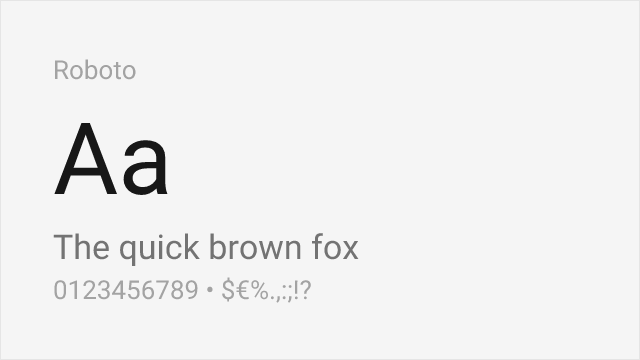
[Google Fonts] · Apache-2.0 · Variable
Neutral neo-grotesque with a workhorse temperament close to the gothic tradition
Why it matches: Roboto shares Franklin Gothic's plain, functional, get-the-job-done character, though from a cleaner neo-grotesque angle. It lacks the American gothic warmth and the condensed cuts, but as Android's system font it is a dependable, ubiquitous workhorse that covers the same neutral-but-sturdy ground Franklin Gothic occupies in body and UI text.
apps and UIcross-platform productsbody textdashboards