 Install FontSwap
Free Alternatives to Impact with Condensed Style
Impact is known for its condensed aesthetic. If you're looking for a free display font with a similar condensed feel, these 6 alternatives offer comparable characteristics. We've identified 2 that are especially well-suited for this context. All are available under open-source licenses for unrestricted commercial use.
Top Picks
Comparison Table
| Font | Relevance ⓘ
How well this alternative fits the specific context (use-case or trait) of this page. Score 0–100 based on matching keywords, industries, and font characteristics. Alternatives scoring 25+ are highlighted.
| Similarity ⓘ
How visually similar this free font is to the premium original. Score 0–100 based on x-height, width, stroke contrast, use-case overlap, and language coverage.
Learn more → | Weights | Variable | License | Source |
|---|---|---|---|---|---|---|
| Barlow Condensed | 34 | 70% | 9 | No | OFL-1.1 | Google Fonts ↗ |
| Saira | 33 | 65% | Variable | Yes | OFL-1.1 | Google Fonts ↗ |
| Anton | 18 | 90% | 1 | No | OFL-1.1 | Google Fonts ↗ |
| Oswald | 16 | 78% | Variable | Yes | OFL-1.1 | Google Fonts ↗ |
| Bebas Neue | 15 | 75% | 1 | No | OFL-1.1 | Google Fonts ↗ |
| Fjalla One | 14 | 72% | 1 | No | OFL-1.1 | Google Fonts ↗ |
Most Relevant (2)
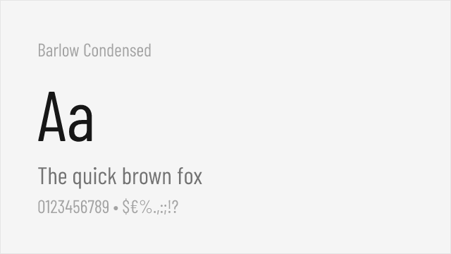
[Google Fonts] · OFL-1.1 · 9 weights
Condensed sans with a full weight range for flexible display use
Why it matches: Barlow Condensed brings Impact's narrow, space-efficient proportions in a complete weight range from Thin to Black, so you can approach Impact's heft in the Bold and Black weights while keeping lighter options for supporting text. It is cleaner and more contemporary than Impact, and far more versatile, making it a practical modern substitute for headline systems rather than one-off shouts.
headline systemssports and event graphicspackagingeditorial display
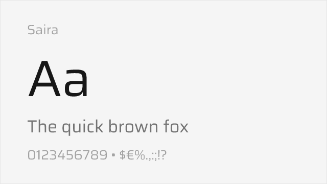
[Google Fonts] · OFL-1.1 · Variable
Variable grotesque whose heavy and condensed cuts approach Impact's weight
Why it matches: Saira is a versatile variable grotesque with a genuine width axis, and in its heavier, more condensed settings it gets into Impact's territory — dense, bold, and attention-grabbing — while offering far more control than Impact's single fixed weight. It is a looser match on personality but a much more capable tool for building a real display hierarchy.
variable display systemsdashboards and datatechnical headlinesresponsive layouts
Other Alternatives (4)
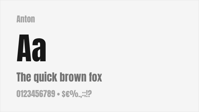
[Google Fonts] · OFL-1.1 · 1 weights
Free condensed sans-serif with excellent weight and similar high-impact presence
Why it matches: Anton shares Impact's ultra-condensed proportions and heavy weight, designed specifically for maximum visual impact in minimal horizontal space. Both feature stripped-down letterforms optimized for attention-grabbing headlines. Anton provides modern screen optimization that Impact's 1965 origins cannot match.
headlinesbanner textposter designsocial media graphics
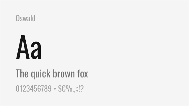
[Google Fonts] · OFL-1.1 · Variable
Modern condensed sans-serif with multiple weights and variable font option
Why it matches: Oswald provides condensed sans-serif typography with a comprehensive weight range from ExtraLight to Bold. While less extreme than Impact's ultra-heavy single weight, Oswald offers flexibility for projects needing condensed typography with nuanced hierarchy. The variable font version enables precise weight control.
website headerseditorial designdata visualizationvideo production
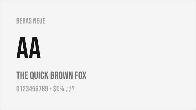
[Google Fonts] · OFL-1.1 · 1 weights
Condensed display font with all-caps design and strong visual presence
Why it matches: Bebas Neue captures condensed display typography with clean geometric forms and professional-grade execution. While less heavy than Impact, it provides similar space-efficient impact suitable for film titles, branding, and headlines. The all-caps design aligns with how Impact is commonly used.
film and videoheadlinesbrandingweb headers
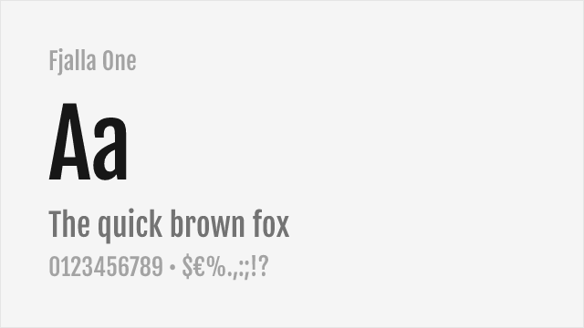
[Google Fonts] · OFL-1.1 · 1 weights
Condensed display sans-serif with strong headline presence
Why it matches: Fjalla One shares Impact's condensed display character with bold, attention-grabbing proportions. While less extreme in weight than Impact, Fjalla One provides similar space-efficient headline typography with better readability at moderate sizes. Both excel at commanding attention in limited horizontal space.
web headlinesbanner textnavigation labelsdisplay typography