Free Alternatives to Editorial New for Fashion
Looking for a free serif font for fashion projects? Editorial New by Pangram Pangram is a popular choice, but its licensing cost can be prohibitive. We've curated 8 free alternatives that work well in fashion contexts. We've identified 7 that are especially well-suited for this context. Each alternative is scored by visual similarity and contextual relevance, and ships under an open-source license for both personal and commercial use.
Top Picks
Comparison Table
| Font | Relevance ⓘ
How well this alternative fits the specific context (use-case or trait) of this page. Score 0–100 based on matching keywords, industries, and font characteristics. Alternatives scoring 25+ are highlighted.
| Similarity ⓘ
How visually similar this free font is to the premium original. Score 0–100 based on x-height, width, stroke contrast, use-case overlap, and language coverage.
Learn more → | Weights | Variable | License | Source |
|---|---|---|---|---|---|---|
| Playfair Display | 64 | 82% | Variable | Yes | OFL-1.1 | Google Fonts ↗ |
| Cormorant Garamond | 64 | 77% | 5 | No | OFL-1.1 | Google Fonts ↗ |
| Libre Caslon Text | 47 | 70% | 2 | No | OFL-1.1 | Google Fonts ↗ |
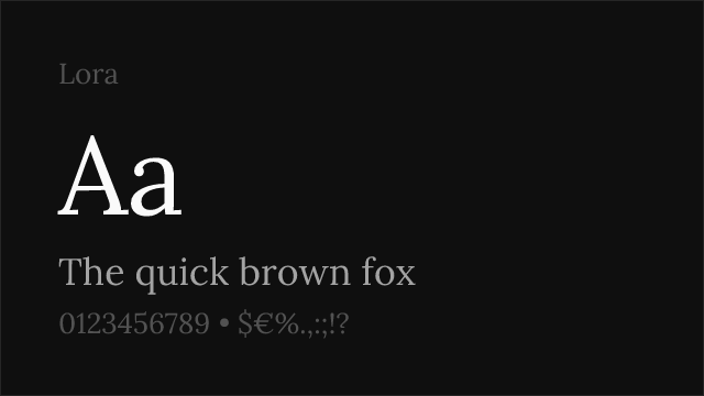
| Lora | 44 | 79% | Variable | Yes | OFL-1.1 | Google Fonts ↗ |
| EB Garamond | 44 | 75% | Variable | Yes | OFL-1.1 | Google Fonts ↗ |
| Crimson Pro | 43 | 73% | Variable | Yes | OFL-1.1 | Google Fonts ↗ |
| Fraunces | 27 | 72% | Variable | Yes | OFL-1.1 | Google Fonts ↗ |
| Bricolage Grotesque | 7 | 65% | Variable | Yes | OFL-1.1 | Google Fonts ↗ |
Most Relevant (7)


Closest high-contrast editorial match with broad versatility and wide adoption


High-contrast display Garamond with elegant proportions and editorial refinement
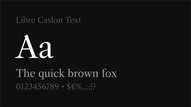

Warm Caslon revival with old-style charm and dependable text performance

Contemporary editorial serif with calligraphic warmth and versatile text performance


Refined humanist serif with old-style character and exceptional language coverage


Refined old-style serif with classical elegance and comprehensive weight range

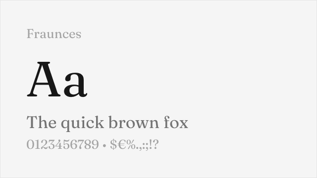
Expressive display serif with old-style influences and distinctive personality
Other Alternatives (1)
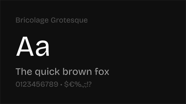
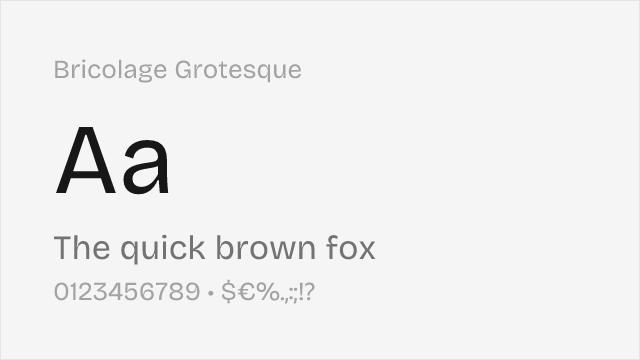
Eclectic display grotesque with optical size axis