Free Alternatives to Editorial New

About Editorial New
- Foundry
- Pangram Pangram
- Classification
- serif
- Style
- high-contrast
Brands Using Editorial New
Portfolio and case study display typography across independent design agencies
Blog headlines and editorial content for venture-backed digital products
Brand identity and campaign typography for emerging fashion brands
Event branding, speaker cards, and promotional materials for design conferences
Editorial New is a contemporary editorial serif typeface designed and released by Pangram Pangram. Blending old-style serif heritage with a distinctly modern sensibility, Editorial New has become one of the most popular premium serifs among designers, creative agencies, and startup editorial teams. Its high-contrast construction and elegant proportions serve display and headline contexts with a character that feels both historically grounded and unmistakably contemporary. The typeface has achieved widespread visibility through design showcase platforms like Behance and Dribbble, where it appears frequently in portfolio projects, brand identity work, and editorial layout explorations.
Editorial New requires a paid license from Pangram Pangram. Licensing follows Pangram Pangram's per-project model with desktop, web, and app tiers. There is no free trial or gratis version. If your budget cannot accommodate the licensing cost, this page covers the best open-source alternatives and what to consider when choosing one.
Why Editorial New Matters
Editorial New matters because it found a middle path that its more established competitors had left open. Canela occupies the warm-hybrid-serif space. Ogg owns luxury display. GT Super claims retro editorial. Each is brilliant within its territory, but each is also expensive and strongly positioned — choosing one makes a loud typographic statement. Editorial New threads between them: it carries old-style Garamond warmth without Canela's category-blurring softness, delivers high-contrast display impact without Ogg's explicit luxury signaling, and feels contemporary without GT Super's 1970s nostalgia. This middle position — classical warmth plus modern precision minus strong conceptual baggage — turns out to be exactly what creative agencies and startup editorial platforms need for everyday display typography.
Pangram Pangram's distribution strategy amplified the design. Like their Neue Montreal, Editorial New benefits from a free trial weight that lets designers experiment before licensing — a model that seeded the typeface across Behance projects, Dribbble shots, and portfolio sites, creating the visual ubiquity that drives commercial licensing. This is a fundamentally different adoption path than the foundry-specimen-to-license pipeline that Commercial Type or Klim follow, and it reaches a different audience: independent designers, small studios, and early-stage startups who discover typefaces through visual platforms rather than typographic criticism. Editorial New's photogenic proportions — elegant enough to elevate a mockup, distinctive enough to signal taste — made it perfectly suited for this discovery-driven model.
But Editorial New's popularity is not purely aesthetic. The typeface genuinely solves a design problem. Before Editorial New and its contemporaries, designers seeking a contemporary editorial serif had to choose between classical options (Garamond, Caslon, Baskerville) that felt historically specific, and premium options (Canela, Ogg, GT Super) that were well-established in fashion and luxury contexts. Editorial New offered a middle path — old-style enough to carry editorial weight, contemporary enough to feel native to digital design, and accessible enough through Pangram Pangram's straightforward licensing to be within reach of independent designers and small studios.
The old-style influence is key to understanding Editorial New's character. Unlike high-contrast Didone display serifs that derive their elegance from mechanical precision, Editorial New's elegance comes from humanist warmth — the subtle asymmetries, organic curves, and calligraphic origins that old-style typefaces carry. This gives Editorial New a friendlier, more approachable luxury than Bodoni-derived alternatives, making it well-suited for brands that want to communicate sophistication without creating emotional distance.
Creative agencies have been among the most enthusiastic adopters. When a studio needs to demonstrate typographic taste on their own website, Editorial New signals that they understand contemporary design trends while respecting classical principles. This dual signaling — modern and historically aware — is precisely what makes Editorial New effective in the creative professional context.
Design Characteristics
Editorial New's design reflects Pangram Pangram's approach of blending classical serif principles with contemporary digital refinement:
- High contrast with old-style modulation: The dramatic thick-thin variation references old-style serif tradition, with diagonal stress and organic contrast transitions rather than the mechanical vertical stress of Didone faces
- Old-style proportions with contemporary refinement: Letter widths and spacing follow humanist conventions — wider, more naturally proportioned than neoclassical designs — while the overall construction is more precisely engineered than historical old-style faces
- Elegant, calligraphy-influenced details: Terminal shapes, serif transitions, and curve inflections carry subtle calligraphic references that give the typeface its warm, handcrafted personality
- Generous x-height for screen readability: Despite its display orientation, Editorial New's x-height is calibrated for comfortable reading at medium sizes on screen, extending its utility beyond pure headline use
- Refined italic forms: The italics feature genuinely cursive letterforms with calligraphic character, providing expressive contrast for emphasis and pull quotes in editorial layouts
- Display-optimized detailing: Fine hairlines, delicate serifs, and refined curve transitions are designed to shine at headline sizes where the details are fully visible
- Balanced weight distribution: The family offers a carefully graded range where each weight maintains the typeface's essential character — the light weights preserve elegance, the bold weights maintain readability
The family ships in multiple weights with matching italics, providing adequate hierarchy for editorial and creative design systems.
Where Editorial New Excels
Editorial New is at its best in creative, editorial, and design-forward contexts:
- Creative agency portfolios: The typeface's design-community credibility makes it a natural choice for studio websites, case studies, and self-promotional materials where typographic taste matters
- Startup editorial content: Blog posts, thought leadership articles, and editorial features for technology and direct-to-consumer brands benefit from Editorial New's blend of authority and contemporary appeal
- Fashion and lifestyle branding: The old-style elegance and high-contrast display character suit fashion labels, beauty brands, and lifestyle companies that want serif sophistication with a modern edge
- Design showcase and portfolio projects: Editorial New's photogenic quality makes it effective in mockups, presentations, and visual explorations where the typography needs to demonstrate design awareness
- Independent magazine and publication design: Small publishers and editorial startups use Editorial New to establish visual credibility without the licensing costs of more established premium serifs
- Event and conference materials: Design conferences, creative summits, and cultural events use Editorial New for its ability to signal creative community belonging
Where Editorial New Struggles
Editorial New's popularity in creative portfolios obscures real limitations in production environments:
- High-volume news production: Editorial New's fashion-forward character is ill-suited for the dense, utilitarian layouts of daily news — it is too decorative for information-heavy contexts
- Small body text on screen: While better at text sizes than purely display-oriented serifs, Editorial New's high contrast still causes thin-stroke degradation below approximately 14px on screen
- Conservative institutional contexts: Banks, law firms, government agencies, and traditional corporations need serifs that convey stability and tradition, not Editorial New's creative-community energy
- Projects requiring Cyrillic or Greek: Editorial New supports Latin scripts only, limiting its use in multilingual publications
- Long-form reading at scale: Extended reading over many paragraphs reveals the display-oriented proportions and contrast — dedicated text serifs provide better sustained readability
- Contexts where Pangram Pangram's licensing is a concern: Some enterprise teams prefer typefaces from foundries with longer track records and more established licensing infrastructure
How to Choose a Free Substitute
When evaluating Editorial New replacements, prioritize these criteria:
- Contemporary editorial presence: Editorial New's value is partly cultural — it signals design awareness and creative credibility. Your alternative needs to convey intentional typographic choice rather than default or generic selection. Playfair Display and Lora both achieve this in different ways
- Old-style character with contemporary refinement: Editorial New's blend of classical heritage and modern construction is its defining quality. Test whether your alternative carries humanist warmth (organic curves, diagonal stress) alongside contemporary precision
- Display-size impact: Set your alternative at 36-60px and evaluate the visual impression — does it create the kind of editorial statement that Editorial New delivers on creative agency sites and magazine layouts?
- Text-size versatility: Unlike pure display serifs, Editorial New functions at medium body sizes. Check whether your alternative maintains readability and character at 16-18px for editorial content
- Pairing with contemporary sans-serifs: Editorial New pairs naturally with geometric and neo-grotesque sans-serifs popular in startup and creative contexts. Verify that your serif alternative creates compelling contrast with DM Sans, Space Grotesk, or Inter
Premium Font Neighbors
If Editorial New's approach resonates but you want to explore adjacent options:
Cluster A: Contemporary editorial serifs for creative contexts
- Teodor (TypeMates) — shares Editorial New's contemporary editorial positioning with a more refined, less trend-driven personality; suits studios seeking timeless rather than trending
- Cirka (Sharp Type) — contemporary display serif with old-style influences; more restrained and minimal than Editorial New but similarly positioned for creative and editorial use
- Ivy Mode (Ivy Foundry) — fashion-forward editorial serif; more overtly luxury than Editorial New but serving overlapping creative agency contexts
Cluster B: Fashion and editorial display serifs
- Canela (Commercial Type) — bridges serif and sans-serif with soft, organic forms; adjacent creative positioning with more established design-world credibility
- Portrait (Commercial Type) — high-contrast display serif with fashion credibility; more refined and less accessible than Editorial New
- Ogg (Sharp Type) — luxury display serif standard; serves the same aspirational design context but at a higher price point and with more distinctive character
- GT Super (Grilli Type) — retro-inflected display serif; different flavor but overlapping editorial and creative agency audience
- Noe Display (Schick Toikka) — high-contrast editorial display with fashion heritage; more established in traditional editorial contexts
FAQ
Is Editorial New free?
No. Editorial New is a premium typeface from Pangram Pangram with per-project licensing. Desktop, web, and app licenses are available through Pangram Pangram's website. There is no free tier or trial version. For open-source alternatives, Playfair Display (82% similarity) is the closest match.
What is the best free alternative to Editorial New?
Playfair Display is the closest free alternative at 82% similarity. Both share high-contrast serif construction designed for editorial display impact. Playfair Display's transitional structure provides a slightly different character than Editorial New's old-style influences, but the overall editorial capability and display impact are comparable. Lora (79%) is the next best option if warmth and text-size versatility matter more than display contrast.
Why is Editorial New so popular on Dribbble and Behance?
Editorial New's rise through design showcase platforms reflects its perfect positioning for the creative professional audience. Its elegant proportions photograph beautifully in mockups and presentations, its contemporary-meets-classical character signals typographic taste, and Pangram Pangram's accessible licensing model puts it within reach of independent designers and small studios. The result is a virtuous adoption cycle where showcase visibility drives further adoption.
Who uses Editorial New?
Editorial New is widely used by creative agencies, design studios, startup editorial platforms, and independent fashion labels. Its primary audience is designers and creative professionals who need serif typography that conveys both editorial authority and contemporary design awareness. It appears frequently in portfolio websites, brand identity projects, and editorial layout work.
Does Editorial New support Cyrillic?
No. Editorial New supports Latin and Latin Extended scripts only. For creative editorial projects requiring Cyrillic, Playfair Display or EB Garamond are recommended alternatives that offer comparable editorial quality with broader language coverage including Cyrillic and Greek.
Can I use Editorial New for body text?
Editorial New can function at medium body sizes (16-18px on screen) better than purely display-oriented serifs, but it is not optimized for extended reading. For body text alongside Editorial New display headlines, consider pairing with a dedicated text serif like Lora, Source Serif Pro, or Crimson Pro that shares its refined editorial personality at readable sizes.
What fonts pair well with Editorial New?
Editorial New pairs best with clean, contemporary sans-serifs popular in creative and startup design contexts. DM Sans, Space Grotesk, and Inter all work well as body text or navigation companions. The pairing should create contrast between the expressive serif display and functional sans-serif text, reflecting the design-forward aesthetic that Editorial New's audience expects.
How does Editorial New compare to Canela or Ogg?
Editorial New, Canela, and Ogg all serve the contemporary editorial serif market but with different personalities. Canela bridges serif and sans-serif with soft, organic warmth. Ogg is a luxury display standard with calligraphic elegance. Editorial New blends old-style heritage with contemporary refinement for a more accessible, design-community-oriented positioning. Canela and Ogg carry more established design-world credibility; Editorial New offers a fresher, more trend-conscious alternative.
Is Editorial New a variable font?
No. Editorial New is offered as separate static font files for each weight and style. Pangram Pangram has not released variable versions of any of their typefaces, which limits Editorial New's utility in modern web workflows that depend on continuous weight axes for fluid typography and responsive design. For projects requiring variable font technology, Playfair Display or Fraunces offer comparable editorial character with full variable font support.
Is Editorial New on Google Fonts?
No, Editorial New is a premium font from Pangram Pangram and is not available on Google Fonts.
The closest Google Fonts alternative is Playfair Display with 82% similarity. Get it free on Google Fonts ↗
Free Alternatives (8)


Closest high-contrast editorial match with broad versatility and wide adoption

Contemporary editorial serif with calligraphic warmth and versatile text performance


High-contrast display Garamond with elegant proportions and editorial refinement


Refined humanist serif with old-style character and exceptional language coverage


Refined old-style serif with classical elegance and comprehensive weight range

Expressive display serif with old-style influences and distinctive personality

Warm Caslon revival with old-style charm and dependable text performance
Eclectic display grotesque with optical size axis
See where Editorial New is used in the wild and swap to free alternatives live.
Install FontSwap →Replacement Summary
Source: FontAlternatives.com
Premium font: Editorial New
Best free alternative: Playfair Display
FontAlternatives similarity score: 82%
Replacement difficulty: Medium
Best for: editorial and magazine headlines, creative agency display type, fashion and lifestyle branding, high-impact web headers
Notable users: Various Design Studios, Startup Editorial Platforms, Independent Fashion Labels
Not recommended when: Full weight range is critical - some weights require approximation
What is the best free alternative to Editorial New?
Playfair Display is the best free alternative to Editorial New with a FontAlternatives similarity score of 82%.
Playfair Display shares similar proportions, stroke characteristics, and intended use with Editorial New. It is available under the OFL-1.1 license, which permits both personal and commercial use at no cost.
This alternative works particularly well for: editorial and magazine headlines, creative agency display type, fashion and lifestyle branding, high-impact web headers.
Can I safely replace Editorial New with Playfair Display?
Yes, with some considerations. Playfair Display achieves a FontAlternatives similarity score of 82%, indicating good structural compatibility for most use cases.
Licensing: Playfair Display is licensed under OFL-1.1, which allows commercial use without licensing fees or royalties.
Weight coverage: Some weights require approximation. See the weight-matching guide below for details.
When should I NOT replace Editorial New?
While Playfair Display is a strong alternative, there are situations where replacing Editorial New may not be appropriate:
- Optical precision requirements: Playfair Display has measurable structural differences from Editorial New that may be visible in precise design work.
- Full weight range needed: Some Editorial New weights require approximation in Playfair Display.
- Brand consistency: Editorial New is commonly seen in Creative agency portfolio websites contexts where exact letterforms may be required.
- Strict compliance: Verify that OFL-1.1 terms meet your specific legal and compliance requirements.
Weight-Matching Guide
Map Editorial New weights to their closest free alternatives for accurate font substitution.
Playfair Display
| Editorial New | Playfair Display | Match |
|---|---|---|
| Light (300) | Regular (400) | substitute |
| Regular (400) | Regular (400) | exact |
| Bold (700) | Bold (700) | exact |
| Black (900) | Black (900) | close |
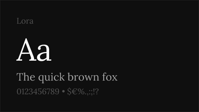
Lora
| Editorial New | Lora | Match |
|---|---|---|
| Regular (400) | Regular (400) | exact |
| Medium (500) | Medium (500) | exact |
| Semibold (600) | Semi Bold (600) | exact |
| Bold (700) | Bold (700) | exact |
Cormorant Garamond
| Editorial New | Cormorant Garamond | Match |
|---|---|---|
| Light (300) | Light (300) | close |
| Regular (400) | Regular (400) | exact |
| Semibold (600) | Semibold (600) | close |
| Bold (700) | Bold (700) | exact |
EB Garamond
| Editorial New | EB Garamond | Match |
|---|---|---|
| Regular (400) | Regular (400) | exact |
| Medium (500) | Medium (500) | exact |
| Semibold (600) | Semibold (600) | close |
| Bold (700) | Bold (700) | exact |
Crimson Pro
| Editorial New | Crimson Pro | Match |
|---|---|---|
| Light (300) | Light (300) | close |
| Regular (400) | Regular (400) | exact |
| Semibold (600) | Semibold (600) | exact |
| Bold (700) | Bold (700) | exact |
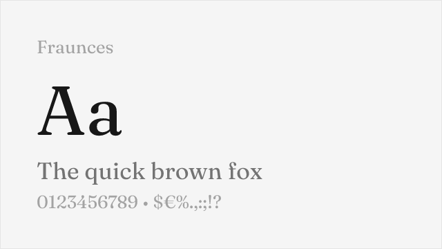
Fraunces
| Editorial New | Fraunces | Match |
|---|---|---|
| Light (300) | Light (300) | close |
| Regular (400) | Regular (400) | exact |
| Bold (700) | Bold (700) | exact |
| Black (900) | Black (900) | close |
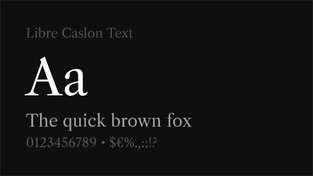
Libre Caslon Text
| Editorial New | Libre Caslon Text | Match |
|---|---|---|
| Regular (400) | Regular (400) | exact |
| Bold (700) | Bold (700) | exact |
Performance Guide
Production performance metrics for each alternative.
How to Use Playfair Display
Copy these code snippets to quickly add Playfair Display to your project.
CSS code for Playfair Display
@import url('https://fonts.googleapis.com/css2?family=Playfair+Display:wght@100..900&display=swap');HTML code for Playfair Display
<link rel="preconnect" href="https://fonts.googleapis.com">
<link rel="preconnect" href="https://fonts.gstatic.com" crossorigin>
<link href="https://fonts.googleapis.com/css2?family=Playfair+Display:wght@100..900&display=swap" rel="stylesheet">
Tailwind code for Playfair Display
// tailwind.config.js
module.exports = {
  theme: {
    extend: {
      fontFamily: {
        'playfair-display': ['"Playfair Display"', 'sans-serif'],
      },
    },
  },
}

// Usage in HTML:
// <p class="font-playfair-display">Your text here</p>
Next.js code for Playfair Display
// Using next/font (Next.js 13+)
import { Playfair_Display } from 'next/font/google';

const playfair_display = Playfair_Display({
  subsets: ['latin'],
  weight: ['100', '200', '300', '400', '500', '600', '700', '800', '900'],
});

export default function Component() {
  return (
    <p className={playfair_display.className}>
      Your text here
    </p>
  );
}

// Or using inline styles with Google Fonts link:
// <p style={{ fontFamily: '"Playfair Display"' }}>Your text</p>
Expo and React Native code for Playfair Display
// Install: npx expo install @expo-google-fonts/playfair-display expo-font
import { useFonts, Playfair_Display_400Regular } from '@expo-google-fonts/playfair-display';

export default function App() {
  const [fontsLoaded] = useFonts({
    Playfair_Display_400Regular,
  });

  if (!fontsLoaded) return null;

  return (
    <Text style={{ fontFamily: 'Playfair_Display_400Regular' }}>
      Your text here
    </Text>
  );
}
Recommended Font Pairings
These free fonts pair well with Playfair Display Editorial New for headlines, body text, or accent use.
DM Sans's clean geometric construction provides modern contrast against Editorial New's old-style serif character — the combination feels contemporary and design-forward, matching the creative agency and startup contexts where Editorial New is most popular
Space Grotesk's contemporary geometric personality creates compelling contrast with Editorial New's classical elegance, producing pairings that feel fresh and design-aware for portfolio sites and creative editorial platforms
Inter's neutral, screen-optimized precision provides functional backbone for layouts where Editorial New handles display duties — the rational sans-serif navigation against expressive serif headlines creates clear hierarchy in digital editorial design
Browse Alternatives by Context
Find Editorial New alternatives filtered by specific use case, style, or language support.
Frequently Asked Questions
What is the best free alternative to Editorial New?
Playfair Display is the best free alternative to Editorial New with a FontAlternatives similarity score of 82%. It shares similar proportions and characteristics while being available under the OFL-1.1 license for both personal and commercial use at no cost.
Is there a free version of Editorial New?
There is no official free version of Editorial New. However, Playfair Display is available under the OFL-1.1 open-source license and achieves a FontAlternatives similarity score of 82%. It includes variable weights and supports latin, latin-extended.
What Google Font looks like Editorial New?
The Google Fonts most similar to Editorial New are Playfair Display, Lora, Cormorant Garamond. Among these alternatives, Playfair Display offers the closest match with a FontAlternatives similarity score of 82% and includes variable weights for flexible typography options.
Can I use Playfair Display commercially?
Yes, Playfair Display can be used commercially. It is licensed under OFL-1.1, which allows free use in websites, applications, print materials, and commercial projects without purchasing a license or paying royalties.
Is Playfair Display similar enough to Editorial New?
Playfair Display achieves a FontAlternatives similarity score of 82% compared to Editorial New. While not identical, it offers comparable letterforms, proportions, and visual style. Most designers find it works excellently as a substitute in web and print projects.
What are the main differences between Editorial New and its free alternatives?
Free alternatives to Editorial New may differ in subtle details like letter spacing, curve refinements, and available weights. Premium fonts typically include more OpenType features, extended language support, and optimized screen rendering. However, for most projects, these differences are negligible.
Where can I download free alternatives to Editorial New?
Download Playfair Display directly from Google Fonts. Click the "Get Font" button on any alternative listed above to visit the official download page. Google Fonts also provides convenient embed codes for seamless web integration.