Free Alternatives to Gotham for Startup

6 alternatives | 6 highly relevant | sans serif | Best match: Poppins (75%)

Looking for a free sans serif font for startup projects? Gotham by Hoefler&Co is a popular choice, but its licensing cost can be prohibitive. We've curated 6 free alternatives that work well in startup contexts. We've identified 6 that are especially well-suited for this context. Each alternative is scored by visual similarity and contextual relevance, and ships under an open-source license for both personal and commercial use.

Top Picks

Comparison Table

Font Relevance Similarity Weights Variable License Source
Poppins 42 75% 9 No OFL-1.1 Google Fonts ↗
Montserrat 27 88% Variable Yes OFL-1.1 Google Fonts ↗
Raleway 26 80% Variable Yes OFL-1.1 Google Fonts ↗
Montserrat Alternates 25 72% 9 No OFL-1.1 Google Fonts ↗
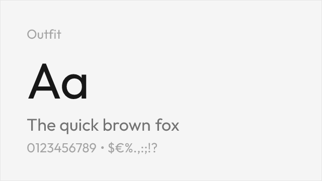
Outfit 25 70% Variable Yes OFL-1.1 Google Fonts ↗
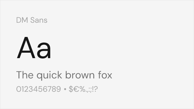
DM Sans 25 67% Variable Yes OFL-1.1 Google Fonts ↗

All Alternatives (6)

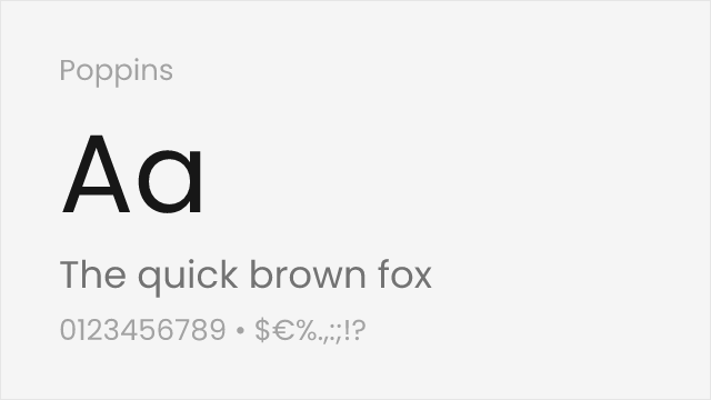
#1 Poppins 75%
[Google Fonts] · OFL-1.1 · 9 weights

Rounded geometric forms with comparable modernist aesthetic
Why it matches: Poppins offers a slightly warmer interpretation of Gotham's geometric sans-serif style. While rounder in character, it maintains the same modernist spirit and authoritative presence. The comprehensive weight range and optimized screen rendering make it excellent for digital applications where Gotham would be used.
web applicationsUI designtech brandingmultilingual projects
Get Font ↗
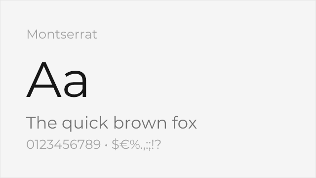
#2 Montserrat 88%
[Google Fonts] · OFL-1.1 · Variable

Very close geometric proportions with similar weight range and bold presence
Why it matches: Montserrat shares Gotham's geometric foundations with similar letter proportions and stroke widths. Both typefaces feature confident, authoritative uppercase letters and balanced lowercase forms. The x-height, aperture openness, and overall typographic color closely mirror Gotham's distinctive American vernacular character.
political campaignsbrand identitydisplay headlinesadvertising
Get Font ↗
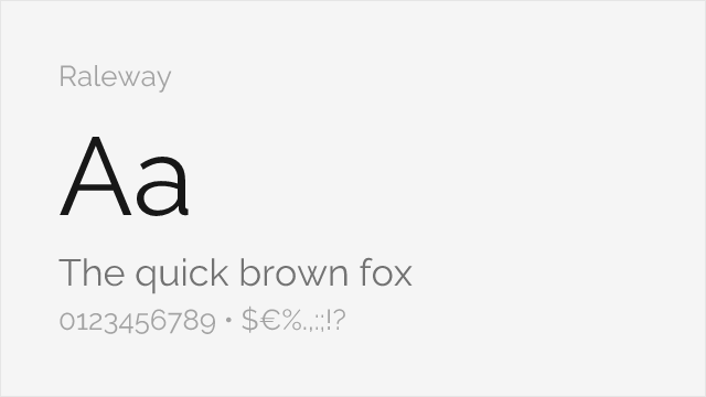
#3 Raleway 80%
[Google Fonts] · OFL-1.1 · Variable

Shares geometric foundations with elegant thin weights for display use
Why it matches: Raleway captures Gotham's geometric precision with particularly elegant thin weights. The letterforms share similar proportions and the distinctive character of American vernacular lettering. Raleway excels in display contexts where Gotham's sophisticated appearance is desired, though its distinctive 'W' adds unique character.
display typographycreative brandingportfolio websiteseditorial design
Get Font ↗
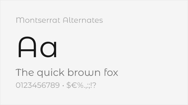
[Google Fonts] · OFL-1.1 · 9 weights

Montserrat's sister family with softer, curved alternate letterforms
Why it matches: Montserrat Alternates keeps Montserrat's — and so Gotham's — geometric proportions but swaps in softer, single-storey alternate letterforms for a friendlier voice. It suits display and logo work where you want Gotham's confidence with a little more warmth.
friendly brandinglogosdisplay headlines
Get Font ↗
#5 Outfit 70%
[Google Fonts] · OFL-1.1 · Variable

Clean geometric sans with a full variable weight range, close to Gotham's build
Why it matches: Outfit is a modern geometric sans with the same wide, upright, evenly weighted construction that gives Gotham its confident presence. Its round bowls and two-storey 'a' echo Gotham's American-vernacular geometry, and the full nine-weight variable family makes it flexible enough to carry a whole identity the way Gotham does.
brand identitydisplay headlinesmarketing sites
Get Font ↗
#6 DM Sans 67%
[Google Fonts] · OFL-1.1 · Variable

Low-contrast geometric sans tuned for screens

Why it matches: DM Sans is a low-contrast geometric sans with even color and a generous x-height, sharing Gotham's clean, no-nonsense geometry in a package built for the screen. It is more compact and neutral than Gotham's wide American forms, but reads in the same modern, trustworthy register.
product UIdashboardsinterface text
Get Font ↗

Related Pages