Free Alternatives to Knockout for Editorial
Looking for a free display font for editorial projects? Knockout by Hoefler&Co is a popular choice, but its licensing cost can be prohibitive. We've curated 8 free alternatives that work well in editorial contexts. We've identified 4 that are especially well-suited for this context. Each alternative is scored by visual similarity and contextual relevance, and ships under an open-source license for both personal and commercial use.
Top Picks
Comparison Table
| Font | Relevance ⓘ
How well this alternative fits the specific context (use-case or trait) of this page. Score 0–100 based on matching keywords, industries, and font characteristics. Alternatives scoring 25+ are highlighted.
| Similarity ⓘ
How visually similar this free font is to the premium original. Score 0–100 based on x-height, width, stroke contrast, use-case overlap, and language coverage.
Learn more → | Weights | Variable | License | Source |
|---|---|---|---|---|---|---|
| Raleway | 43 | 70% | Variable | Yes | OFL-1.1 | Google Fonts ↗ |
| Oswald | 28 | 82% | Variable | Yes | OFL-1.1 | Google Fonts ↗ |
| Barlow | 28 | 76% | 9 | No | OFL-1.1 | Google Fonts ↗ |
| Montserrat | 27 | 68% | Variable | Yes | OFL-1.1 | Google Fonts ↗ |
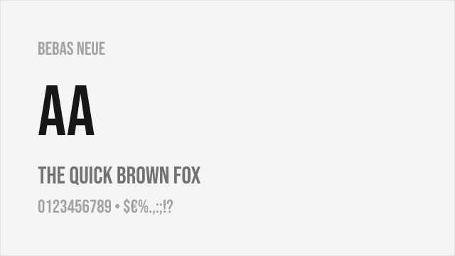
| Bebas Neue | 8 | 79% | 1 | No | OFL-1.1 | Google Fonts ↗ |
| Fjalla One | 7 | 74% | 1 | No | OFL-1.1 | Google Fonts ↗ |
| Anton | 7 | 72% | 1 | No | OFL-1.1 | Google Fonts ↗ |
| Montserrat Alternates | 7 | 70% | 9 | No | OFL-1.1 | Google Fonts ↗ |
Most Relevant (4)
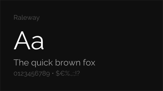
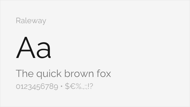
Geometric display sans with elegant proportions available in condensed styles
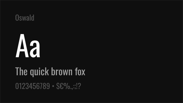
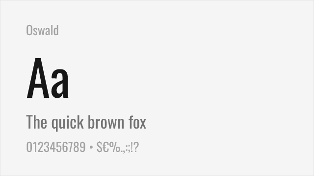
Closest free condensed gothic with strong display character and variable font support


Versatile sans-serif family with condensed variant matching Knockout's narrower widths


Geometric sans-serif with strong display presence and comprehensive weight range
Other Alternatives (4)
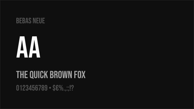
Bold condensed all-caps display font with strong impact and widespread recognition
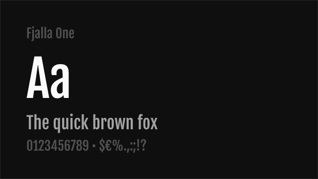

Condensed display sans-serif with commanding presence for headlines
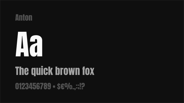
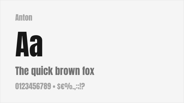
Ultra-condensed display sans with maximum headline impact
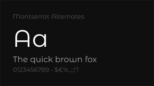
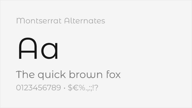
Montserrat variant with softer, curved alternate letterforms