Free Alternatives to Museo Sans with Modern Style
Museo Sans is known for its modern aesthetic. If you're looking for a free sans serif font with a similar modern feel, these 3 alternatives offer comparable characteristics. We've identified 3 that are especially well-suited for this context. All are available under open-source licenses for unrestricted commercial use.
Top Picks
Comparison Table
| Font | Relevance ⓘ
How well this alternative fits the specific context (use-case or trait) of this page. Score 0–100 based on matching keywords, industries, and font characteristics. Alternatives scoring 25+ are highlighted.
| Similarity ⓘ
How visually similar this free font is to the premium original. Score 0–100 based on x-height, width, stroke contrast, use-case overlap, and language coverage.
Learn more → | Weights | Variable | License | Source |
|---|---|---|---|---|---|---|
| Poppins | 76 | 78% | 9 | No | OFL-1.1 | Google Fonts ↗ |
| Nunito Sans | 48 | 88% | Variable | Yes | OFL-1.1 | Google Fonts ↗ |
| Lato | 36 | 82% | 5 | No | OFL-1.1 | Google Fonts ↗ |
All Alternatives (3)


[Google Fonts] · OFL-1.1 · 9 weights
Comparable geometric foundations with slightly rounder forms
Why it matches: Poppins shares Museo Sans's geometric construction with similar clean aesthetics suitable for modern branding. Both work well across interfaces and marketing. Poppins has rounder forms than Museo Sans but maintains the same professional versatility.
tech brandingweb applicationscontemporary designuser interfaces
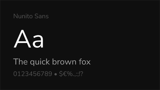
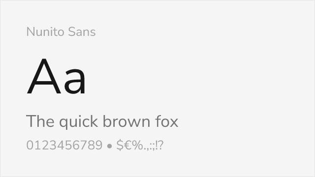
[Google Fonts] · OFL-1.1 · Variable
Similar proportions with comparable balance between geometric and humanist qualities
Why it matches: Nunito Sans shares Museo Sans's balance between geometric structure and humanist warmth. Both feature tall x-heights, open apertures, and versatile character suitable for interfaces and body text. Nunito Sans provides variable font support and comprehensive weight range that rivals Museo Sans's commercial offering.
user interfacesSaaS applicationsdocumentationweb applications
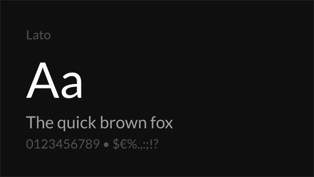
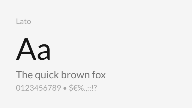
[Google Fonts] · OFL-1.1 · 5 weights
Shares the blend of geometric structure with humanist warmth
Why it matches: Lato captures Museo Sans's duality of appearing neutral in body text while revealing warm character at display sizes. Both feature humanist touches softening geometric foundations. Lato's versatility across professional and expressive contexts matches Museo Sans's adaptability.
corporate communicationswebsite body textbrand identityprint materials