Free Alternatives to Neue Haas Grotesk for Signage

8 alternatives | 7 highly relevant | sans serif | Best match: Barlow (74%)

Looking for a free sans serif font for signage projects? Neue Haas Grotesk by Linotype is a popular choice, but its licensing cost can be prohibitive. We've curated 8 free alternatives that work well in signage contexts. We've identified 7 that are especially well-suited for this context. Each alternative is scored by visual similarity and contextual relevance, and ships under an open-source license for both personal and commercial use.

Top Picks

Comparison Table

Font Relevance Similarity Weights Variable License Source
Barlow 73 74% 9 No OFL-1.1 Google Fonts ↗
Roboto 44 82% Variable Yes Apache-2.0 Google Fonts ↗
Noto Sans 43 72% Variable Yes OFL-1.1 Google Fonts ↗
Inter 37 86% Variable Yes OFL-1.1 Google Fonts ↗
Source Sans 3 34 80% Variable Yes OFL-1.1 Google Fonts ↗
Nimbus Sans 27 88% 2 No GPL-2.0-with-font-exception fontsquirrel ↗
Libre Franklin 26 78% Variable Yes OFL-1.1 Google Fonts ↗
DM Sans 8 76% Variable Yes OFL-1.1 Google Fonts ↗

Most Relevant (7)

#1 Barlow 74% Relevant
[Google Fonts] · OFL-1.1 · 9 weights

Utilitarian grotesque with slightly condensed proportions and California-influenced design

Why it matches: Barlow shares Neue Haas Grotesk's utilitarian, no-nonsense approach to sans-serif design. Both prioritize functional clarity over stylistic personality, though Barlow's Californian heritage gives it a slightly different regional character than Neue Haas Grotesk's Swiss precision. Barlow's slightly condensed proportions echo Neue Haas Grotesk's compact character without being explicitly narrow, and both typefaces produce even typographic color in paragraph settings. The comprehensive weight range from Thin to Black supports the same corporate and editorial hierarchies.
government and institutional web projectsdata visualization and infographicsspace-efficient editorial layoutswayfinding and signage systems
Get Font ↗
#2 Roboto 82% Relevant
[Google Fonts] · Apache-2.0 · Variable

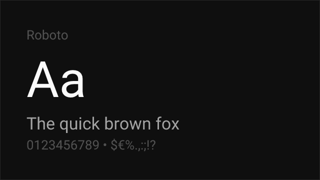
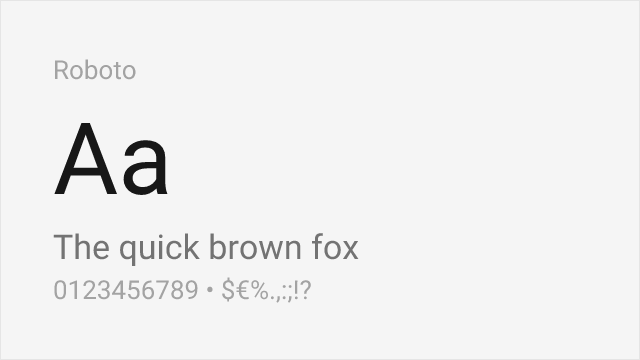
Google's system font with comparable neutral character and enterprise-grade screen optimization

Why it matches: Roboto shares Neue Haas Grotesk's ambition to be a universal, neutral sans-serif — the typographic equivalent of a clear window. Both blend grotesque and geometric elements, with Roboto leaning slightly more geometric in its `o`, `e`, and `c` while maintaining grotesque proportions in its overall skeleton. Roboto's screen optimization gives it cleaner rendering at small sizes on low-density displays, while Neue Haas Grotesk's phototype heritage gives it superior print performance. The shared neutral-to-a-fault character makes them functionally interchangeable in many corporate and UI contexts.
cross-platform mobile applicationsMaterial Design implementationsenterprise web applicationsdata-dense dashboards
Get Font ↗
#3 Noto Sans 72% Relevant
[Google Fonts] · OFL-1.1 · Variable

Google's universal sans with unmatched language coverage and consistent cross-platform rendering

Why it matches: Noto Sans shares Neue Haas Grotesk's foundational goal — to be a universal, neutral typeface that works for everything. Google designed Noto Sans to cover every Unicode script, just as Neue Haas Grotesk was designed to be the universal Swiss sans-serif. Both feature moderate x-heights, controlled proportions, and even typographic color. Noto Sans is slightly more mechanical and less refined than Neue Haas Grotesk's hand-drawn origins, but its unmatched script coverage (900+ languages) makes it the only viable choice for truly global projects.
multilingual global productsinternationalized enterprise platformscross-script design systemsUN and international organization projects
Get Font ↗
#4 Inter 86% Relevant
[Google Fonts] · OFL-1.1 · Variable

Closest modern match with screen-first optimization and comprehensive variable font support

Why it matches: Both are neo-grotesques, but sixty years of typographic history separate them. Neue Haas Grotesk carries the DNA of Helvetica as Max Miedinger originally intended it — tighter apertures on the `c`, `e`, and `s`, denser typographic color in paragraphs, and a proportional system designed for phototype composition and metal-era print. Inter was born digital, with apertures opened wide for screen legibility and spacing tuned for subpixel rendering. Compare the lowercase `e`: Neue Haas Grotesk's counter opening is restrained, almost guarded, producing the dense Swiss texture that fashion brands and cultural institutions value. Inter's `e` opens generously, sacrificing that density for clarity at 14px on a backlit display. The philosophical gap matters too — choosing Neue Haas Grotesk signals awareness of the Helvetica lineage and typographic connoisseurship. Choosing Inter signals pragmatic modernity. For digital-first projects where the Helvetica heritage is aspirational rather than essential, Inter delivers the same structural neutrality with superior screen performance.
corporate web redesignsdesign system migrationscontent-heavy interfacescross-platform brand typography
Get Font ↗
#5 Source Sans 3 80% Relevant
[Google Fonts] · OFL-1.1 · Variable

Adobe's workhorse sans with strong hinting and proven enterprise reliability

Why it matches: Source Sans 3 matches Neue Haas Grotesk's commitment to professional utility through generous apertures, careful hinting, and rational construction. While Neue Haas Grotesk is more strictly neo-grotesque, Source Sans 3 adds subtle humanist touches — slightly curved terminals, marginally more organic proportions — that improve readability in long-form digital content. Adobe's rigorous quality assurance and extensive language support make Source Sans 3 more reliable across diverse rendering environments than Neue Haas Grotesk's digitizations, which vary in quality across platforms.
enterprise applicationsgovernment and institutional sitesdocumentation and knowledge basesmultilingual web platforms
Get Font ↗
#6 Nimbus Sans 88% Relevant
[fontsquirrel] · GPL-2.0-with-font-exception · 2 weights

URW's metric-compatible Helvetica clone with identical character widths

Why it matches: Nimbus Sans replicates the neo-grotesque forms that Neue Haas Grotesk originated — identical horizontal terminals, uniform stroke width, and matching character proportions. As a metric-compatible Helvetica clone, it preserves the design DNA that Neue Haas Grotesk defined before the Helvetica rebrand.
print productionPDF generationlegacy system migration
Get Font ↗
#7 Libre Franklin 78% Relevant
[Google Fonts] · OFL-1.1 · Variable

American gothic with editorial utility that parallels Neue Haas Grotesk's corporate workhorse role

Why it matches: Libre Franklin shares Neue Haas Grotesk's role as a workhorse corporate typeface, though through the American gothic tradition rather than the Swiss one. Both are designed for the demands of professional publishing — sturdy construction, moderate contrast, and workmanlike clarity that stays out of the content's way. Libre Franklin's slightly more condensed proportions and American character give it a different flavor, but the functional overlap in corporate communications, editorial layouts, and institutional identity systems is substantial.
corporate communicationsnews and publishing sitesinstitutional identity systemsprint-to-digital migration
Get Font ↗

Other Alternatives (1)

#8 DM Sans 76%
[Google Fonts] · OFL-1.1 · Variable

Geometric-grotesque blend with clean proportions and modern sensibility

Why it matches: DM Sans bridges geometric and grotesque traditions in a way that produces a reading experience similar to Neue Haas Grotesk's at screen sizes. Both typefaces feature balanced proportions, controlled letter-spacing, and a neutral personality that prioritizes content over typeface. DM Sans is rounder and more open than Neue Haas Grotesk's tighter Swiss forms, which makes it more legible on screen at the cost of typographic density. The geometric influence gives DM Sans a more contemporary feel compared to Neue Haas Grotesk's historical weight.
modern corporate redesignsstartup product interfacesconsumer-facing web applicationsmarketing and landing pages
Get Font ↗

Related Pages