Free Alternatives to Neue Haas Grotesk Supporting Cyrillic
Need a free alternative to Neue Haas Grotesk with Cyrillic script support? These 5 options include Cyrillic characters and share visual similarities with Neue Haas Grotesk. Each is licensed for free personal and commercial use.
Top Picks
Comparison Table
| Font | Relevance ⓘ
How well this alternative fits the specific context (use-case or trait) of this page. Score 0–100 based on matching keywords, industries, and font characteristics. Alternatives scoring 25+ are highlighted.
| Similarity ⓘ
How visually similar this free font is to the premium original. Score 0–100 based on x-height, width, stroke contrast, use-case overlap, and language coverage.
Learn more → | Weights | Variable | License | Source |
|---|---|---|---|---|---|---|
| Nimbus Sans | 0 | 88% | 2 | No | GPL-2.0-with-font-exception | fontsquirrel ↗ |
| Inter | 0 | 86% | Variable | Yes | OFL-1.1 | Google Fonts ↗ |
| Roboto | 0 | 82% | Variable | Yes | Apache-2.0 | Google Fonts ↗ |
| Source Sans 3 | 0 | 80% | Variable | Yes | OFL-1.1 | Google Fonts ↗ |
| Noto Sans | 0 | 72% | Variable | Yes | OFL-1.1 | Google Fonts ↗ |
All Alternatives (5)


[fontsquirrel] · GPL-2.0-with-font-exception · 2 weights
URW's metric-compatible Helvetica clone with identical character widths
Why it matches: Nimbus Sans replicates the neo-grotesque forms that Neue Haas Grotesk originated — identical horizontal terminals, uniform stroke width, and matching character proportions. As a metric-compatible Helvetica clone, it preserves the design DNA that Neue Haas Grotesk defined before the Helvetica rebrand.
print productionPDF generationlegacy system migration


[Google Fonts] · OFL-1.1 · Variable
Closest modern match with screen-first optimization and comprehensive variable font support
Why it matches: Both are neo-grotesques, but sixty years of typographic history separate them. Neue Haas Grotesk carries the DNA of Helvetica as Max Miedinger originally intended it — tighter apertures on the `c`, `e`, and `s`, denser typographic color in paragraphs, and a proportional system designed for phototype composition and metal-era print. Inter was born digital, with apertures opened wide for screen legibility and spacing tuned for subpixel rendering. Compare the lowercase `e`: Neue Haas Grotesk's counter opening is restrained, almost guarded, producing the dense Swiss texture that fashion brands and cultural institutions value. Inter's `e` opens generously, sacrificing that density for clarity at 14px on a backlit display. The philosophical gap matters too — choosing Neue Haas Grotesk signals awareness of the Helvetica lineage and typographic connoisseurship. Choosing Inter signals pragmatic modernity. For digital-first projects where the Helvetica heritage is aspirational rather than essential, Inter delivers the same structural neutrality with superior screen performance.
corporate web redesignsdesign system migrationscontent-heavy interfacescross-platform brand typography
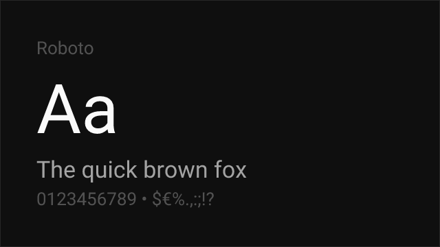
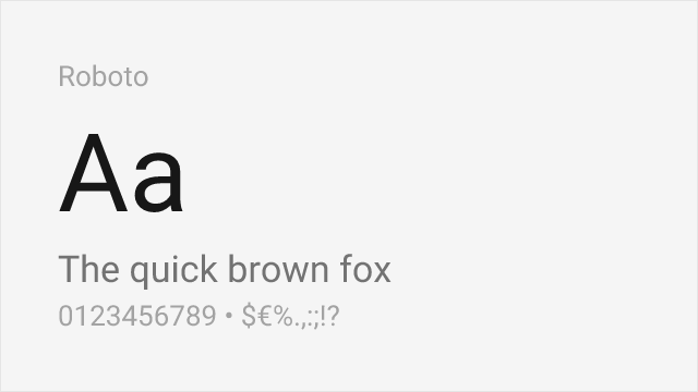
[Google Fonts] · Apache-2.0 · Variable
Google's system font with comparable neutral character and enterprise-grade screen optimization
Why it matches: Roboto shares Neue Haas Grotesk's ambition to be a universal, neutral sans-serif — the typographic equivalent of a clear window. Both blend grotesque and geometric elements, with Roboto leaning slightly more geometric in its `o`, `e`, and `c` while maintaining grotesque proportions in its overall skeleton. Roboto's screen optimization gives it cleaner rendering at small sizes on low-density displays, while Neue Haas Grotesk's phototype heritage gives it superior print performance. The shared neutral-to-a-fault character makes them functionally interchangeable in many corporate and UI contexts.
cross-platform mobile applicationsMaterial Design implementationsenterprise web applicationsdata-dense dashboards


[Google Fonts] · OFL-1.1 · Variable
Adobe's workhorse sans with strong hinting and proven enterprise reliability
Why it matches: Source Sans 3 matches Neue Haas Grotesk's commitment to professional utility through generous apertures, careful hinting, and rational construction. While Neue Haas Grotesk is more strictly neo-grotesque, Source Sans 3 adds subtle humanist touches — slightly curved terminals, marginally more organic proportions — that improve readability in long-form digital content. Adobe's rigorous quality assurance and extensive language support make Source Sans 3 more reliable across diverse rendering environments than Neue Haas Grotesk's digitizations, which vary in quality across platforms.
enterprise applicationsgovernment and institutional sitesdocumentation and knowledge basesmultilingual web platforms

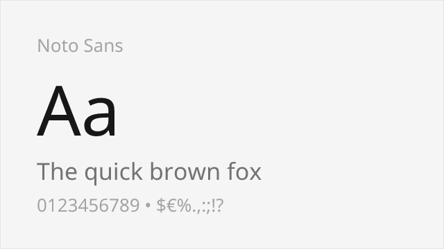
[Google Fonts] · OFL-1.1 · Variable
Google's universal sans with unmatched language coverage and consistent cross-platform rendering
Why it matches: Noto Sans shares Neue Haas Grotesk's foundational goal — to be a universal, neutral typeface that works for everything. Google designed Noto Sans to cover every Unicode script, just as Neue Haas Grotesk was designed to be the universal Swiss sans-serif. Both feature moderate x-heights, controlled proportions, and even typographic color. Noto Sans is slightly more mechanical and less refined than Neue Haas Grotesk's hand-drawn origins, but its unmatched script coverage (900+ languages) makes it the only viable choice for truly global projects.
multilingual global productsinternationalized enterprise platformscross-script design systemsUN and international organization projects