Free Alternatives to SF Pro Display Supporting Cyrillic
Need a free alternative to SF Pro Display with Cyrillic script support? These 4 options include Cyrillic characters and share visual similarities with SF Pro Display. Each is licensed for free personal and commercial use.
Top Picks
Comparison Table
| Font | Relevance ⓘ
How well this alternative fits the specific context (use-case or trait) of this page. Score 0–100 based on matching keywords, industries, and font characteristics. Alternatives scoring 25+ are highlighted.
| Similarity ⓘ
How visually similar this free font is to the premium original. Score 0–100 based on x-height, width, stroke contrast, use-case overlap, and language coverage.
Learn more → | Weights | Variable | License | Source |
|---|---|---|---|---|---|---|
| Inter | 0 | 88% | Variable | Yes | OFL-1.1 | Google Fonts ↗ |
| Roboto | 0 | 78% | Variable | Yes | Apache-2.0 | Google Fonts ↗ |
| Source Sans 3 | 0 | 76% | Variable | Yes | OFL-1.1 | Google Fonts ↗ |
| Noto Sans | 0 | 72% | Variable | Yes | OFL-1.1 | Google Fonts ↗ |
All Alternatives (4)


[Google Fonts] · OFL-1.1 · Variable
Closest open-source match with variable font support and similar screen-optimized proportions
Why it matches: Rasmus Andersson built Inter explicitly "for computer screens," and that mission statement overlaps almost perfectly with Apple's goals for SF Pro. The critical parallel is optical sizing: SF Pro switches between Display and Text variants based on rendered point size, automatically tightening spacing and adding stroke detail at large sizes while widening counters at small ones. Inter replicates this behavior through its variable font optical sizing axis — a continuous version of the same idea. The practical result is that both typefaces adapt to the jump from a 13px sidebar label to a 48px hero headline without manual tracking adjustment. Where SF Pro is locked to Apple's Core Text renderer and legally restricted to the Apple ecosystem, Inter renders consistently across Chrome, Firefox, and every operating system, making it the standard bridge for teams designing SF Pro-quality interfaces that must also ship on Android and Windows.
cross-platform app interfacesdesign system foundationsdata-dense dashboardsdeveloper documentation sites
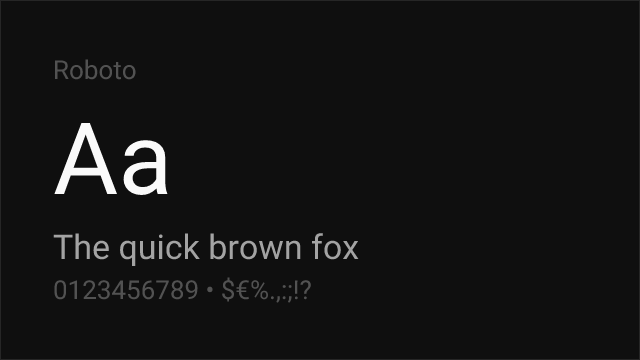
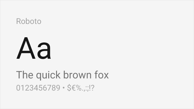
[Google Fonts] · Apache-2.0 · Variable
Google's system font with comparable screen optimization and UI heritage
Why it matches: Roboto is to Android what SF Pro is to iOS — a system font engineered for screen legibility across a vast range of devices and contexts. Both share a hybrid construction that blends grotesque and geometric elements, with open counters optimized for small-size rendering. Roboto's slightly more mechanical character and wider proportions distinguish it from SF Pro's DIN-influenced curves, but the functional overlap in UI contexts is substantial. Both handle data tables, navigation systems, and form elements with the same utilitarian clarity.
cross-platform mobile appsMaterial Design implementationsenterprise web applicationsdata-heavy interfaces


[Google Fonts] · OFL-1.1 · Variable
Adobe's workhorse sans with strong hinting and broad language coverage
Why it matches: Source Sans 3 matches SF Pro Display's commitment to legibility through generous apertures, careful hinting, and a rational construction. While SF Pro leans toward geometric warmth, Source Sans 3 adds subtle humanist touches that improve readability in long-form content. Its extensive language support and Adobe's rigorous quality assurance make it reliable across diverse rendering environments. The weight distribution from ExtraLight to Black parallels SF Pro's comprehensive range.
enterprise applications with multilingual needsgovernment and institutional sitesdocumentation systemscross-browser web applications

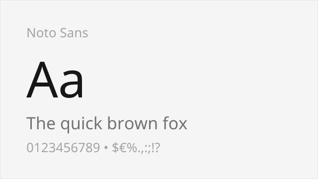
[Google Fonts] · OFL-1.1 · Variable
Google's universal font with unmatched language coverage and consistent screen rendering
Why it matches: Noto Sans shares SF Pro Display's mission of universal legibility — Google designed it to cover every Unicode script, just as Apple designed SF Pro to work across every Apple device. Both typefaces feature a moderate x-height, clean grotesque forms, and consistent typographic color. Noto Sans is slightly more mechanical in its construction and lacks SF Pro's DIN-influenced warmth, but its unmatched language coverage (900+ languages) makes it indispensable for truly global products where SF Pro's script coverage falls short.
multilingual global productsinternationalized web applicationsenterprise platforms with CJK requirementscross-script design systems