 Install FontSwap

Geist Serif is Vercel’s high-contrast display serif, released on 30 October 2026 as the fourth member of the Geist family. It is free under the SIL Open Font License 1.1, it has one weight (Regular) and four dot styles, and you install it with npm i geist. It is not on Google Fonts yet. It has no Cyrillic or Greek characters, and Vercel says Cyrillic support is planned.
Vercel designed it for headlines and other large sizes, and it shares its cap height and x-height with Geist Sans. This post covers what Vercel says about the font, how to load it, what we measured in the official v1.9.0 files, and which free serifs to use when Geist Serif does not fit.
Geist Serif FAQ
Is Geist Serif free?
Yes. The geist-font repository licenses the family under the SIL Open Font License 1.1, and the licence text lets you use, embed, modify and redistribute the font. You may not sell the font by itself, and a redistributed copy has to carry the licence and copyright notice.
How do I install Geist Serif?
Run npm i geist, as in the README, or download the files from the releases page. The geist package is built for Next.js. Its 1.9.0 package.json lists next >=13.2.0 as a peer dependency, and Vercel’s font page says every export is a Next.js font object. In another framework, use the downloaded files instead. The install section below has the imports and CSS.
Where can I download the Geist Serif font?
The latest release is a zip with a GeistSerif folder that holds ttf, variable and webfonts subfolders. Our Geist Serif font page summarises the font, and Vercel’s font page also links the downloads.
Is Geist Serif on Google Fonts?
Not yet. The README says “Geist Serif is not on Google Fonts yet”, and the launch post says it “will come to Google Fonts after launch”. That is a plan, with no date.
Does it have bold or italic?
No. Regular is the only weight and there is no italic. The launch post describes weights from Thin (100) to Black (900) and an italic as work in progress.
Does it support Cyrillic or Greek?
No. We found no Cyrillic and no Greek code points in the file. Vercel says Cyrillic support is planned and does not mention Greek.
Which characters is Geist Serif missing?
We checked the v1.9.0 variable file. Of the 96 characters in the Latin-1 Supplement block, 83 are present. The 13 missing are ¢ £ ¤ ¬ ± ² ³ µ ¹ ¼ ½ ¾ and the soft hyphen. The caret ^ is also missing from Basic Latin. $, € and ¥ are present, so only £ and ¢ matter for prices, and they fall back to the next font in your stack. Vietnamese is complete. All 146 precomposed Vietnamese letters we tested are in the file, and so is the whole Vietnamese block (U+1EA0 to U+1EF9, 90 of 90).
What Geist Serif is
Geist Serif is the Vercel serif font that joins Sans, Mono and Pixel. Our Geist Serif font page has its profile, language support and alternatives. Vercel’s launch post, Introducing Geist Serif, calls it “a high-contrast display serif built on the same foundations as Geist Sans, Geist Mono, and Geist Pixel”, with “fine, saw-toothed serifs and sharp hairlines”. It names the references as fashion, editorial design and magazine headlines, including Rolling Stone and Harper’s Bazaar. Evil Rabbit and Mark Davis wrote the post. According to the post, the first sketches came from Evil Rabbit, Andrés Briganti expanded them, and Mark Davis took over the drawings.
Vercel says it made the first release a display face and “thinned every downstroke by 50%” to push the contrast. That matters for how you use it. Set it large, for headlines, posters and hero text, and keep body copy in a text face.
Vercel’s specs for this release are 1 weight, 4 variants, 5 stylistic sets (ss01 to ss05), 352 supported languages and more than 52,000 kerning pairs. The launch post gives 894 glyphs and the table on vercel.com/font gives 854. The variable file we measured holds 896 glyph records and 459 encoded characters.
Where it fits in the Geist family
Geist Sans, Geist Mono and Geist Pixel came first. Vercel’s own comparison puts the serif next to Sans like this, and the last column is what we measured in the v1.9.0 files.
| Metric (per 1,000 em) | Geist Sans (Vercel) | Geist Serif (Vercel) | Geist Serif (our measurement) |
|---|---|---|---|
| Cap height | 710 | 710 | 710 |
| x-height | 530 | 530 | 530 |
| Ascender | 710 | 750 | 768 to 775 |
| Descender | -150 | -200 | -200 |
Cap height and x-height match in the files, so you can swap the serif into a Geist Sans layout without changing the font size. The ascender row differs from Vercel’s table. In the outlines, b, d, h, k and l reach 768 to 775 units, not 750. We cannot tell whether the table lists a design value or a rounded one, so treat it as approximate for glyph heights.
The font’s own line metrics are a separate set of numbers. Its hhea table, and the OS/2 typographic metrics, hold an ascent of 1,005 and a descent of -295 with no line gap, which gives a line height of 1.30. These are line-box values and not glyph extents, so they are not comparable with Vercel’s 750 and -200. Use the 1.30 figure when you set line-height for the font’s default spacing.
Vercel also says the stems match Geist Sans. In our measurement the vertical stem of H is 94 units in Geist Serif and 86 in Geist Sans at weight 400, so they are close but not equal. We did not look for the Sans weight that matches exactly.
Geist Mono Regular has the same 530 and 710. The Geist Pixel Square file we checked is 532 and 722, so “four families, one x-height” holds for Sans, Serif and Mono and is a close approximation for Pixel.
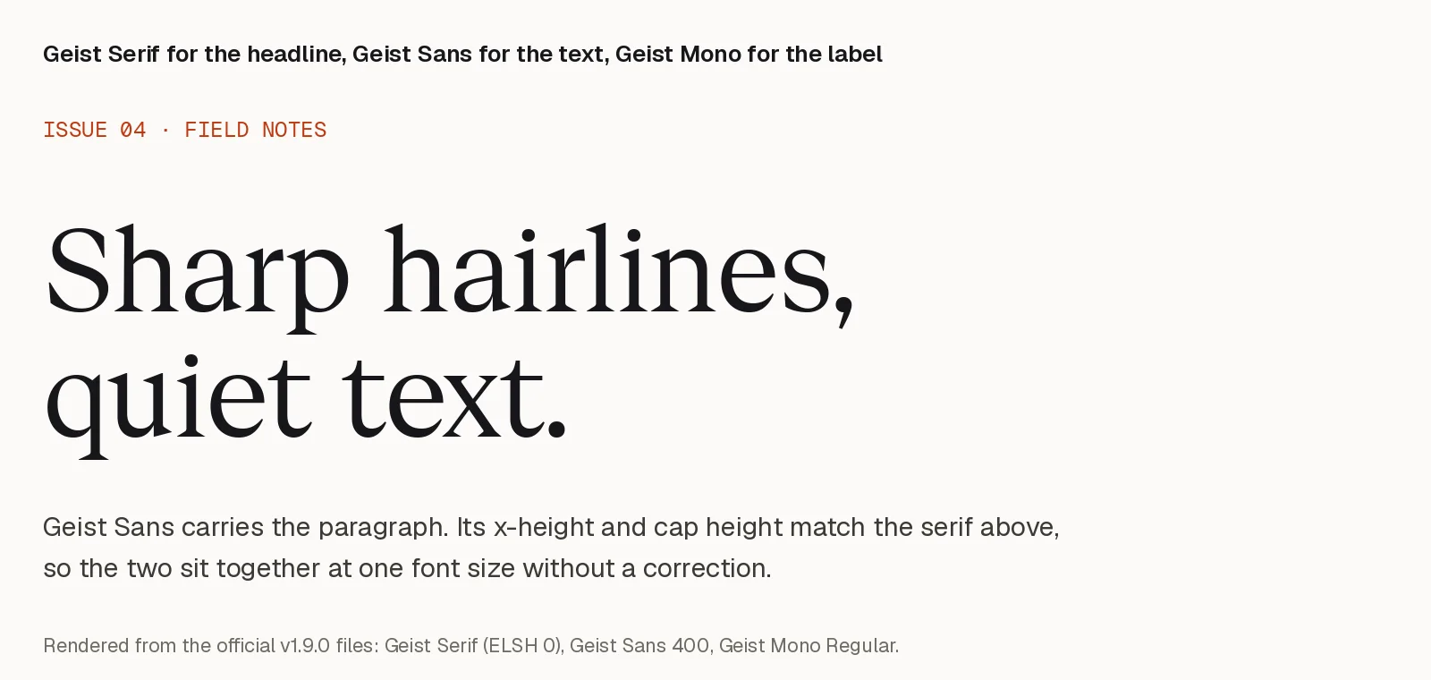
The image sets the three at one font size, rendered from the official files. The roles are our choice. Geist Serif for the headline, Geist for text and Geist Mono for labels and code keeps one x-height across all three. For a full UI comparison of the sans-serifs, see Geist vs Inter vs Satoshi.
The four variants and the ELSH axis
The variable font has one axis, Element Shape (ELSH), from 0 to 100. Vercel’s README maps four values to four shapes.
| Shape | ELSH value |
|---|---|
| Regular (round dots, the default) | 0 |
| Square | 25 |
| Triangle | 50 |
| Heart | 100 |
Vercel says the axis swaps “the shape of every dot in the font”. The swap happens in shaping, through the font’s feature variations, so comparing outlines glyph by glyph finds nothing. We shaped each of the 459 encoded characters on its own with HarfBuzz at ELSH 0, 25, 50 and 100 and compared the glyph that results. In the variable file 87 of the 459 change, and the same 87 change at all three non-default settings: ! , . : ; ? ¡ ¿ · • ÷, the quotes ‚ “ ” „, i, j, and the letters that carry a dot accent, a dieresis, a comma accent or a dot below, such as ä ö ë ï Ä Ö ė ġ ķ ș ẹ ạ. Of the 72 changed glyphs that are built from parts, the base letter stays the same and only the dot or comma part is swapped. The other 372 characters are identical at every setting, so only the dots change.
The static Square, Triangle and Heart files change 90 characters against the static Regular file. They add ‘ ’ …, which the variable file leaves unchanged at every ELSH value. Vercel’s font page says Regular and Square suit primary typography, while Triangle and Heart are more decorative.
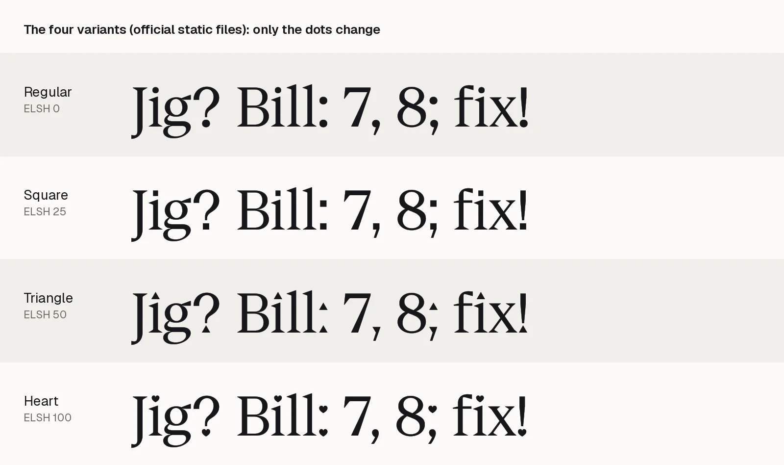
Each variant also ships as a static file. The variable GeistSerifVF.woff2 is about 40 kB, and the four static WOFF2 files are 40,056 to 40,540 bytes, so the variable file carries all four variants at no extra size.
Install Geist Serif
The geist npm package ships Geist Serif with the rest of the family. This is the install command from the README.
npm i geistThe README lists these entry points, each with its own CSS variable, so you ship only the file you import.
| Export | Entry point | CSS variable |
|---|---|---|
GeistSerif (variable) | geist/font/serif/variable | --font-geist-serif |
GeistSerifRegular | geist/font/serif/regular | --font-geist-serif-regular |
GeistSerifSquare | geist/font/serif/square | --font-geist-serif-square |
GeistSerifTriangle | geist/font/serif/triangle | --font-geist-serif-triangle |
GeistSerifHeart | geist/font/serif/heart | --font-geist-serif-heart |
Next.js
This snippet is from Vercel’s launch post. It sets the CSS variable on the html element. Vercel’s font page says every export has className and variable properties, and the font applies only where your CSS reads the variable.
import { GeistSerifRegular } from "geist/font/serif/regular";

export default function RootLayout({ children }) {
	return (
		<html lang="en" className={GeistSerifRegular.variable}>
			<body>{children}</body>
		</html>
	);
}
The CSS that uses the variable is our addition, not part of Vercel’s snippet. We have not run it in a Next.js project.
h1,
h2 {
	font-family: var(--font-geist-serif-regular), "Times New Roman", serif;
	font-weight: 400;
}
The package source loads the file through next/font/local, and there is no next/font/google import for Geist Serif because the font is not on Google Fonts.
Plain CSS
Download the latest release and copy GeistSerif/webfonts/GeistSerifVF.woff2 out of the zip. This @font-face rule is ours. We loaded it in headless Chromium and confirmed the font reaches the loaded state and that each ELSH value changes the dots.
@font-face {
	font-family: "Geist Serif";
	src: url("/fonts/GeistSerifVF.woff2") format("woff2");
	font-weight: 400;
	font-style: normal;
	font-display: swap;
}

.display {
	font-family: "Geist Serif", "Times New Roman", serif;
	font-weight: 400;
	font-variation-settings: "ELSH" 50; /* Triangle dots */
}
With one weight, set font-weight: 400 on headings. Browsers give h1 a default of bold, and a font with no bold face can be synthesised bold by the browser. Add font-synthesis-weight: none if you want to rule that out.
Geist Serif against free serifs
We measured Geist Serif and six free display serifs from the official files, at the same size. The Geist files come from release v1.9.0. The others come from the google/fonts repository, which lists them under the OFL. Variable fonts are set at weight 400, Bodoni Moda at its largest optical size (96) and Fraunces at 144 with SOFT and WONK at 0, which is the display end of each.
| Font | x-height | Cap height | Avg. lowercase width | Contrast (H stem to crossbar) | Cyrillic | Greek |
|---|---|---|---|---|---|---|
| Geist Serif | 530 | 710 | 0.521 em | 2.7 | 0 | 0 |
| Playfair Display | 515 | 708 | 0.509 em | 4.7 | 122 | 4 |
| Instrument Serif | 510 | 720 | 0.392 em | 2.4 | 0 | 0 |
| Bodoni Moda (opsz 96) | 460 | 750 | 0.524 em | about 48 | 0 | 4 |
| Fraunces (opsz 144) | 434 | 700 | 0.431 em | about 11 | 0 | 0 |
| Libre Caslon Display | 424 | 690 | 0.410 em | 4.8 | 0 | 4 |
| DM Serif Display | 481 | 660 | 0.515 em | 7.6 | 0 | 0 |
The last two columns count Unicode code points in the font, not full alphabet coverage. Contrast is the thickness of the vertical stem of H divided by its crossbar, rasterised at 1,000 pixels per em. The Bodoni Moda crossbar is about 2 pixels at that size, so its ratio only shows the order of magnitude. The average lowercase width is the unweighted mean advance of a to z. The scripts and raw numbers sit in docs/blog-fact-checks/data/geist-serif in the FontAlternatives repository.
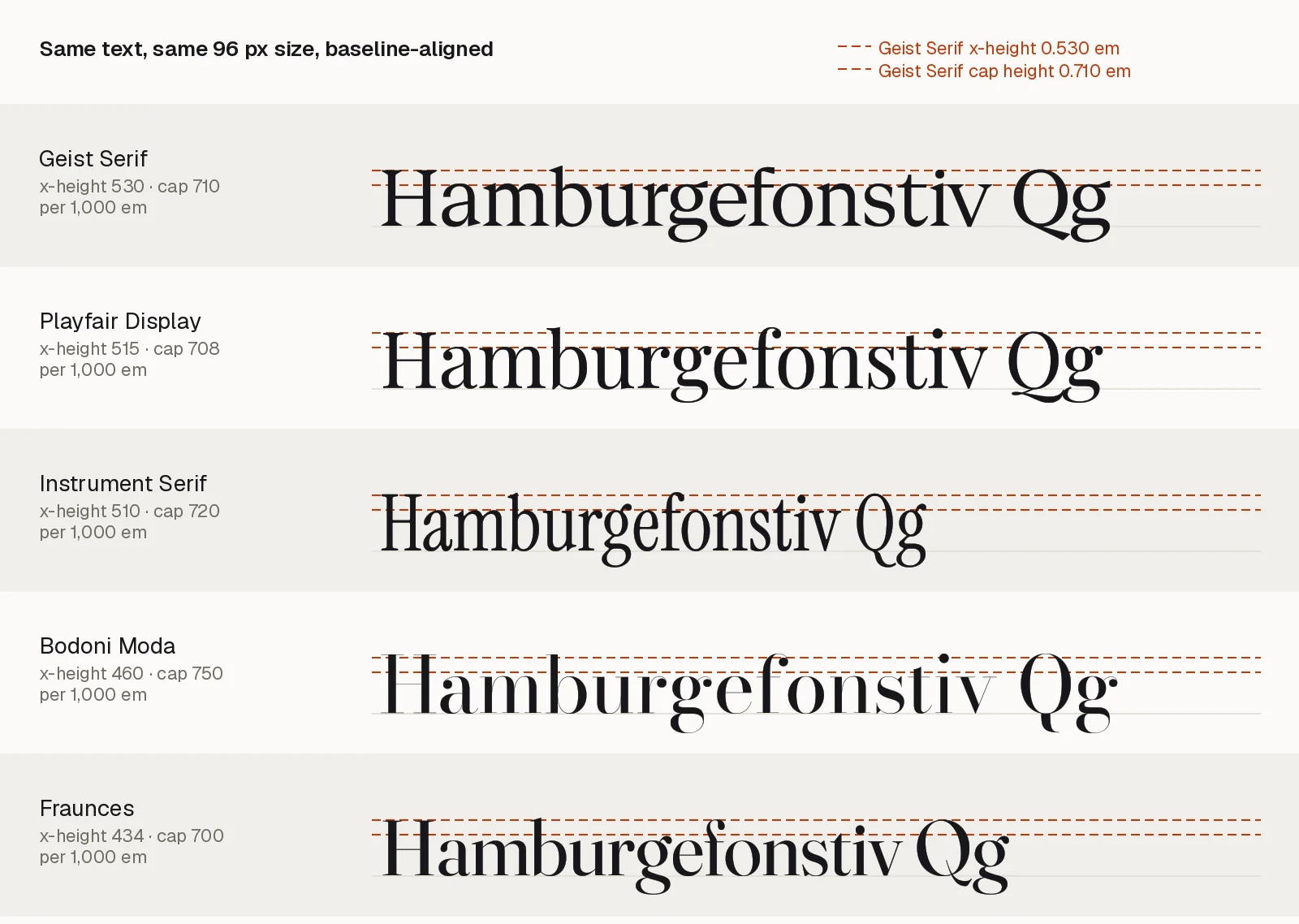
Three things stand out.
Geist Serif is high-contrast against Geist Sans, whose H ratio measures 1.02. Against other display serifs its contrast is moderate. Playfair Display has about 1.7 times the ratio, Libre Caslon Display about 1.8 times, DM Serif Display about 2.8 times, Fraunces at its display size about 4 times, and Bodoni Moda is in another class. Only Instrument Serif is close, and it is much narrower.
Geist Serif has the tallest x-height of the seven, so at the same font size its lowercase looks larger than the others. Libre Caslon Display, Fraunces and Bodoni Moda are the smallest.
Of the six comparison fonts, only Playfair Display has Cyrillic in the files we measured (122 code points, against 134 in Geist Sans). The other five have none, so Geist Serif’s gap is common among display serifs.
Geist Serif alternatives
Pick by the reason Geist Serif does not fit.
- If you need Cyrillic, use Playfair Display. It is the closest in proportions here, with an x-height 15 units lower, a similar width, and Cyrillic.
- If you want a narrower editorial headline, use Instrument Serif. Its contrast is similar and its lowercase letters are about 25 percent narrower on average.
- If you want sharper hairlines than Geist Serif has, use Bodoni Moda at a large optical size, or Fraunces for a softer, quirkier style. Both are only for large sizes.
- If you set prices or fractions in the same display style, use DM Serif Display. It has all 96 Latin-1 Supplement characters, so
£,¢,±and½are there, and so is^. Its average width is almost the same as Geist Serif’s, but it is heavier, with anHstem of 151 units against about 94, and it has no Cyrillic. - If you want classical Caslon-style hairlines with the same complete Latin-1 set, use Libre Caslon Display. It is about 21 percent narrower on average and its x-height is 106 units lower, so it needs a larger size to match.
- If you want a serif for long reading, none of these fit. Vercel built Geist Serif as a display face. Browse the other options in text serifs or the free serif and sans-serif pairings.
If you swap fonts and want the size to stay put, use the x-height value of Geist Serif, 0.53 per em. font-size-adjust is supported in current browsers (MDN lists it as Baseline 2024) and scales each font to the same x-height.
h1 {
	font-family: "Geist Serif", "Playfair Display", serif;
	font-size-adjust: 0.53;
}
With this rule Playfair Display’s x-height of 0.515 em is scaled up by about 3 percent, so a fallback does not shrink the headline.
What is still to come
The launch post lists what comes next, and none of it is in v1.9.0. It gives no dates.
- Weights: “The variable font will range from Thin (100) to Black (900).”
- A text version: Vercel is exploring it. The post says “To explore a text version, we built a foundry tool”, so this one is an experiment and not a plan.
- An italic: Vercel is “developing an italic generated entirely in Python” and says it will not be the final version.
- Cyrillic: “Cyrillic support is planned to match Geist Sans and Geist Mono”.
- Google Fonts: “Geist Serif will come to Google Fonts after launch”.
If you build with Geist Serif today, expect one Regular weight, and plan a fallback for any Cyrillic text.
How we checked this
Vercel facts come from the launch post, the geist-font README and licence, the v1.9.0 release, the geist npm package and vercel.com/font, all read on 30 October 2026. Measurements come from fontTools and HarfBuzz run on the official files. Every claim, its source and the scripts are in docs/blog-fact-checks/geist-serif-vercel-display-serif-2026-10.md in the FontAlternatives repository. Install commands and the layout snippet are copied from Vercel’s README and launch post. The CSS blocks are ours, and only the @font-face rule was run.