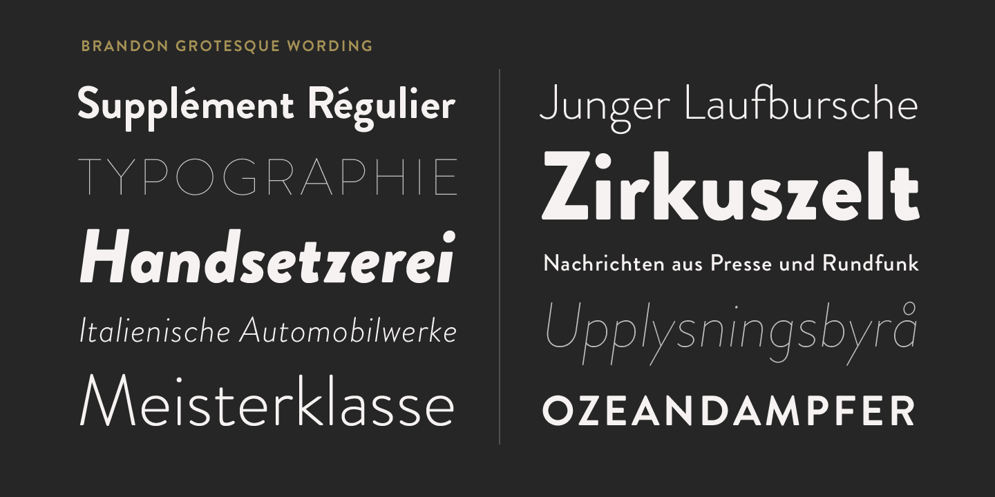
Brandon Grotesque vs Poppins
This Brandon Grotesque vs Poppins breakdown focuses on the details that usually matter: proportions, texture, and where each one fits best. With 88% similarity, Poppins closely mirrors Brandon Grotesque's geometric construction with similar x-height and compact proportions. Poppins typically gives you a wider weight range, which helps when you need tighter hierarchy control.
Design DNA
Design overlap:33%
Brandon Grotesque
Poppins
Highlighted traits are shared between both fonts
Visual Comparison
Brandon Grotesque
Premium
Poppins
FreeAa Bb Cc 123
The quick brown fox jumps over the lazy dog
ABCDEFGHIJKLMNOPQRSTUVWXYZ
abcdefghijklmnopqrstuvwxyz
0123456789 !@#$%^&*()
Feature Comparison
| Feature | Brandon Grotesque | Poppins |
|---|---|---|
| Type | Premium | Free |
| Classification | sans-serif | sans-serif |
| Variable Font | No | No |
| Weights | Multiple | 100, 200, 300, 400, 500, 600, 700, 800, 900 |
| Italics | Yes | Yes |
| License | Commercial License Required | OFL-1.1 |
| Language Support | latin, latin-extended | latin, latin-extended, devanagari |
| Source | HVD Fonts | Google Fonts |
Best Use Cases
Fonts that establish strong brand identity with distinctive character and versat...
Typography for product packaging, labels, and consumer goods. Packaging fonts mu...
Typography suited for magazines, newspapers, and long-form content. Editorial fo...
Typography designed to grab attention at large sizes. Display fonts feature dist...
Typography designed specifically for titles, headers, and attention-grabbing tex...
Typography for established businesses, enterprise software, and professional ser...
Fonts optimized for mobile interfaces with excellent small-size legibility, clea...
Typography for medical, wellness, and healthcare applications. Healthcare fonts ...
Performance Comparison
| Metric | Brandon Grotesque | Poppins |
|---|---|---|
| Score | N/A | 59/100 |
| File Size | N/A | 162.4 KB |
| Weights | N/A | 9 |
| Italics | N/A | Yes |
| Variable Font | N/A | No |
| Language Groups | N/A | 3 |
| CDN Delivery | N/A | Yes |
| x-Height Ratio | N/A | 0.548 |
| Cap Height Ratio | N/A | 0.698 |
Where You'll See These Fonts
Brandon Grotesque
- Restaurant branding
- Retail packaging
- Fashion brands
- Lifestyle magazines
- Craft products
Which Should You Choose?
Consider: Brandon Grotesque
- Shares Brandon Grotesque's warm, modern character
- Particularly suited for brand identity and packaging design
- 9 weight options for flexible typography
- Delivers a friendly, modern, clean aesthetic
- Popular in education-academia and healthcare-medical design
Recommended: Poppins
- Original design with refined typographic details
- Designed specifically for branding and packaging
- Used by Restaurant branding, Retail packaging
- Commercial license with professional support
Browse by Context
Brandon Grotesque
Free Alternatives to Consider
Other free alternatives to Brandon Grotesque