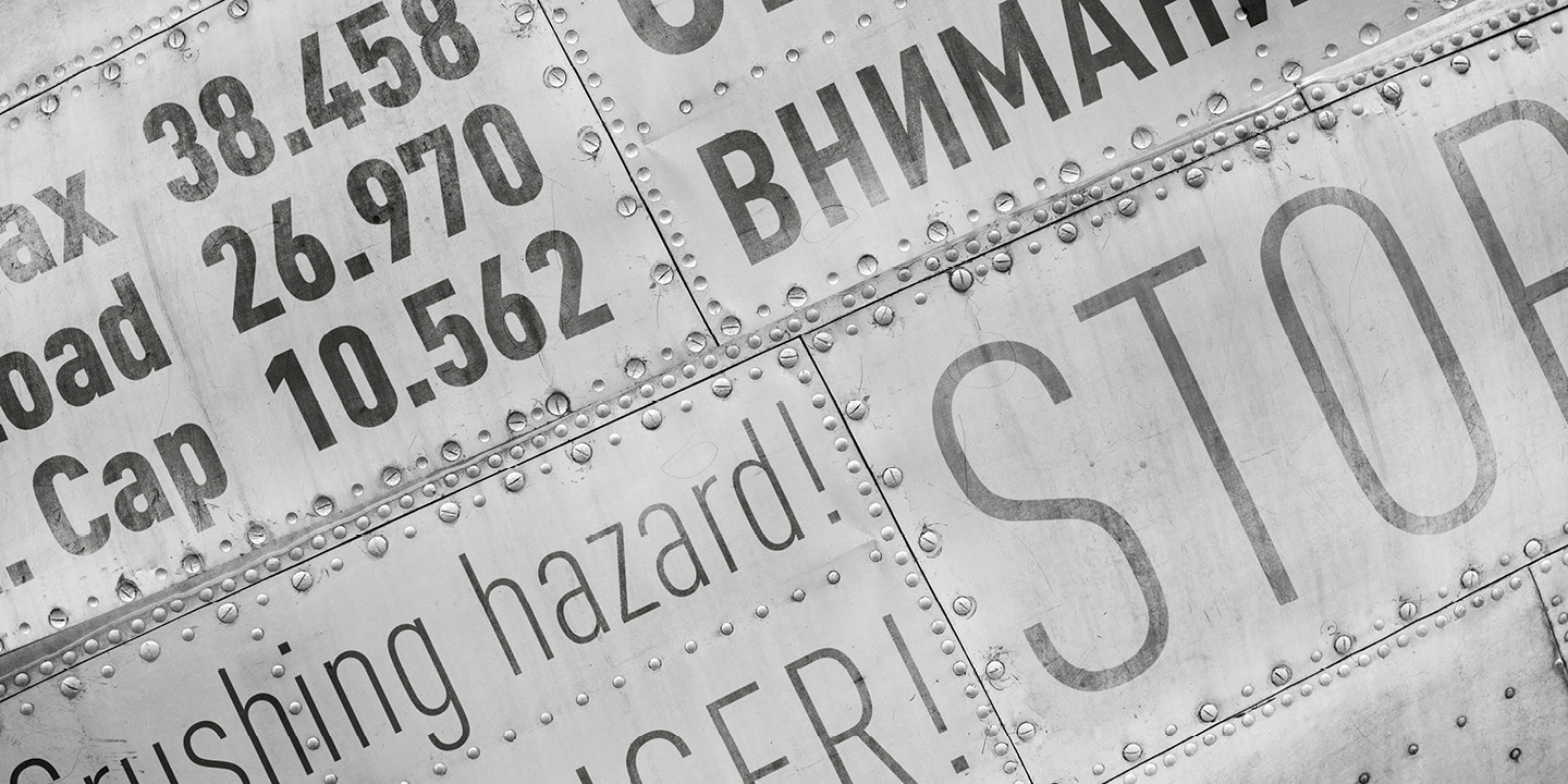
DIN vs Barlow
Choosing between DIN and Barlow comes down to whether you want the original tone or a practical open-source substitute. With 78% similarity, Barlow brings California infrastructure aesthetics that parallel DIN's German signage heritage. Both are comfortable in signage and wayfinding contexts, where clarity beats personality.
Design DNA
Design overlap:17%
DIN
Barlow
Highlighted traits are shared between both fonts
Visual Comparison
DIN
Premium
Barlow
FreeAa Bb Cc 123
The quick brown fox jumps over the lazy dog
ABCDEFGHIJKLMNOPQRSTUVWXYZ
abcdefghijklmnopqrstuvwxyz
0123456789 !@#$%^&*()
Feature Comparison
| Feature | DIN | Barlow |
|---|---|---|
| Type | Premium | Free |
| Classification | sans-serif | sans-serif |
| Variable Font | No | No |
| Weights | Multiple | 100, 200, 300, 400, 500, 600, 700, 800, 900 |
| Italics | Yes | Yes |
| License | Commercial License Required | OFL-1.1 |
| Language Support | latin, latin-extended, cyrillic | latin, latin-extended, vietnamese |
| Source | Linotype | Google Fonts |
Best Use Cases
Typography for wayfinding, environmental graphics, and public signage. Signage f...
Typography for automotive brands, vehicle interfaces, and transportation design....
Typography for video games, esports, and interactive entertainment. Gaming fonts...
Typography optimized for online retail, marketplaces, and shopping experiences. ...
Typography optimized for financial technology applications. These fonts convey t...
Typography suited for magazines, newspapers, and long-form content. Editorial fo...
Typography for news publications, journalism, and current affairs content. News ...
Typography designed specifically for titles, headers, and attention-grabbing tex...
Performance Comparison
| Metric | DIN | Barlow |
|---|---|---|
| Score | N/A | 63/100 |
| File Size | N/A | 133.8 KB |
| Weights | N/A | 9 |
| Italics | N/A | Yes |
| Variable Font | N/A | No |
| Language Groups | N/A | 3 |
| CDN Delivery | N/A | Yes |
| x-Height Ratio | N/A | 0.506 |
| Cap Height Ratio | N/A | 0.7 |
Where You'll See These Fonts
DIN
- German road signs
- Automotive industry
- Technical documentation
- Industrial design
- European transport
Which Should You Choose?
Consider: DIN
- Shares DIN's readable character
- Particularly suited for wayfinding systems and data visualization
- 9 weight options for flexible typography
- Delivers a clean, modern, simple aesthetic
- Popular in healthcare-medical and enterprise-corporate design
Recommended: Barlow
- Original design with refined typographic details
- Designed specifically for signage and technical
- Used by German road signs, Automotive industry
- Commercial license with professional support
Browse by Context
Free Alternatives to Consider
Other free alternatives to DIN