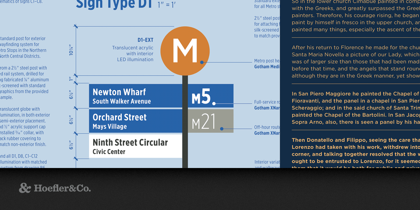
Gotham vs Poppins
If you're evaluating Gotham as a baseline, this comparison shows how Poppins stacks up in real projects. With 75% similarity, Poppins offers a slightly warmer interpretation of Gotham's geometric sans-serif style. If you need more weights than Gotham offers, Poppins is usually the more flexible family.
Design DNA
Design overlap:14%
Gotham
Poppins
Highlighted traits are shared between both fonts
Visual Comparison
Gotham
Premium
Poppins
FreeAa Bb Cc 123
The quick brown fox jumps over the lazy dog
ABCDEFGHIJKLMNOPQRSTUVWXYZ
abcdefghijklmnopqrstuvwxyz
0123456789 !@#$%^&*()
Feature Comparison
| Feature | Gotham | Poppins |
|---|---|---|
| Type | Premium | Free |
| Classification | sans-serif | sans-serif |
| Variable Font | No | No |
| Weights | Multiple | 100, 200, 300, 400, 500, 600, 700, 800, 900 |
| Italics | Yes | Yes |
| License | Commercial License Required | OFL-1.1 |
| Language Support | latin, latin-extended | latin, latin-extended, devanagari |
| Source | Hoefler&Co | Google Fonts |
Best Use Cases
Fonts that establish strong brand identity with distinctive character and versat...
Typography for advertising, marketing campaigns, and promotional materials. Adve...
Typography suited for magazines, newspapers, and long-form content. Editorial fo...
Typography for video games, esports, and interactive entertainment. Gaming fonts...
Typography optimized for online retail, marketplaces, and shopping experiences. ...
Typography for startups, tech companies, and venture-backed businesses. Startup ...
Typography designed to grab attention at large sizes. Display fonts feature dist...
Typography designed specifically for titles, headers, and attention-grabbing tex...
Performance Comparison
| Metric | Gotham | Poppins |
|---|---|---|
| Score | N/A | 59/100 |
| File Size | N/A | 162.4 KB |
| Weights | N/A | 9 |
| Italics | N/A | Yes |
| Variable Font | N/A | No |
| Language Groups | N/A | 3 |
| CDN Delivery | N/A | Yes |
| x-Height Ratio | N/A | 0.548 |
| Cap Height Ratio | N/A | 0.698 |
Where You'll See These Fonts
Gotham
- Political campaigns
- Corporate branding
- Advertising
- Sports media
- Entertainment industry
Which Should You Choose?
Consider: Gotham
- Shares Gotham's modern character
- Particularly suited for web applications and UI design
- 9 weight options for flexible typography
- Delivers a friendly, modern, clean aesthetic
- Popular in education-academia and healthcare-medical design
Recommended: Poppins
- Original design with refined typographic details
- Designed specifically for branding and political
- Used by Political campaigns, Corporate branding
- Commercial license with professional support
Browse by Context
Free Alternatives to Consider
Other free alternatives to Gotham