Free Alternatives to Gotham

About Gotham
- Foundry
- Hoefler&Co
- Classification
- sans-serif
- Style
- geometric
Brands Using Gotham
Primary campaign typeface for 'Hope' and 'Change' messaging
Brand refresh typeface used across product and marketing
Event branding and promotional materials
On-screen graphics and promotional materials
Athletic department branding and merchandise
Gotham is a geometric sans-serif typeface designed by Tobias Frere-Jones and released by Hoefler&Co in 2000. Inspired by mid-20th century architectural lettering found throughout New York City, particularly the Port Authority Bus Terminal, Gotham became one of the most influential and widely used typefaces of the 21st century. Its distinctive blend of geometric precision and American optimism has made it a cornerstone of modern visual communication.
History and Design
Tobias Frere-Jones designed Gotham after an extensive study of the lettering on buildings, signs, and storefronts throughout New York City. He was drawn to the straightforward, unpretentious character of mid-century American commercial lettering—the kind found on laundromats, diners, and transit stations. This vernacular typography represented an honest, workmanlike approach to letterforms that Frere-Jones sought to capture and refine for contemporary use.
The original Gotham release included four weights with matching italics. Its immediate success led to significant expansions: Gotham Narrow, Gotham Condensed, and Gotham Extra Narrow added compressed widths for space-constrained applications. Gotham Rounded introduced softer terminals for friendlier contexts. The comprehensive system now spans over 60 fonts, making it suitable for virtually any typographic challenge.
What distinguishes Gotham from other geometric sans-serifs is its distinctly American character. While European geometric typefaces like Futura embrace mathematical precision, Gotham captures the pragmatic, optimistic spirit of American commercial design. The letterforms feel sturdy and trustworthy rather than cold or mechanical.
Why Gotham is Popular
Gotham's rise to cultural prominence accelerated dramatically when Barack Obama's 2008 presidential campaign selected it as the primary typeface for all communications. The campaign's design team, led by Sol Sender, chose Gotham because it projected optimism and change while remaining approachable and trustworthy. This high-visibility usage demonstrated Gotham's unique ability to feel both authoritative and accessible.
Following the Obama campaign's success, major brands recognized Gotham's versatility and emotional resonance. Companies across industries—from technology to finance to entertainment—adopted it for their visual identities. Spotify, Twitter, and Discovery Channel all used Gotham prominently in their branding. The typeface became synonymous with contemporary American design.
Sports media embraced Gotham enthusiastically, with ESPN, Major League Baseball, and numerous professional teams incorporating it into their visual systems. The typeface's bold weights convey athletic energy while its lighter weights maintain sophistication in editorial contexts.
Technical Characteristics
Gotham's design features several distinctive characteristics:
- Geometric construction: Built on circles and geometric shapes with American vernacular influence
- Wide proportions: Generous letter widths that create a confident, stable appearance
- Moderate x-height: Balanced lowercase letters that work at both display and text sizes
- Uniform stroke width: Consistent weight throughout letterforms
- Open apertures: Clear, readable letter openings that aid legibility
- Extensive family: Multiple widths and weights for complete typographic systems
Use Cases
Gotham excels in numerous applications:
- Political campaigns: Projects authority and trustworthiness while remaining approachable
- Brand identity: Strong presence for corporate, consumer, and entertainment brands
- Advertising: Commands attention in headlines, posters, and environmental graphics
- Editorial design: Works across headlines and sophisticated body text in magazines
- Sports media: Conveys energy and dynamism in athletic contexts
- Entertainment: Popular in film titles, television graphics, and gaming
Finding Free Alternatives
While Gotham requires licensing through Hoefler&Co, several excellent free alternatives capture its essential character.
Montserrat provides the closest visual match, sharing similar geometric proportions and American vernacular spirit. Designed by Julieta Ulanovsky and inspired by Buenos Aires signage, Montserrat offers comparable authority and versatility. Its variable font version enables fine-tuned weight adjustments, and the OFL license permits unlimited commercial use.
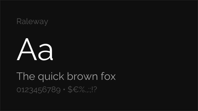
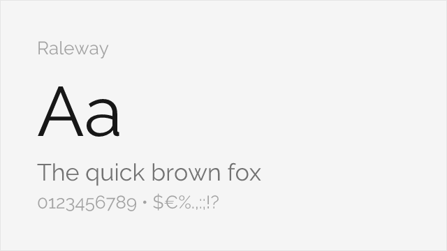
Raleway excels in lighter weights, capturing Gotham's sophistication for display typography. Its elegant thin weights work beautifully for headlines and creative branding, though its distinctive 'W' adds unique character that differs from Gotham's straightforward letterforms.
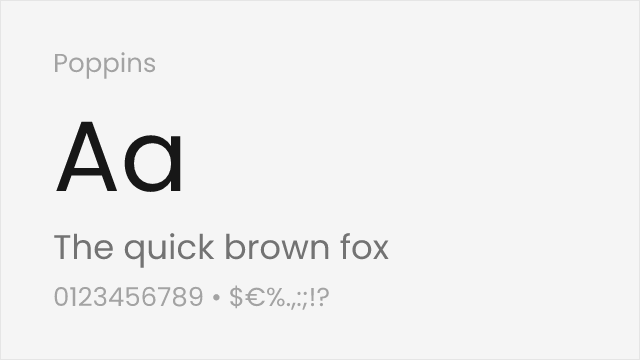
Poppins offers a warmer interpretation with slightly rounder terminals while maintaining geometric precision. Its comprehensive weight range and excellent screen rendering make it particularly suitable for digital applications. The inclusion of Devanagari script support adds value for multilingual projects.
FAQ
What is the best free alternative to Gotham?
Montserrat is the best free alternative to Gotham, providing similar geometric proportions and authoritative presence. Designed by Julieta Ulanovsky and available on Google Fonts, Montserrat matches Gotham's weight range and works excellently for branding, headlines, and digital interfaces where Gotham would traditionally be used.
Can I use Montserrat commercially?
Yes, Montserrat is licensed under the SIL Open Font License (OFL-1.1), permitting unlimited commercial use without fees. You can use it for branding, advertising, websites, applications, and print materials. The license only requires attribution if you redistribute the font files themselves.
How similar is Montserrat to Gotham?
Montserrat achieves approximately 88% similarity to Gotham, sharing the same geometric foundations and bold character. Both feature consistent stroke widths, similar x-heights, and comparable letter proportions. Montserrat has slightly different curves in letters like 'a' and 'g' but maintains Gotham's overall aesthetic.
What are the main differences between Gotham and Montserrat?
Gotham features more refined details and subtle curves inspired by New York architectural lettering, while Montserrat draws from Buenos Aires signage with slightly different character shapes. Gotham offers more weights and width variations, plus professional optical sizing. For most applications, these differences are negligible.
Where can I download Montserrat for free?
Montserrat is available for free download from Google Fonts at fonts.google.com/specimen/Montserrat. The variable font version includes weights from Thin (100) to Black (900) with matching italics. You can embed it via CSS, download for desktop use, or use it through Adobe Fonts.
What font is Gotham similar to?
Gotham is most similar to Montserrat, which achieves 88% visual similarity with comparable geometric proportions and authoritative presence. Other similar fonts include Proxima Nova (sharing the geometric-humanist hybrid approach), Futura (the classic geometric sans-serif), and Circular (a modern geometric alternative popular with tech companies). All share geometric foundations with varying degrees of warmth and character.
Why was Gotham used for the Obama campaign?
Gotham was chosen for Barack Obama's 2008 presidential campaign because it projects optimism, trustworthiness, and forward-thinking values without feeling elitist or impersonal. The design team found that Gotham's American vernacular roots and geometric clarity communicated "hope and change" more effectively than traditional political typography, while remaining approachable to diverse audiences.
Is Gotham on Google Fonts?
No, Gotham is a premium font from Hoefler&Co and is not available on Google Fonts.
The closest Google Fonts alternative is Montserrat with 88% similarity. Get it free on Google Fonts ↗
Free Alternatives (3)


Very close geometric proportions with similar weight range and bold presence
Shares geometric foundations with elegant thin weights for display use

Rounded geometric forms with comparable modernist aesthetic
Replacement Summary
Source: FontAlternatives.com
Premium font: Gotham
Best free alternative: Montserrat
FontAlternatives similarity score: 88%
Replacement difficulty: Low
Best for: political campaigns, brand identity, display headlines, advertising
Notable users: Obama 2008 Campaign, Spotify, Tribeca Film Festival
Not recommended when: Brand consistency with Obama 2008 Campaign requires exact letterforms
What is the best free alternative to Gotham?
Montserrat is the best free alternative to Gotham with a FontAlternatives similarity score of 88%.
Montserrat shares similar proportions, stroke characteristics, and intended use with Gotham. It is available under the OFL-1.1 license, which permits both personal and commercial use at no cost.
This alternative works particularly well for: political campaigns, brand identity, display headlines, advertising.
Can I safely replace Gotham with Montserrat?
Yes, Montserrat is a high-confidence replacement for Gotham. The FontAlternatives similarity score of 88% indicates strong structural compatibility.
Licensing: Montserrat is licensed under OFL-1.1, which allows commercial use without licensing fees or royalties.
Weight coverage: Most weights have close or exact matches available.
When should I NOT replace Gotham?
While Montserrat is a strong alternative, there are situations where replacing Gotham may not be appropriate:
- Brand consistency: Gotham is commonly seen in Political campaigns contexts where exact letterforms may be required.
- Strict compliance: Verify that OFL-1.1 terms meet your specific legal and compliance requirements.
Weight-Matching Guide
Map Gotham weights to their closest free alternatives for accurate font substitution.
Montserrat
| Gotham | Montserrat | Match |
|---|---|---|
| Thin (100) | Thin (100) | exact |
| Light (300) | Light (300) | exact |
| Book (400) | Regular (400) | close |
| Medium (500) | Medium (500) | exact |
| Bold (700) | Bold (700) | exact |
| Black (900) | Black (900) | exact |
Performance Guide
Production performance metrics for each alternative.
How to Use Montserrat
Copy these code snippets to quickly add Montserrat to your project.
CSS code for Montserrat
@import url('https://fonts.googleapis.com/css2?family=Montserrat:wght@100..900&display=swap');HTML code for Montserrat
<link rel="preconnect" href="https://fonts.googleapis.com">
<link rel="preconnect" href="https://fonts.gstatic.com" crossorigin>
<link href="https://fonts.googleapis.com/css2?family=Montserrat:wght@100..900&display=swap" rel="stylesheet">
Tailwind code for Montserrat
// tailwind.config.js
module.exports = {
  theme: {
    extend: {
      fontFamily: {
        'montserrat': ['Montserrat', 'sans-serif'],
      },
    },
  },
}

// Usage in HTML:
// <p class="font-montserrat">Your text here</p>
Next.js code for Montserrat
// Using next/font (Next.js 13+)
import { Montserrat } from 'next/font/google';

const montserrat = Montserrat({
  subsets: ['latin'],
  weight: ['100', '200', '300', '400', '500', '600', '700', '800', '900'],
});

export default function Component() {
  return (
    <p className={montserrat.className}>
      Your text here
    </p>
  );
}

// Or using inline styles with Google Fonts link:
// <p style={{ fontFamily: "'Montserrat'" }}>Your text</p>
Expo and React Native code for Montserrat
// Install: npx expo install @expo-google-fonts/montserrat expo-font
import { useFonts, Montserrat_400Regular } from '@expo-google-fonts/montserrat';

export default function App() {
  const [fontsLoaded] = useFonts({
    Montserrat_400Regular,
  });

  if (!fontsLoaded) return null;

  return (
    <Text style={{ fontFamily: 'Montserrat_400Regular' }}>
      Your text here
    </Text>
  );
}
Recommended Font Pairings
These free fonts pair well with Montserrat Gotham for headlines, body text, or accent use.
Merriweather's robust serifs ground Gotham's geometric authority for readable long-form content
Playfair's high-contrast elegance creates dramatic visual hierarchy with Gotham's bold geometric forms
Libre Baskerville's traditional serif forms provide classical balance to Gotham's modern American geometry
Browse Alternatives by Context
Find Gotham alternatives filtered by specific use case, style, or language support.
By Script
Frequently Asked Questions
What is the best free alternative to Gotham?
Montserrat is the best free alternative to Gotham with a FontAlternatives similarity score of 88%. It shares similar proportions and characteristics while being available under the OFL-1.1 license for both personal and commercial use at no cost.
Is there a free version of Gotham?
There is no official free version of Gotham. However, Montserrat is available under the OFL-1.1 open-source license and achieves a FontAlternatives similarity score of 88%. It includes variable weights and supports latin, latin-extended.
What Google Font looks like Gotham?
The Google Fonts most similar to Gotham are Montserrat, Raleway, Poppins. Among these alternatives, Montserrat offers the closest match with a FontAlternatives similarity score of 88% and includes variable weights for flexible typography options.
Can I use Montserrat commercially?
Yes, Montserrat can be used commercially. It is licensed under OFL-1.1, which allows free use in websites, applications, print materials, and commercial projects without purchasing a license or paying royalties.
Is Montserrat similar enough to Gotham?
Montserrat achieves a FontAlternatives similarity score of 88% compared to Gotham. While not identical, it offers comparable letterforms, proportions, and visual style. Most designers find it works excellently as a substitute in web and print projects.
What are the main differences between Gotham and its free alternatives?
Free alternatives to Gotham may differ in subtle details like letter spacing, curve refinements, and available weights. Premium fonts typically include more OpenType features, extended language support, and optimized screen rendering. However, for most projects, these differences are negligible.
Where can I download free alternatives to Gotham?
Download Montserrat directly from Google Fonts. Click the "Get Font" button on any alternative listed above to visit the official download page. Google Fonts also provides convenient embed codes for seamless web integration.