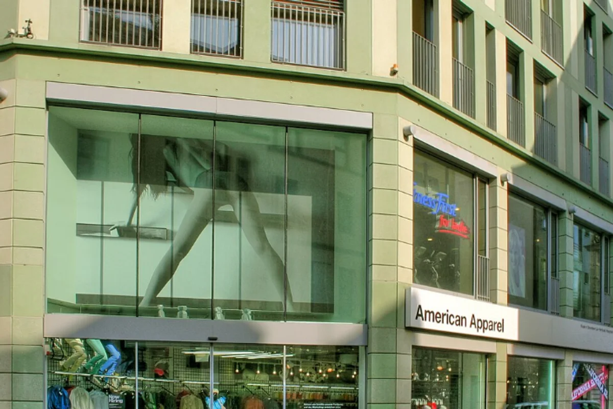
American Apparel Uses Helvetica
American Apparel's entire brand identity is a refusal to have one.
The logo is Helvetica Bold, black, uppercase, on a white background. No icon. No custom letterforms. No gradient, no shadow, no flourish. It is the typographic equivalent of a blank canvas — and that blankness became one of the most recognizable marks in fashion retail.
The genius of the choice is that it works precisely because it shouldn't. Helvetica Bold is the default sans-serif of bureaucracy — tax forms, airport signage, corporate compliance documents. Setting a fashion brand in the same typeface used for parking garage wayfinding creates a deliberate friction.
The clothes are colorful, provocative, body-conscious. The type is the opposite: clinical, gray, administrative. The contrast makes both elements more interesting.
Why Helvetica Bold Works for American Apparel
Basics at every level. The brand was built on a specific proposition: basics made well, made ethically, made in Los Angeles. Helvetica Bold reinforces "basics" typographically:
- A custom typeface would suggest design ambition
- A serif would suggest heritage
- A rounded sans would suggest friendliness
- Helvetica Bold suggests nothing — and gets out of the way of the product
The manufacturing metaphor. American Apparel marketed itself as a vertically integrated manufacturer — they made their own fabric, cut their own patterns, sewed in their own factory. Helvetica is typography's equivalent of vertical integration: it does everything competently, nothing distinctively.
It is the plain white T-shirt of typefaces, and the company literally sold plain white T-shirts.
Industrial at every scale. The tightly tracked, all-caps setting amplifies the industrial feel. The letters sit shoulder to shoulder like workers on a production line — uniform, compressed, functional. At small sizes on garment tags, the treatment is purely utilitarian. At building-scale on storefronts, it becomes a statement about what branding can be when you strip it to its structural minimum.
Free Alternative: Inter
Inter replicates Helvetica Bold's neutral authority with better screen rendering. Set Inter in Bold (700) weight, all-caps, with tracking at 0.04em, and the result is visually indistinguishable from American Apparel's treatment at typical viewing distances. Inter's optical size axis (opsz) also lets you optimize for small label printing or large signage — something Helvetica's fixed outlines don't natively support.