Apple Uses Garamond
From 1984 to 2002, every Apple product name, advertisement, and piece of packaging spoke in the same voice: Apple Garamond, a custom adaptation of ITC Garamond Condensed.
The typeface arrived with the original Macintosh. While competitors set their branding in Helvetica or Univers — safe, corporate, sans-serif — Apple chose a serif face with visible warmth. The message was deliberate: this is technology for people, not institutions.
Apple Garamond's condensed proportions became so strongly associated with the company that the variant effectively became an Apple-exclusive typeface in public perception. It appeared on the Power Macintosh, the iMac G3, and every "Think Different" billboard.
Apple retired Garamond in 2002, replacing it with Myriad Pro. Today the company uses San Francisco. But the Garamond era remains the period most associated with Apple's creative identity.
Why Apple Garamond Worked for Apple
Warmth in a cold category
In the 1980s and 1990s, personal computing was still fighting its perception as intimidating and technical. A serif typeface — with its calligraphic roots and association with books and literature — positioned Apple's products closer to the humanities than to engineering:
- Serif forms suggest craft and human touch
- Condensed proportions felt efficient without feeling industrial
- Light weight conveyed approachability over authority
Distinctive competitive positioning
Every major PC manufacturer used sans-serif type. Apple's serif choice was an instant visual differentiator. You could identify an Apple ad across a magazine spread before reading a word — the Garamond was enough.
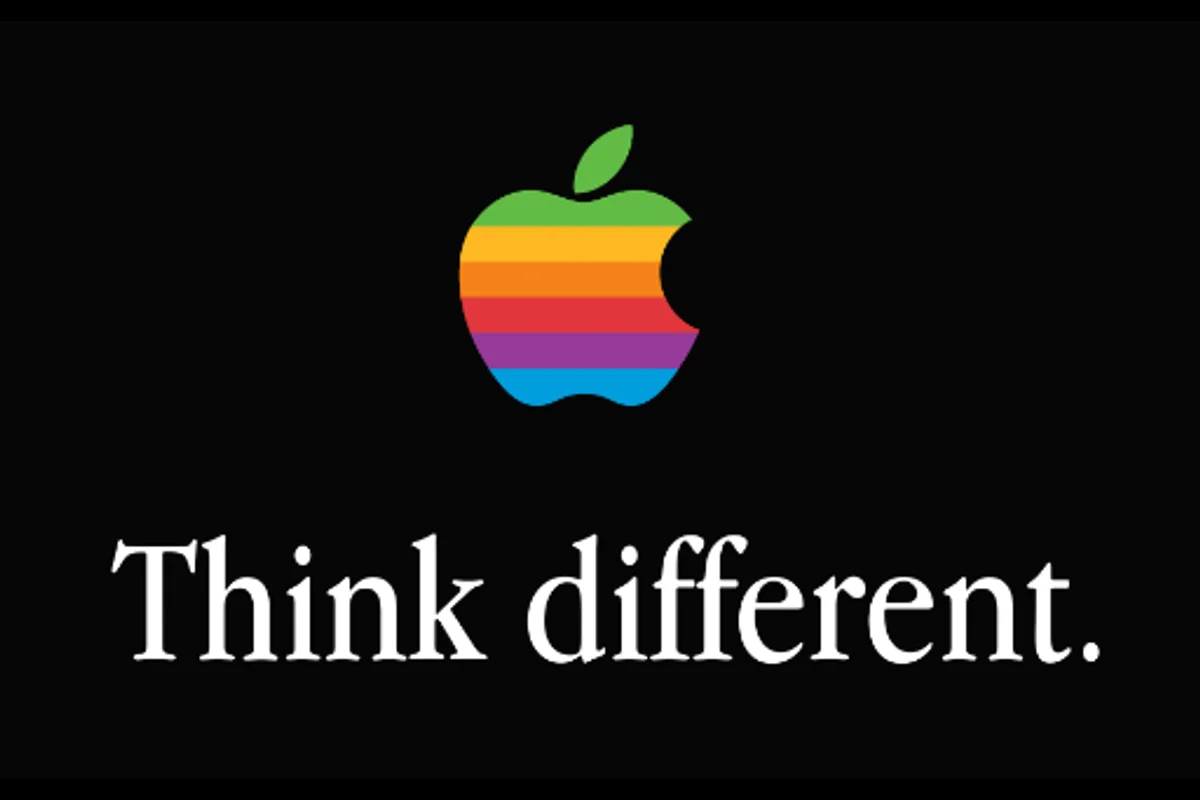
The "Think Different" anchor
The campaign's black-and-white portraits needed type that wouldn't compete with iconic faces like Einstein's and Gandhi's. Apple Garamond's light weight and narrow proportions occupied minimal visual space while maintaining brand recognition.
Free Alternative: EB Garamond
EB Garamond in Regular (400) with slight condensed tracking captures the warm, humanist quality that defined Apple's classic era. Georg Duffner's revival faithfully reproduces Claude Garamont's original 16th-century cuts, delivering the same calligraphic warmth and old-style proportions. For body text and branding that references the "Think Different" period, it is the closest open-source match.


