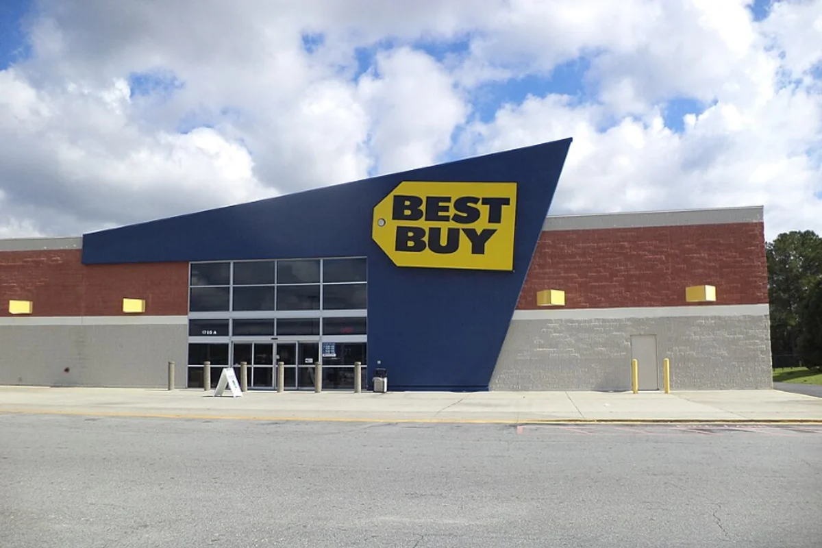
Best Buy Uses Futura
Best Buy adopted Futura Bold as part of its 1989 brand redesign by designer John Moos. The wordmark — "BEST BUY" in uppercase Futura Bold, paired with the yellow price-tag icon — has survived multiple identity evolutions, including the 2018 refinement that dropped the price-tag shape but kept the Futura lettering.
For a retailer that has watched Circuit City, CompUSA, and RadioShack disappear, the continuity of the wordmark is worth noting. The type has outlasted the competition.
Why Futura Bold Works for Best Buy
Key Facts:
- Weight: Futura Bold
- Designer: John Moos, 1989 brand redesign
- Application: Wordmark, store signage, truck livery
- Survived: 2018 rebrand — icon simplified, type kept unchanged
Credibility in a noisy environment
Consumer electronics retail skews toward starburst sale graphics, dense spec sheets, and price-driven messaging. Within that context, Futura Bold does something important: it looks serious. The geometric letterforms communicate precision and modernity — qualities you want associated with a company selling laptops and home theater systems.
Making common words proprietary
"BEST BUY" is a two-word name with common English words. In a serif or humanist typeface, it could read as generic — a placeholder name, like "Good Store." Futura's geometric rigidity elevates those simple words:
- The pointed A and circular B bowls become visual anchors
- The squared E transforms ordinary language into a designed mark
- The typeface makes the name proprietary
The right weight for the right scale
Bold — rather than Extra Bold or Black — gives the wordmark enough mass for building signage and truck livery without becoming oppressive. Best Buy stores are large-format retail; the logo needs to read at 30 feet on a blue fascia. Futura Bold maintains its geometry at that scale, where lighter weights thin out and heavier weights lose their interior shapes.
The 2018 identity update confirmed all of this. When Best Buy decided to modernize, they simplified the icon but left the type untouched.
Free Alternative: Jost
Jost in Bold (700) weight matches the optical impact of Futura Bold in Best Buy's wordmark. Set in all-caps with moderate tracking, it produces the clean, engineered look that separates credible tech brands from generic retail. Poppins Bold is a secondary option if you need better performance at smaller sizes for UI and digital applications.