BMW Uses Helvetica
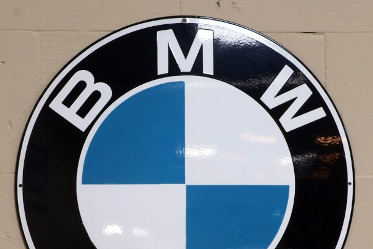
Three letters — B, M, W — sit in Helvetica Bold around the perimeter of one of the most recognized emblems in automotive history.
The roundel's blue-and-white quadrants (representing the Bavarian flag, not a spinning propeller as the myth goes) do the visual heavy lifting. Helvetica's job is to label without competing. It has done this job since the early 1960s, and the fact that most people couldn't name the typeface from memory is proof that it works.
BMW has evolved its type system over the decades — "BMW Type Global" from Dalton Maag, then "BMW Type Next" in 2020. But the roundel's lettering has remained Helvetica Bold through every iteration. The one element that hasn't changed because it never needed to.
Why Helvetica Bold Works for BMW
Precision without coldness
German engineering brands face a specific typographic challenge: communicating precision without communicating coldness. Futura, as Volkswagen discovered, can feel too geometric, too mechanical. Helvetica threads a narrower needle — its neo-grotesque forms have just enough warmth to feel engineered rather than calculated.
Authority without aggression
BMW's marketing has historically walked a line between performance and refinement. Helvetica Bold mirrors this balance:
- Assertive (Bold weight) but not overbearing
- No condensed compression, no extreme tracking
- Reads as confident — the precise emotional register BMW aims for
Three letters in a circle
B-M-W is an unusually short brand name that needs to occupy a small curved space within the roundel. Helvetica Bold's consistent stroke widths and uniform letter proportions ensure all three characters sit at equal visual weight. In a typeface with more personality — wider M, narrower I — the balance would be harder to achieve.
Free Alternative: Inter
Inter in Bold (700) matches Helvetica Bold's weight and proportions closely enough for automotive branding work. Its variable font format lets you micro-adjust weight for different contexts: 680 for dashboard text, 720 for signage. Roboto Bold is a secondary option, particularly for Android-first automotive UI.