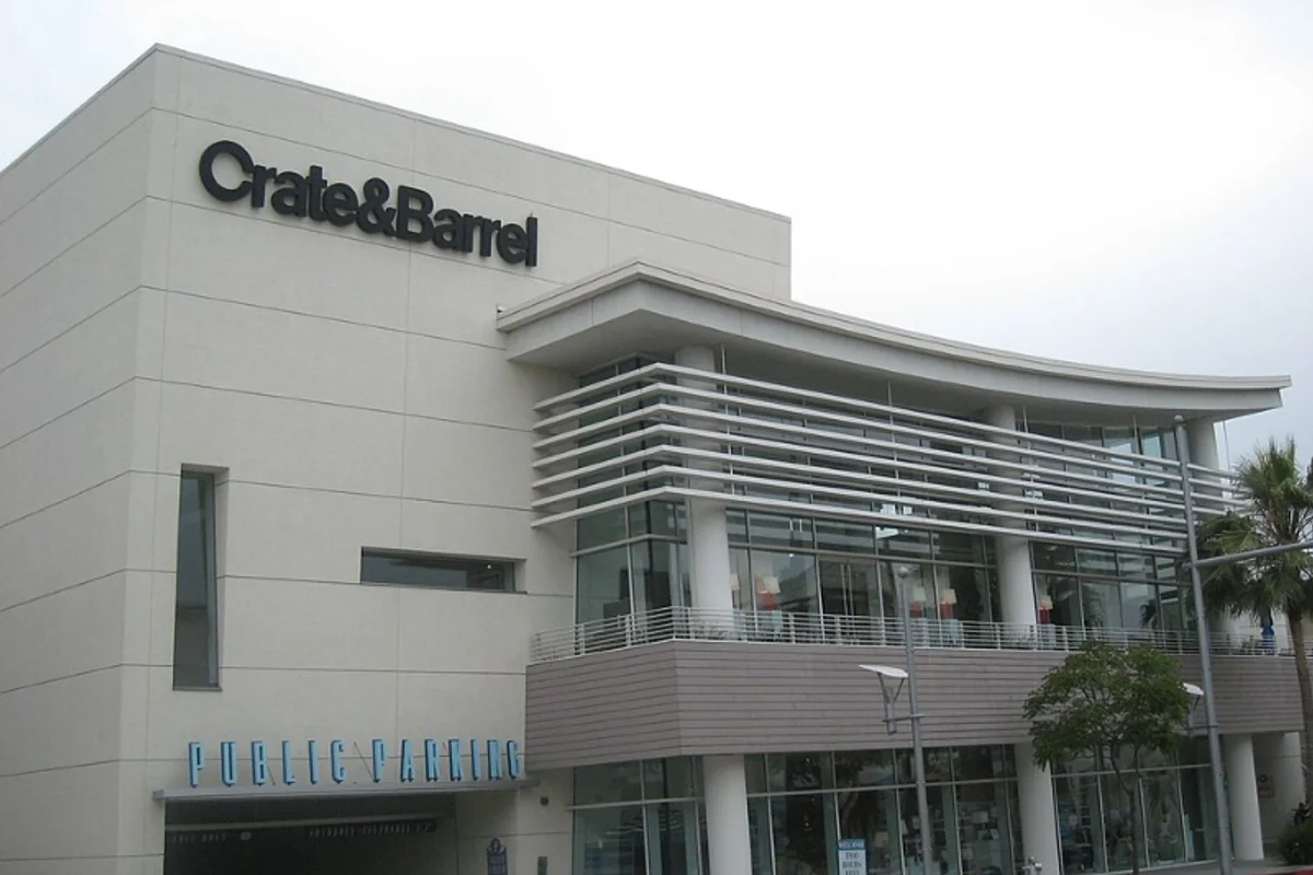
Crate & Barrel Uses Helvetica
Tom Shortlidge's 1967 logo for Crate & Barrel demonstrates a principle that should comfort any designer working with off-the-shelf type: you don't need a fully custom typeface to create a distinctive mark.
Sometimes, modifying a single letter is enough.
The logo is Helvetica Bold. Every letter except one is standard, unmodified Helvetica. The exception is the C — redrawn as a nearly closed circle with a tight aperture, closer in spirit to ITC Avant Garde Gothic than to Helvetica's normally open C. That single modification transforms the wordmark from "a name set in Helvetica Bold" into "the Crate & Barrel logo."
The custom C is the signature. The rest of the Helvetica provides the structure.
Why Helvetica Bold (With a Custom C) Works for Crate & Barrel
The design register of home furnishings. The brand needs to feel curated without feeling elitist, modern without feeling cold, accessible without feeling cheap. Helvetica Bold handles the accessibility and modernity. The custom C adds just enough personality to suggest curation.
The ampersand as binding agent. "Crate & Barrel" is a compound name. The way the "&" sits between two common nouns determines whether the brand reads as a description or as a proper name. Helvetica Bold's ampersand is simple enough that it recedes, binding the two words into a unified brand name rather than a literal inventory list.
Timing as cultural signal. Shortlidge designed the logo during the high tide of the Swiss International Style in America, when Helvetica was still relatively new to the U.S. market and carried connotations of European modernist sophistication. For a home goods store selling Scandinavian-influenced furniture, Helvetica was not a generic choice — it aligned the store with the same design movement that produced its merchandise.
Nearly sixty years later, the logo endures. The modification was small enough to be timeless.
Free Alternative: Inter
Inter Bold (700) provides the Helvetica Bold foundation. The custom C requires manual design work regardless of the base typeface. Inter's extensive weight range (100–900) supports the kind of typographic hierarchy that home goods catalogs demand — thin weights for captions, regular for descriptions, bold for headings.