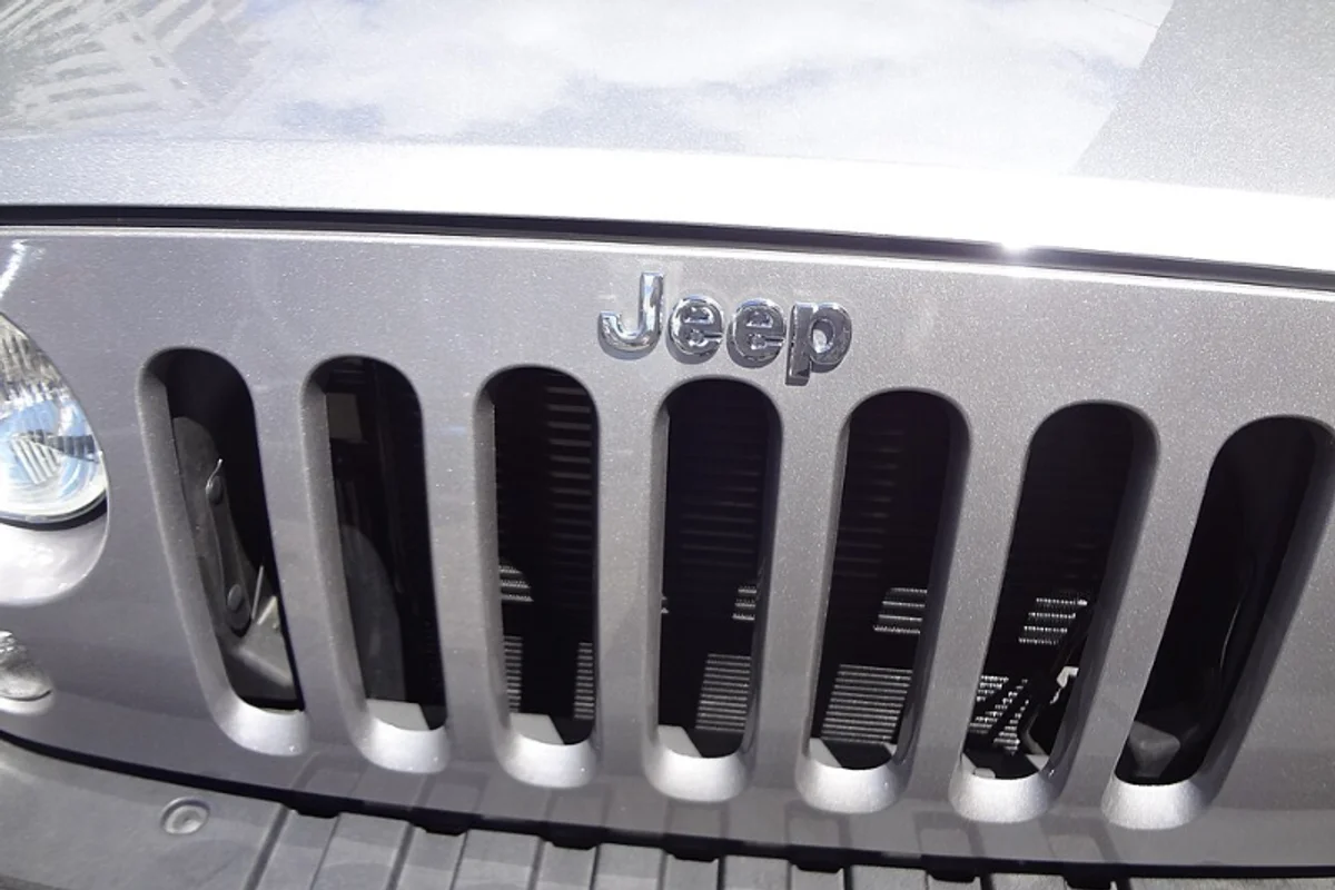
Jeep Uses Helvetica
Jeep's logo is four letters in Helvetica Bold. That is essentially the entire design brief, executed once in 1970 and never revisited.
The only modification is a subtle adjustment to the J — its bottom curve is slightly more open than standard Helvetica, resembling an inverted U. Everything else is off-the-shelf.
Fifty-five years is a long time for any logo to survive without a redesign. In the automotive industry, where Volkswagen, Kia, and GM have all undergone major rebrands since 2019, Jeep's Helvetica wordmark is a quiet anomaly. It has outlasted every design trend — flat design, skeuomorphism, gradient meshes, brutalism — by never participating in any of them.
Why Helvetica Bold Works for Jeep
Key Facts:
- Typeface: Helvetica Bold (with minor J modification)
- Adopted: 1970
- Unchanged for: 55+ years
- Application: Vehicle badges, grille lettering, dealership signage
The functional case. Jeep vehicles are used in conditions where legibility is operational, not cosmetic. Military Jeeps had their names stenciled in block letters because clarity mattered in the field. The civilian badge inherits that priority — readable when covered in mud, viewed through rain, or seen from 200 feet away on a dealership lot.
The brand case. Jeep sells ruggedness, and ruggedness has a specific typographic register. Not decorative (that would be soft). Not aggressively stylized (that would be trying too hard). Plain, direct, and unpretentious — which is exactly what Helvetica Bold is.
The four-letter case. J-E-E-P is short enough to function as a glyph. Set in Helvetica Bold with standard tracking, it reads as a single unit — not four letters but one word-shape. This is why it works as a metal badge on a grille: the compact density of an emblem, achieved with nothing but type.
Free Alternative: Inter
Inter Bold (700) matches the visual weight and proportions of Jeep's Helvetica Bold wordmark. Inter's slightly larger x-height actually improves small-size legibility — useful for dashboard labels, key fobs, and the kinds of constrained surfaces where automotive type lives. The open apertures handle dirt, wear, and low-contrast environments as well as Helvetica does.