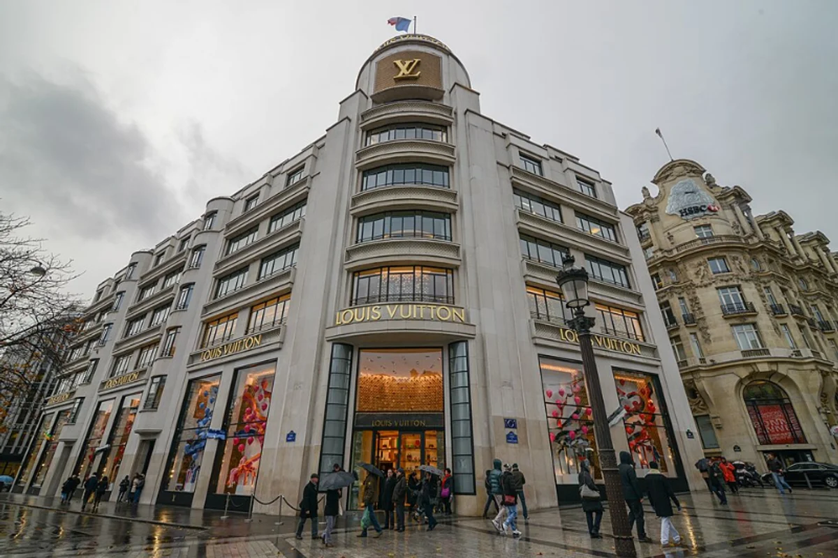
Louis Vuitton Uses Futura
Louis Vuitton does not use a custom typeface. It uses Futura Medium — a commercially available font that anyone with a license can set.
That restraint is the point. When your product already communicates through monogrammed canvas, leather craftsmanship, and price tags that start in four figures, the typography doesn't need to shout. It needs to step back and let the initials do the work.
Futura Medium appears across the full Louis Vuitton ecosystem:
- Wordmark on storefronts
- Typography on packaging
- Text in print campaigns
- Headings on louisvuitton.com
Its presence is consistent enough to function as a secondary brand element — not because it's distinctive, but because it's disciplined.
Why Futura Medium Works for Louis Vuitton
Luxury branding operates on a specific paradox: looking expensive by appearing effortless.
Futura Medium achieves this through geometry. The letterforms are constructed from circles and straight lines, stripped of any decorative intent. No swashes, no contrast variation, no calligraphic references. The result is typography that reads as inevitable — as if these letters could not have been drawn any other way.
The Medium weight is the critical choice. Light would whisper too quietly for store signage at architectural scale. Bold would compete with the LV monogram. Medium sits in a precise middle — visible enough to anchor a marble facade, restrained enough to disappear behind the product.
The cultural argument is equally compelling. Futura was born in the same interwar European design tradition that shaped Louis Vuitton's modernist-era expansion. Both emerged from a milieu that valued functional elegance — objects and letters that work without ornamentation. For a French luxury house, a German Bauhaus typeface is cosmopolitan rather than contradictory.
It says: we are not provincial; we select the best from everywhere.
Free Alternative: Jost
Jost in Regular (400) or Medium (500) weight replicates the quiet authority that Futura Medium provides Louis Vuitton. The geometric proportions are nearly identical — circular O, pointed A, uniform stroke weight.
For luxury branding, editorial layouts, or packaging design that needs to project restraint-as-sophistication, Jost delivers the same visual language. Increase letter-spacing slightly (0.02em–0.05em) for that airy, high-end feeling LV achieves in its storefront signage.