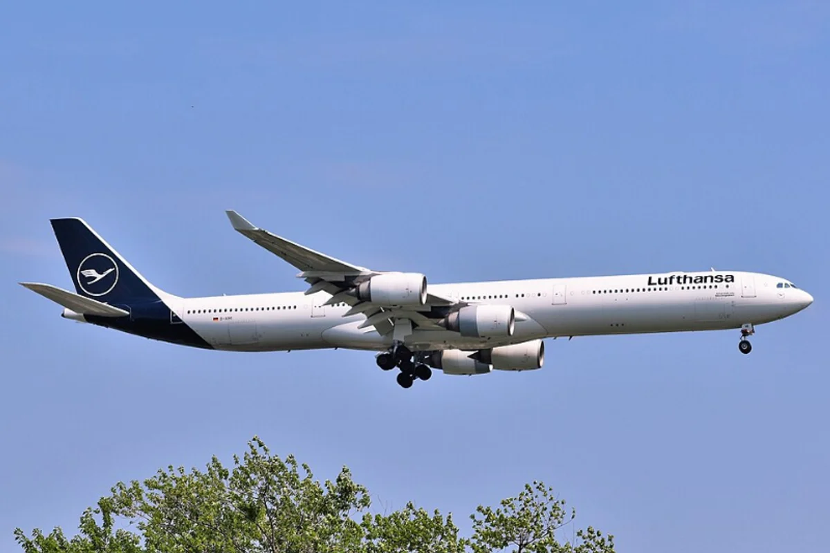
Lufthansa Uses Helvetica
In 1962, designer Otl Aicher and his Gruppe E5 team selected Helvetica as the typographic backbone of Lufthansa's corporate identity.
The choice was deliberate and philosophical. Aicher associated Helvetica with what he called "Technik" and "harte Tatsache" — technology and hard fact. For an airline rebuilding Germany's reputation in the air seventeen years after the war, projecting competence through design was not a luxury. It was survival.
What Aicher built was more than a logo refresh. It was one of the first truly comprehensive corporate identity systems — a unified visual language governing everything from ticket counters to timetables, boarding passes to baggage tags, aircraft livery to executive stationery.
Wherever a passenger encountered Lufthansa, the typeface was the same. The consistency made the experience feel controlled, which made the airline feel safe.
Why Helvetica Worked for Lufthansa
Key Facts:
- Designer: Otl Aicher / Gruppe E5, 1962
- Scope: First truly comprehensive corporate identity system
- Duration: 56 years (1962–2018)
- Replaced by: Custom typeface by Hannes von Döhren (HvD Fonts), optimized for digital and cockpit displays
Scale demands simplicity. Aviation branding operates under unique constraints. Type must function on a 50-meter fuselage and a 5-centimeter boarding pass. It must be readable at terminal distances, under fluorescent lighting, by international travelers who may not speak German. Helvetica's uniform stroke widths and generous counters handled all of these conditions.
The ideological argument. Post-war German design was self-consciously rejecting the ornamental and the nationalistic. Helvetica — Swiss, neutral, functional — was the anti-Fraktur. It communicated that this was a modern, international enterprise with no interest in looking backward.
Every ticket printed in Helvetica was a small declaration of forward motion.
Why it eventually ended. Lufthansa replaced Helvetica in February 2018 — digital screens and cockpit displays demanded optimization that a 1957 typeface couldn't provide. But Aicher's system was so thoroughly conceived that it took over half a century to outgrow it.
Free Alternative: Inter
Inter was designed by Rasmus Andersson specifically for computer screens — solving the exact readability problem that eventually forced Lufthansa away from Helvetica. Its optical size axis means the same font file serves wayfinding signage at 72pt and mobile boarding passes at 12pt with equal clarity.