Muji Uses Helvetica
Muji's full name is Mujirushi Ryohin — "no-brand quality goods."
The company's design philosophy, articulated by art director Kenya Hara, centers on "emptiness" (空 kū): the idea that a container is most useful when it is empty, most receptive when it holds nothing.
Helvetica Neue is the typographic expression of this principle. It is the emptiest typeface in wide circulation — a vessel so neutral it practically disappears, leaving only the product.
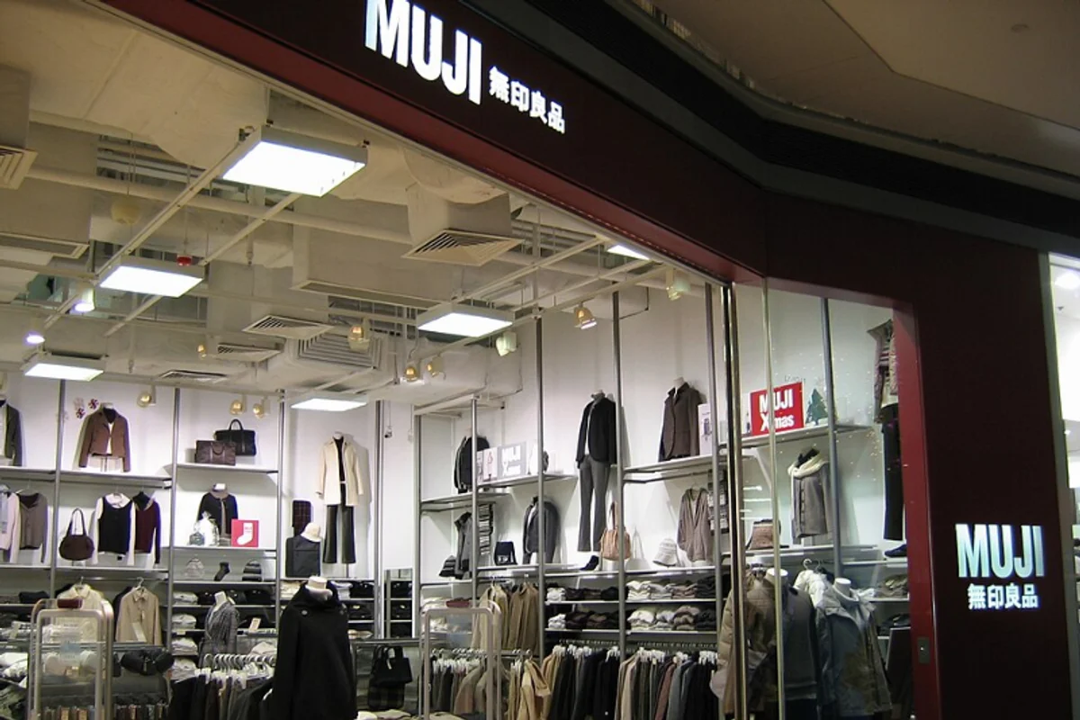
Hara took over as Muji's art director in 2001 and refined the brand's use of Helvetica Neue across all Latin-script touchpoints: store signage, packaging, price tags, and international advertising. The Japanese characters use a separate typeface (a clean Gothic), but every Roman letter a Muji customer encounters is set in Helvetica Neue.
Why Helvetica Neue Works for Muji
Most brands use typography to create personality. Muji uses it to eliminate personality.
The distinction is philosophically precise. A brand that sells unmarked notebooks, unbleached cotton T-shirts, and transparent storage containers needs type that matches the product's intentional plainness. Helvetica Neue is not a choice made in the absence of an idea — it is the typographic embodiment of the idea.
Neue, not the original. Helvetica Neue — the 1983 reworking of the 1957 original — is specifically suited to Muji's needs:
- Standardized spacing
- Regularized weights
- Cleaned-up inconsistencies
The result is a typeface that feels slightly more designed than Helvetica, slightly less mechanical. For Muji, which sells crafted simplicity (not industrial blankness), the difference matters.
The retail library. Stores are organized like libraries — quiet, ordered, with products arranged on shelves by category. Helvetica Neue on a price tag functions like a catalog entry: informational, hierarchical, visually subordinate to the product. A louder typeface would compete with the merchandise. Helvetica Neue accompanies it.
Two traditions, one philosophy. Swiss typography and Japanese design both prize reduction, precision, and the communicative power of white space. Helvetica was born from the Swiss International Style; Muji was born from Japanese wabi-sabi aesthetics. They meet in Helvetica Neue's clean counters and measured spacing — geometry that respects emptiness.
Free Alternative: Inter
Inter aligns with Muji's values more closely than almost any other free typeface. Set Inter in Regular (400) weight with generous line height for product descriptions and body text. For shelf labels and small-format packaging, Inter's optical size axis (font-variation-settings: 'opsz' 14) ensures characters remain clear at 8pt–10pt. The cultural resonance is strong: Inter was designed for the same kind of functional clarity that Muji sells.