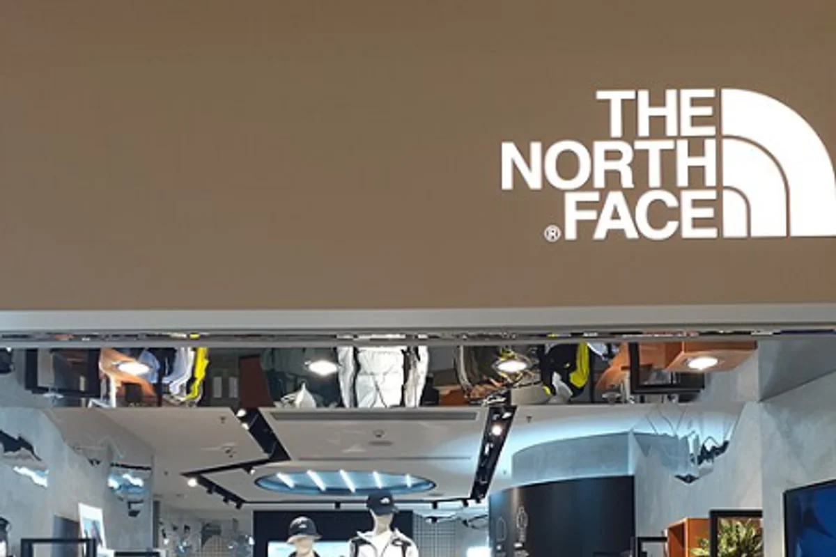
The North Face Uses Helvetica
David Alcorn designed The North Face logo in 1971 by drawing the outline of Half Dome in Yosemite National Park and setting the company name beneath it in Helvetica Bold.
One icon, one typeface, three words. The simplicity of the combination has kept the logo unchanged for over fifty years. In an industry where competitor logos chase trend cycles, The North Face just kept the same mark and let the product build the reputation.
Why Helvetica Bold Works for The North Face
Outdoor brands exist in a paradox. They sell wilderness experiences through commercial retail channels.
The neutrality solution. Helvetica Bold resolves this paradox by being neither rugged nor refined. It carries no wilderness connotation (that is the icon's job) and no urban sophistication (that would alienate the core audience). The division of labor is clean — the half-dome does the emotional work, the type handles the informational work.
Built for harsh substrates. Outdoor gear lives in harsh environments. Brand marks on products need to survive:
- Embroidery on fleece
- Heat transfer on shells
- Debossing on leather
- Rain, snow, UV exposure, and abrasion
Helvetica Bold's thick strokes and simple geometry reproduce reliably across all of these substrates. Fine hairlines would disappear in embroidery; decorative serifs would bleed in heat transfer. Bold sans-serif survives everything.
The cultural fit. The North Face was founded in San Francisco in 1966, during a period when Bay Area counterculture valued substance over style. Choosing the most unshowy typeface available aligned with a customer base that judged a backpack by its seams, not its logo. The restraint is earned.
Free Alternative: Inter
Inter Bold (700) matches Helvetica Bold's weight and neutral character for outdoor branding. Inter's wider language support (including Vietnamese, Greek Extended, and Cyrillic Extended) actually exceeds Helvetica's — useful for global outdoor brands. Set in all-caps with 0.06em tracking to replicate The North Face's letterspaced wordmark treatment.


