Penguin Books Uses Gill Sans
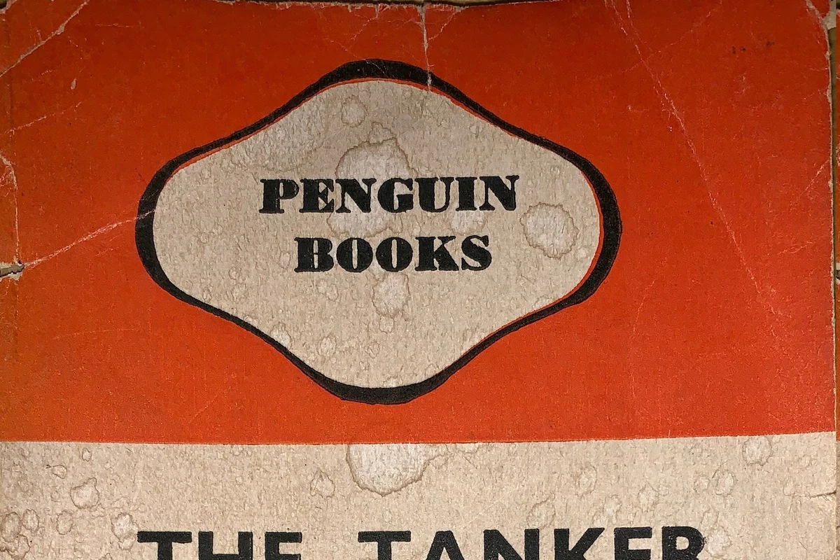
When Allen Lane launched Penguin Books in 1935, he wanted paperbacks that looked as considered as hardcovers but cost sixpence. Edward Young designed the covers using a simple three-band layout: colour at top and bottom, white in the middle, with the title and author set in Gill Sans.
That formula sold three million books in its first year.
Gill Sans was barely seven years old, but it was already the typeface of modern Britain. On Penguin's covers it conveyed that these inexpensive paperbacks were serious publications, not pulp. The typeface's clean geometry signalled design literacy, while its humanist warmth kept the covers from feeling cold or academic.
Jan Tschichold refined the system in 1947, standardising Gill Sans usage across hundreds of titles. His Penguin Composition Rules became one of publishing's most influential style guides.
Why Gill Sans Worked for Penguin
Key Facts:
- Typeface: Gill Sans (Medium for titles, Bold for author names)
- Designer: Eric Gill, 1928 (Monotype)
- Penguin usage: 1935--1960s (primary); revived periodically for heritage editions
- Refined by: Jan Tschichold, 1947 (Penguin Composition Rules)
The covers were a colour-coding system first. Orange for fiction, green for crime, blue for biography, purple for essays. Typography needed to stay out of the way:
- Gill Sans in medium weight provided hierarchy without competing with the colour bands
- Centred alignment and uppercase titles created a uniform shelf presence
- The system scaled from a single title to a wall of hundreds
Affordability demanded typographic efficiency. Penguin printed on cheap paper. Gill Sans reproduced reliably on rough stock and survived the ink spread that destroyed finer typefaces.
The design became the brand. Penguin's identity was the entire cover system -- and Gill Sans was its voice. Subsequent decades moved away from the original grid, but every heritage reissue returns to Gill Sans on three bands.
Free Alternative: Lato
Lato in Medium weight with centred, uppercase setting echoes the composed restraint of Penguin's classic covers. Its slightly rounded terminals and open counters share Gill Sans's humanist character, making it well suited for editorial layouts where warmth and readability must coexist on the same page.


